
For a year, 33n’s weekly COVID-19 Reports have provided detailed information about the impact of the coronavirus pandemic in the 10-county Atlanta Metro Area. The reports used data published by the Georgia Department of Public Health’s COVID-19 Status Report on weekly new confirmed cases, weekly new tests, hospitalizations, deaths, and, more recently, vaccines administered.
As cases increased in Atlanta, the city’s economy and activities were affected. The second component of the reports looks at economic recovery trends in three measures: weekly unemployment insurance (UI) claims, weekly job postings for the Atlanta-Sandy Springs-Roswell MSA, and time spent outside of home.
These publications aimed to understand COVID-19’s spread trends at the county level and its impact on employment and mobility, influencing our economic landscape.
To explore the data at the county level for the last couple of months, check our latest post on COVID-19 Local Cases Report and Economic Recovery Indicators.
Revisiting COVID-19 Data for the Atlanta Metro Area
The first two charts compare weekly new COVID-19 cases and PCR+Antigen tests per 1,000 population for ARC’s ten-member counties. By analyzing the data sets per 1,000, it is easier to see if case counts and tests increase or decrease at similar rates.
Besides new confirmed cases, COVID-19 testing data is fundamental to determine if the spread of the virus is decreasing instead of appearing to decline because of fewer tests administered. Plus, when a community performs more tests, it can better identify the transmission level of the virus and make fact-based decisions about loosening restrictions and reactivating the economy. Therefore, the more tests and fewer cases, the better.
The dashboard shows confirmed new cases and tests per 1,000 population at the county level to help understand the trends for both indicators. It also includes the percent positivity rate, which is the most common measure for analyzing the state of the pandemic at the county, 10-county region, and state level. As a reference, the World Health Organization (WHO) recommends a community has a 5 percent positivity rate before implementing a reopening strategy or loosening restrictions.
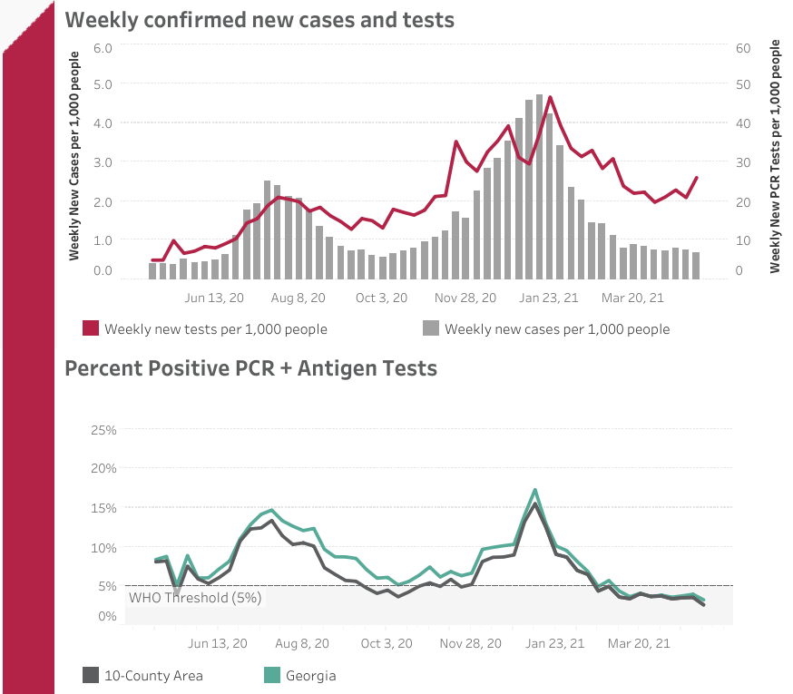
- The chart shows two of three waves of the virus in the 10-County area. The second, which started in mid-November 2020, peaked at 21,209 new cases on the week of January 16th.
- Similarly, the number of weekly new tests reached an all-time high on the week of January 23rd and have remained steady since the end of the third wave.
- There are two peaks in the percentage of tests returning positive. One during the second wave of the virus in the summer of 2020, and the second, with the highest positivity rate recorded, during the first week of January 2021.
- As of May 1st, 2021, both the 10-county area and the state of Georgia had positivity rates lower than 5 percent. These values have remained steady since the week of February 27th. As mentioned before, the World Health Organization’s threshold before implementing a reopening strategy or loosening restrictions is 5 percent.
The following chart shows the weekly new hospitalizations and deaths reported by GA DPH.
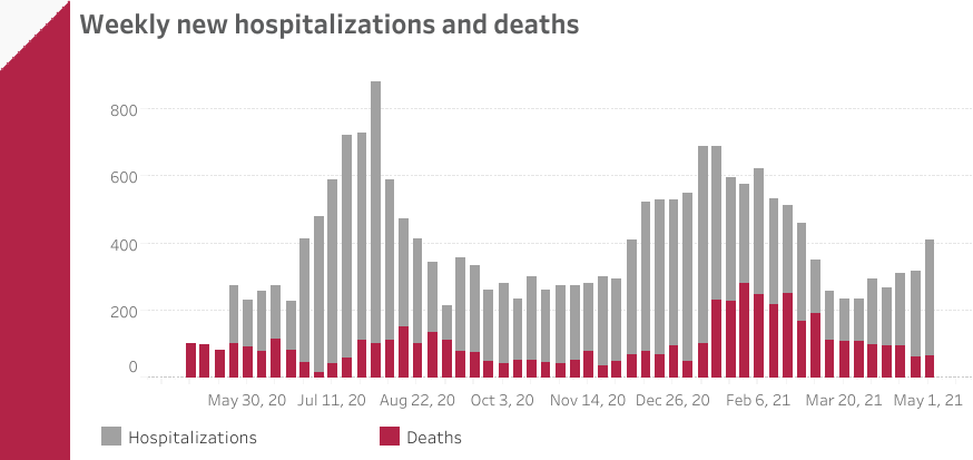
- Hospitalizations and COVID-related deaths chart follow the same patterns as the weekly new cases chart above, with two clear peaks for hospitalizations—the first one during the first week of August 2020 and the second in January 2021.
- The chart also shows how the second wave caused more hospitalizations per week in the 10-county area than the third wave of the virus. However, the latter lasted more weeks and caused a higher number of hospitalizations in total.
- As expected during the second wave with a significantly higher number of people infected, COVID-related deaths had an all-time high in the 10-county area of 282 people during the week of January 30th.
Vaccination data is provided by the Georgia Department of Public Health Vaccine Distribution Dashboard. The total number of vaccines administered and the vaccination rate per 100,000 residents count both the first and second doses.
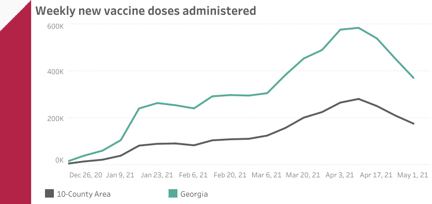
- GA DPH reports that, as of May 1st, 6,282,829 COVID-19 vaccines have been administered statewide (counting both the first and second doses). In the 10-county area, 2,668,950 doses have been administered.
- As of May 1st, the 10-county area had a vaccination rate of 59,356 vaccines administered per 100K residents. On the other hand, Georgia has administered 61,013 vaccines per 100K residents.
- There was an increase in the number of weekly vaccine doses administered from late March to mid-April, peaking 282,212 vaccinations on the week of April 10th.
- Similar to national trends, both Georgia and the 10-county area have decreased their number of weekly new doses administered since mid-April.
As mentioned above, the second part of the COVID-19 Weekly Reports comprises the economic and mobility data for the ten counties that are part of the Atlanta Metro Area and the Atlanta-Sandy Springs-Roswell MSA.
Since the start of the pandemic in March 2020, one of the most concerning indicators was the dramatic increase in Initial Unemployment Insurance (UI) Claims, reported by the Georgia Labor Market Explorer.
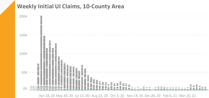
- The largest number of UI claims was during the first week of April 2020, at the beginning of the pandemic, with 201,429 claims. This represents a 9,552% increase when compared to the March 8-14 2020 baseline. Since then, the number of weekly new UI claims has been steadily decreasing, with a few exceptions in July and October 2020.
- There were 13,087 initial unemployment insurance claims in the 10-county area during the week of April 25 – May 1, 2021, representing a 527.1 percent increase from the baseline.
- After reporting 10,964 claims (425% compared to the baseline) in the week of March 20, 2021, GA Labor Market Explorer reported 18,833 claims the following week, which represents a 71% increase. Since then, the number of weekly new claims has remained above 500% compared to the baseline.
The following chart shows job postings by occupation family. It is important to mention that job postings provide just an impression of what is occurring on the ground for hiring, since (a) job boards heavily favor professionalized sectors, and (b) sometimes postings remain on job boards even when the position has been filled or if the company has elected to delay filling a job. Still, examining postings can tell us a lot about what’s in demand in the workplace.
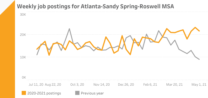
- In the Atlanta-Sandy Springs-Roswell MSA, there were 21,567 job postings between April 25th and May 1st, compared to the 9,076 postings the same week last year during the first pandemic stay-at-home mandate.
- The chart shows how this year’s values diverge from last year’s since the beginning of March, illustrating the impact of the coronavirus pandemic in job postings.
Since the start of the pandemic, Google launched the COVID-19 Community Mobility Reports to support public health officials and organizations make critical decisions to combat the spread of the virus. These reports include aggregated and anonymized insights used in products such as Google Maps showing mobility trends over time by geography, across different categories of places such as retail and recreation, groceries and pharmacies, parks, transit stations, workplaces, and residential.
Finally, the following chart showcases this information for the 10-County Area. The data shows how visitors to (or time spent in) categorized places change compared to Google’s baseline days – the median value from the 5‑week period Jan 3 – Feb 6, 2020.
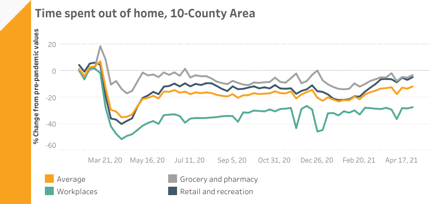
- Overall time spent out of home increased 1.7 percentage points in the last week. This represents 11.7 percent below the baseline.
- Time spent out of home hit an all-time low at the beginning of the pandemic, during the week of April 11, 2020, with -35% compared to the baseline.
- Compared to other destinations, workplaces have recorded the lowest values throughout the year, with a -51.4% decrease compare to base values during the week of April 11, 2020.
- Grocery and pharmacy remained with high values when compared to the other location categories. Since the first week of May of 2020, these destinations have been the only ones to record values above the baseline – one week of July 2020 and the last week of December 2020.
Resources
Confirmed cases, Hospitalizations, Deaths, PCR Tests, and Rates by county:
Georgia Department of Public Health Daily Status Report
COVID-19 Vaccine Doses Administered by county:
Georgia Department of Public Health COVID-19 Vaccine Dashboard
Analysis and trends in the ongoing COVID-19 pandemic
Amber Schmidtke’s Georgia COVID-19 Updates
GA Initial Unemployment Insurance Claimes by County:
Georgia Labor Market Explorer
Atlanta-Sandy Springs-Roswell Job Postings:
Labor Insight, Burning Glass
Time spent outside of home by destination:
Google COVID-19 Community Mobility Reports