


Monday Mapday: Veterans in Metro Atlanta
In honor of Veterans Day, this map shows where the most veterans live in metro Atlanta. Between 11-20% of residents in the areas shown in blue are veterans. The greatest concentrations of veterans are in the outermost regions of the metro area, primarily below 1-20.


Monday Mapday: Demand for Exercise Products / Services
This map shows the market potential for exercise products/services based on the number of adults who follow a regular routine. The areas in tan represent an average demand (compared to national demand). The red areas represent lower demand, and the blue areas represent the greatest demand, indicating the highest market potential.
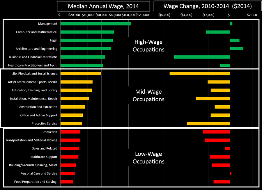
Stuck in the Middle
Amid the rise of income inequality in both the nation and here in metro Atlanta, many researchers are pointing to the slow growth of middle-wage jobs as one of the culprits behind this phenomenon. And, indeed, in looking at occupational data from the Bureau of Labor Statistics, there has been hardly any job growth in [...]


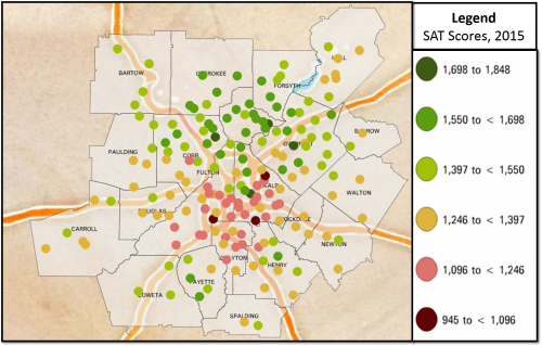
Exploring Latest SAT Scores in Georgia and Atlanta Region
The Georgia Department of Education (DOE) recently reported that high school students in the state achieved a 5-point increase in their SAT scores from 2014 to 2015. This improvement comes amidst a 7-point decline in the national average. Broken down by test components, Georgia test-takers achieved an average increase of two points from 488 to [...]


Monday Mapday: Small Business Loans
This map highlights an uneven distribution of small business loans, concentrated in the northern region of metro Atlanta. The locations in blue received the greatest number of small business loans in 2014. Investment is distributed in the same areas where major employment centers are located. To make your own maps of small business lending in [...]