

Transportation Tuesday: Park-and-Ride Lots
This week's Transportation Tuesday looks at park-and-ride lots in metro Atlanta. As a Transportation Demand Management (TDM) strategy, park-and-ride lots serve to increase access to transit options by allowing commuters to transfer from their vehicles to transit, vanpools, or carpools. The circles in this map represent park and ride lots and increase in size based on the number [...]
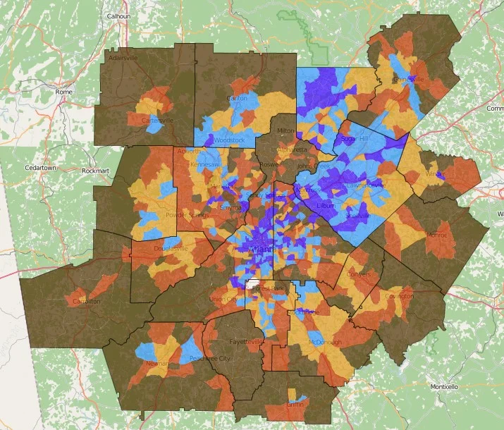
Monday Mapday: Change in Population Density 2015-2040 (ARC Series 15 Forecast)
The Atlanta Region's Plan was adopted by the Atlanta Regional Commission board on February 24. As part of the process, ARC has forecast population and employment change from 2015-2040. This map shows change in population density by census tracts, with the greatest concentrations of change occurring in central DeKalb and Fulton counties, Gwinnett County, and Forsyth [...]


Monday Mapday: 100 Metros by Gross Domestic Product
This map compares the 100 largest metros by their percent change in Gross Domestic Product (GDP) from 2010-2014. Metro Atlanta is in the second highest class, with a 7.72% increase in GDP (using 2009 dollars). You can explore this map and others by visiting the 100 Largest Metros interactive map on Neighborhood Nexus. [...]

Transportation Tuesday: Gas Prices and Vehicle Miles Traveled
When gas prices go up, do people drive less? This motion chart uses data from the Texas Transportation Institute (TTI) to compare gas prices and vehicle miles traveled for the 15 metro areas TTI classifies as "Very Large." For the time period of 1982-2014, the chart uses the following variables: Daily vehicle-miles of travel (VMT) [...]
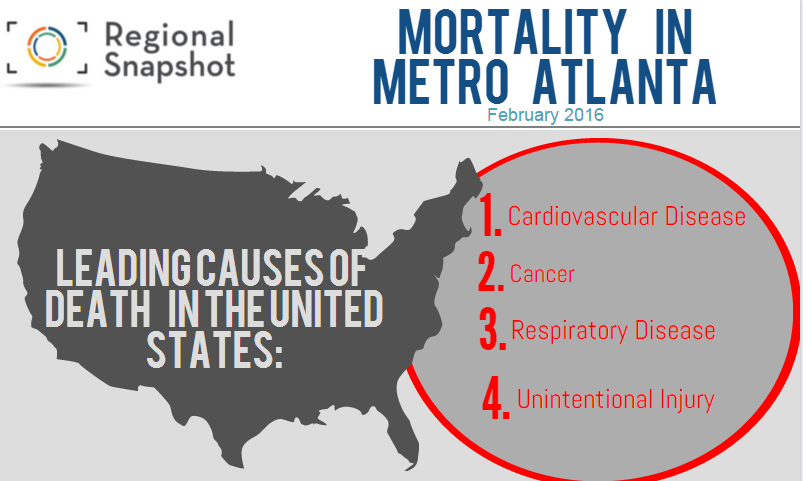
Regional Snapshot: Taking the Pulse of Public Health in the Atlanta Region: Exploring Disparities by Race and Age
For February's Snapshot, we decided to take a look at how mortality rates from the leading causes of death have improved or worsened over time, and explore any disparities by race and age. We then took it a step further by delving into the question that has been circulating national headlines: Why is the mortality rate for [...]
