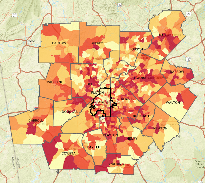
Monday Mapday: Change in Family Income

By |2016-12-08T15:24:49-05:00October 24th, 2016|Monday Mapday|

These maps show change in family income from 1970 to today. The blue map shows neighborhoods with the largest declines in family income (concentrated in south Fulton, south DeKalb, and Clayton counties), and the red map shows neighborhoods with the largest increases in average family income (primarily in north Fulton County). Click the map to [...]

Comments Off on Monday Mapday: Change in Family Income

Transportation Tuesday: Commuting between Counties

By |2016-12-08T15:24:49-05:00October 18th, 2016|Economy, Transportation, Transportation Tuesday|

For each of the ten core metro Atlanta counties, this chart shows the number of workers that commute into the county for work but live elsewhere, that live and work in the county, and that live in the county but commute out for work.

Comments Off on Transportation Tuesday: Commuting between Counties

Monday Mapday: Educational Attainment

By |2016-12-08T15:24:49-05:00October 17th, 2016|Monday Mapday|

Which cities have the highest educational attainment levels? This map shows the percentage of residents age 25+ that have a Bachelor's degree or higher. The dark green colors, which are prominent in the metro Atlanta area, have some of the most well-educated populations. Explore the interactive version of the map at the Neighborhood Nexus/Georgia Municipal Association Data [...]

Comments Off on Monday Mapday: Educational Attainment

Regional Snapshot: October 2016

By |2016-12-08T15:24:49-05:00October 14th, 2016|Economy, Regional Snapshot|

Take a look at October's Regional Snapshot to gear up for the election and see how our economy has improved since the recession. Check out the highlights below, or download the entire report here. Nationally, recovery with expansion continues Gross Domestic Product (GDP) is recovering since the recessionary trough, and employment has as well, but [...]

Comments Off on Regional Snapshot: October 2016

The Quarter Update: October 2016

By |2016-12-08T15:24:49-05:00October 12th, 2016|Economy, The Quarter|

It's that time of the year when we take a look to see how our economy is performing. With employment rates, home price indices, building permits, and more, The Quarter can help us identify what areas of our economy are striving and what areas are slower to recover. Check out the highlights below and take [...]

Comments Off on The Quarter Update: October 2016

Monday Mapday: Patents Filed

By |2016-12-08T15:24:50-05:00October 10th, 2016|Monday Mapday|

Trends in patents are a leading indicator for higher-wage job growth. When there are high amounts of patents filed, it suggests that people are innovating, creating, and starting businesses. This map shows the number of patents filed per 100,000 people in 2015. Dark blue represents the highest rates and light blue/ grey represent the lowest. Atlanta [...]

Comments Off on Monday Mapday: Patents Filed

Transportation Tuesday: Worst Traffic Jams in September

By |2016-12-08T15:24:50-05:00October 4th, 2016|Transportation Tuesday|

The lists and maps below show the Top 10 Worst Bottlenecks in September 2016 in metro Atlanta. The worst bottleneck was located at I-85/I-75 S @ I-20/SB Exit 247. On average, this location had a maximum back up of 3.6 miles, an average duration of 5 hours and 10 minutes, and was classified as a bottleneck [...]

Comments Off on Transportation Tuesday: Worst Traffic Jams in September

Monday Mapday: Fastest Growing Metros

By |2016-12-08T15:24:50-05:00October 3rd, 2016|Monday Mapday|

This map shows the top twenty metros that had the greatest increase in population from 2010-2015. The metros in darker circles had the greatest increase in population. Austin had the greatest increase with a population that grew 15.8 percent from 2010. In addition to the top twenty, the map shows metro Atlanta (ranking 23rd) with [...]

Comments Off on Monday Mapday: Fastest Growing Metros

Where are the Voters? Voter Registration and Turnout in Metro Atlanta (2004 to 2012)

By |2020-10-05T14:54:56-04:00September 29th, 2016|Special Features|

Election Day is just 39 days away and there are only 12 days left to register to vote. We are taking a timely look at voter data from the last three Presidential elections. In 2012, there were a little over 3 million registered voters in the 23-county metro Atlanta region, and 2.2 million voted. As of September 1, [...]

Comments Off on Where are the Voters? Voter Registration and Turnout in Metro Atlanta (2004 to 2012)
Go to Top