
Monday Mapday
Maps showing themes and trends, published on Mondays

Monday Mapday: Change in Employment Density 2015-2040 (ARC Series 15 Forecast)
Last week's Monday Mapday looked at the ARC 2015-2040 population forecast for change in population density from The Atlanta Region's Plan, which was adopted by the Atlanta Regional Commission board on February 23. This week, the map [...]
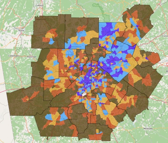
Monday Mapday: Change in Population Density 2015-2040 (ARC Series 15 Forecast)
The Atlanta Region's Plan was adopted by the Atlanta Regional Commission board on February 24. As part of the process, ARC has forecast population and employment change from 2015-2040. This map shows change in population density [...]

Monday Mapday: 100 Metros by Gross Domestic Product
This map compares the 100 largest metros by their percent change in Gross Domestic Product (GDP) from 2010-2014. Metro Atlanta is in the second highest class, with a 7.72% increase in GDP (using 2009 dollars). [...]

Monday Mapday: Low Birthweight Births
Low birthweight is a key indicator of maternal and infant health. This map uses data from the Georgia Department of Health to show the rate of low birthweight births (where the infant weights less than 2,500 [...]
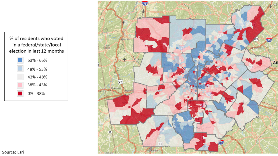
Monday Mapday: Voting in the last 12 months
It's time to get in the voting spirit! Are you an active voter? This map shows the percentage of residents who voted in a federal/state/local election in the last 12 months by census tract in [...]

Monday Mapday: Millennial Homeowners
This map shows the percentage of owner-occupied housing units headed by a Millennial (age 18-34) in metro Atlanta. The areas in pink have the highest concentrations of Millennial homeowners. This map was created with Neighborhood Nexus. [...]