Transportation Tuesday: Peachtree Center Cycletrack

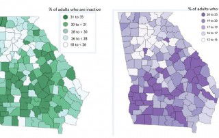
This Monday we wanted to highlight a few findings from our last post about the 2016 County Health Rankings. Looking at health behaviors by county, specifically percent of adults who smoke and percent of adults who are inactive, we can see there is a pattern between maps. The metro Atlanta counties have the lowest rates [...]
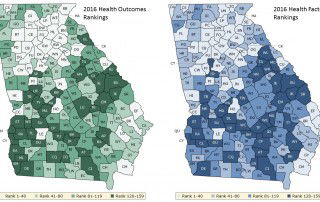
The new 2016 County Health Rankings (https://www.countyhealthrankings.org/) rank each county based on health outcomes (length of life and quality of life) and health factors (health behaviors, clinical care, social and economic factors, and physical environment). The maps below show the Georgia rankings for health outcomes (left) and factors (right). The majority of the 20 counties [...]
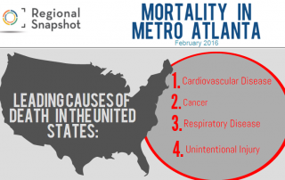
For February's Snapshot, we decided to take a look at how mortality rates from the leading causes of death have improved or worsened over time, and explore any disparities by race and age. We then took it a step further by delving into the question that has been circulating national headlines: Why is the mortality rate for [...]
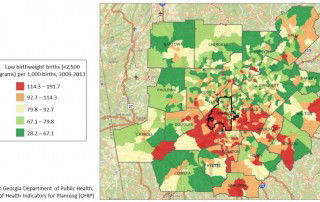
Low birthweight is a key indicator of maternal and infant health. This map uses data from the Georgia Department of Health to show the rate of low birthweight births (where the infant weights less than 2,500 grams or 5.5 pounds) in metro Atlanta from 2009-2013. The highest rates occur in south Fulton and south DeKalb counties, with other [...]
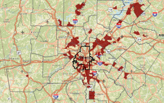
This map uses the most recent healthcare coverage data from the U.S. Census Bureau, showing the percentage of population with no health insurance coverage. The areas in brown are census tracts with the highest uninsured rates, where 26.5%-76.1% of residents do not have health insurance. Source: ACS 2010-2014 5-year estimates
Visit the ARC website for more information and to review the draft plan. ARC is accepting public comments on the plan until January 15, 2016.