Regional Snapshot: 100 Metros Data Dashboard
This month's regional snapshot introduces our updated 100 Metros dashboard, with an overview of some select findings and a demonstration of the comparison feature.

This month's regional snapshot introduces our updated 100 Metros dashboard, with an overview of some select findings and a demonstration of the comparison feature.
Population Insights from the 100 Metros Dashboard.
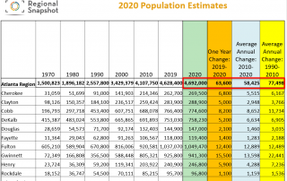
ARC's 2020 major jurisdiction population estimates. The 10-county region’s population increased by 1.2 percent and now stands at 4,692,000 — more than that of 24 states. A significant reduction in job growth has resulted in slowing of the region’s population growth, to the lowest level of the last four years.
April 1 this year is known in data circles not as April Fools Day, but rather as Census Day. In these times of pandemic, response to this decennial data collecton effort is even more critical than usual.
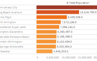
This month's regional snapshot provides summary findings from an initial review of a just-released new and (vastly) improved version of a 100 Metros Data Dashboard. This tool enables easy access to interactive rankings of the top 10 major metros, across data in topic areas such as demographics, economics, health, and housing.
Interactive maps taking a look at how our black, non-Hispanic population is distributed across the state today and how things have (or haven't) changed since 2000.
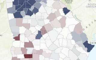
A series of static maps and an interactive tool exploring population change throughout the state.
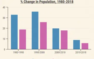
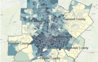
Examining population change in the 10-county area since 1980, including absolute population change, percent change and changes in density.
A series of maps comparing percent point change in white and black residents at the county and tract level, followed by a map explorer tool with additional data.
A look back at how metro Atlanta's diversity has grown and changed since 1980.