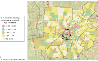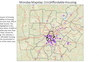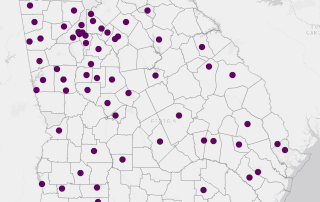
Monday Mapday: Rental Affordability in Georgia Cities
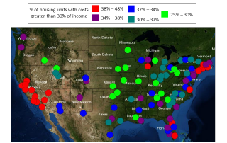
We recently looked at housing affordability in metro areas across the U.S. and in neighborhoods in metro Atlanta. This map shows the cities in Georgia where 52 percent or more of housing units are occupied by renters, and where 48 to 85 percent of renters pay more than 30 percent of their household income towards housing costs [...]