
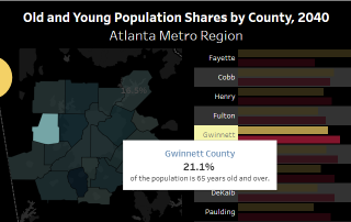
Friday Factday: Older Population Set to Outnumber Children in 2035 in the U.S.
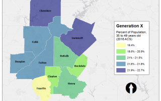
The U.S. Census Bureau forecasts that by 2035, for the first time in the country's history, the 65 and over population will outnumber those under 18 years old. This benchmark national demographic shift results from both an increase in longevity and a decline in birth rates (which is characteristic of developed economies). In the [...]