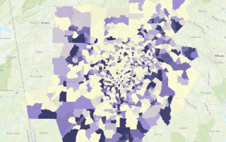
Happy Birthday, W.E.B. Du Bois
Celebrating the life of the incomparable W.E.B Du Bois through a series of maps and charts that show just how long the arc of data visualization history in Georgia actually is.

Celebrating the life of the incomparable W.E.B Du Bois through a series of maps and charts that show just how long the arc of data visualization history in Georgia actually is.
Perhaps better titled "Where will Santa be stressed?" Some maps showing population numbers of children age 9 and younger, where Santa's gonna be working double time to execute his all-important annual job.
Celebrating Family Caregivers Month with a look at rates of grandparents who are caring for their grandchildren.
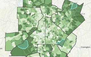
A tract-level look at broadband access across the state, as well as the rates of school-age children in each tract.
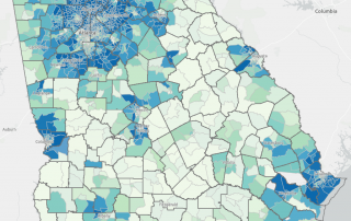
A county-level look at rates of grandparents living with grandchildren across the state of Georgia.
While the medical and public health communities continue to work towards flattening the curve for COVID-19 infections, data continues to show that older adults may be at higher risk for severe illness from coronavirus. A few weeks ago on this blog, we provided information on the spatial distribution of the senior population in Georgia: https://33n.atlantaregional.com/monday-mapday/monday-mapday-older-populations [...]
As we've all heard, our older adults have high vulnerability to coronavirus. This post provides some interactive maps that take a look at how our 65+ and 85+ populations are distributed across the state, in absolute and percentage terms.
This Monday Mapday considers disconnected youth ages 16 to 19 in the 21 County Metro Area.
Take a look at how labor force participation rates among different age groups today compare to the year 2000 as well as how representation of different age groups in the workforce has changed over time.
A dive into differences in unemployment rates based on education, sex and age.