About ARC Research

This author has not yet filled in any details.
So far ARC Research has created 361 blog entries.

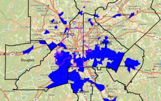
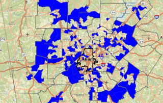
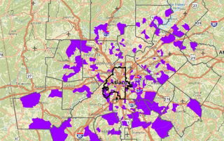
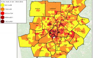
Monday Mapday: Riding Solo

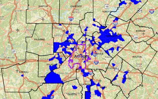
The heaviest concentrations of commuters driving alone come from outside the urban core. It appears that the highest rates of commuting solo come from the larger more rural counties along the exurban fringe, such as Bartow, Walton, Newton, Coweta and Carroll counties. As expected, the lowest  rates are in the City of Atlanta where commuters [...]

By |2016-12-08T15:25:31-05:00September 21st, 2015|Monday Mapday, Transportation|0 Comments

Monday Mapday: Change in Family Composition: 1970-2010

This map comes from September's Regional Snapshot and highlights the areas most affected by the changing family structures. The areas highlighted in blue are those that flipped from very light concentrations of single-parent families in 1970 (20% or less) to very heavy concentrations of single-parent families in 2010 (50% or more).

By |2016-12-08T15:25:31-05:00September 14th, 2015|Monday Mapday, Other Demographics|0 Comments

Regional Snapshot: Household Composition in Metro Atlanta

The structure of the family in the Atlanta region has changed dramatically over the past 40 years. There are fewer husband-wife families and more single-parent families and “non-families.” Here are some other key findings from this month’s Regional Snapshot: As of 2010, almost 34 percent of families with children are headed by a single-parent in [...]

By |2016-12-08T15:25:31-05:00September 11th, 2015|Other Demographics, Regional Snapshot|0 Comments

Monday Mapday: As the Stork Flies

These maps isolate those census tracts where the Stork has been the busiest. The first map shows the total number of births between 2009 and 2013. These are concentrated mostly in exurban areas where the tracts are pretty big. The second map shows the number of births per square mile between 2009 and 2013. This paints a [...]

By |2016-12-08T15:25:31-05:00September 7th, 2015|Age and Generations, Monday Mapday|0 Comments

Monday Mapday: Low-income jobs and low-income workers

These two maps show another challenge that low-income workers typically have - access to jobs. The first map shows the greatest concentrations of low-income jobs - those paying less than $15,000 annually. These jobs are scattered throughout the region. The second map shows where workers who make less than $15,000 annually live. These workers are [...]

By |2016-12-08T15:25:31-05:00August 31st, 2015|Economy, Monday Mapday|0 Comments

Regional Snapshot: ARC’s 2015 Population Estimates

In keeping with tradition - ARC has been estimating the population annually for the last 50 years, or so -  August is when we discuss ARC’s Population Estimates for 2015. It has been another steady year of growth for the region. Continue reading to get the highlights… The 10-county Atlanta region is now home to [...]

By |2016-12-08T15:25:31-05:00August 11th, 2015|Economy, Housing, Other Demographics, Regional Snapshot|0 Comments

Want To Graduate High School? Come From A Wealthy Neighborhood!

Median Household Income by High School Attendance Zone, 2014 (Source: ESRI) It’s back-to-school time in the Atlanta region! And while this is hardly ground-breaking research, we thought it would be a good time to remind everyone what one of the best indicators of educational success is - income! We actually tweeted [...]

By |2016-12-08T15:25:31-05:00August 5th, 2015|Economy, Education, Special Features|0 Comments

Earned Income Tax Credit Usage in the Atlanta Region

Percent of Filers Receiving Earned Income Tax Credit, 2013 (By Zip Code) Source: IRS, through Brookings The Earned Income Tax Credit (EITC) is a federal tax credit program created in 1975 to shield lower-income workers from rising payroll taxes. (See Alan Berube, here) Taxpayers are eligible for EITC if they are working and have low-to-moderate income. [...]

By |2016-12-08T15:25:32-05:00July 21st, 2015|Economy, Special Features|0 Comments

We Hope You “Like” This Post

Where Potential Facebook Users Are in the Atlanta Region, 2015Blues are highest potential Facebook usage; Reds are lowest.(Source: ESRI)We know that you have been clamoring for this information, and we try to be responsive to such outsize demands. So here it is - Where are the areas in the region where residents are most likely [...]

By |2016-12-08T15:25:32-05:00July 15th, 2015|Special Features|0 Comments
Go to Top