About ARC Research

This author has not yet filled in any details.
So far ARC Research has created 361 blog entries.

Transportation Tuesday: T-SPLOST

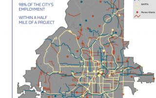
On November 8, 2016, Atlanta voters will vote on two ballot referenda authorizing investment in transit and transportation infrastructure. This map from the City of Atlanta's T-SPLOST Fact Sheet shows proposed T-SPLOST, MARTA, and Renew Atlanta projects. Read more about the referenda on the City's website.

By |2016-12-08T15:24:49-05:00October 25th, 2016|Transportation, Transportation Tuesday|Comments Off on Transportation Tuesday: T-SPLOST

Monday Mapday: Change in Family Income

These maps show change in family income from 1970 to today. The blue map shows neighborhoods with the largest declines in family income (concentrated in south Fulton, south DeKalb, and Clayton counties), and the red map shows neighborhoods with the largest increases in average family income (primarily in north Fulton County). Click the map to [...]

By |2016-12-08T15:24:49-05:00October 24th, 2016|Monday Mapday|Comments Off on Monday Mapday: Change in Family Income

Transportation Tuesday: Commuting between Counties

For each of the ten core metro Atlanta counties, this chart shows the number of workers that commute into the county for work but live elsewhere, that live and work in the county, and that live in the county but commute out for work.

By |2016-12-08T15:24:49-05:00October 18th, 2016|Economy, Transportation, Transportation Tuesday|Comments Off on Transportation Tuesday: Commuting between Counties

Monday Mapday: Educational Attainment

Which cities have the highest educational attainment levels? This map shows the percentage of residents age 25+ that have a Bachelor's degree or higher. The dark green colors, which are prominent in the metro Atlanta area, have some of the most well-educated populations. Explore the interactive version of the map at the Neighborhood Nexus/Georgia Municipal Association Data [...]

By |2016-12-08T15:24:49-05:00October 17th, 2016|Monday Mapday|Comments Off on Monday Mapday: Educational Attainment

Regional Snapshot: October 2016

Take a look at October's Regional Snapshot to gear up for the election and see how our economy has improved since the recession. Check out the highlights below, or download the entire report here. Nationally, recovery with expansion continues Gross Domestic Product (GDP) is recovering since the recessionary trough, and employment has as well, but [...]

By |2016-12-08T15:24:49-05:00October 14th, 2016|Economy, Regional Snapshot|Comments Off on Regional Snapshot: October 2016

The Quarter Update: October 2016

It's that time of the year when we take a look to see how our economy is performing. With employment rates, home price indices, building permits, and more, The Quarter can help us identify what areas of our economy are striving and what areas are slower to recover. Check out the highlights below and take [...]

By |2016-12-08T15:24:49-05:00October 12th, 2016|Economy, The Quarter|Comments Off on The Quarter Update: October 2016

Monday Mapday: Patents Filed

Trends in patents are a leading indicator for higher-wage job growth. When there are high amounts of patents filed, it suggests that people are innovating, creating, and starting businesses. This map shows the number of patents filed per 100,000 people in 2015. Dark blue represents the highest rates and light blue/ grey represent the lowest. Atlanta [...]

By |2016-12-08T15:24:50-05:00October 10th, 2016|Monday Mapday|Comments Off on Monday Mapday: Patents Filed

Transportation Tuesday: Worst Traffic Jams in September

The lists and maps below show the Top 10 Worst Bottlenecks in September 2016 in metro Atlanta. The worst bottleneck was located at I-85/I-75 S @ I-20/SB Exit 247. On average, this location had a maximum back up of 3.6 miles, an average duration of 5 hours and 10 minutes, and was classified as a bottleneck [...]

By |2016-12-08T15:24:50-05:00October 4th, 2016|Transportation Tuesday|Comments Off on Transportation Tuesday: Worst Traffic Jams in September

Monday Mapday: Fastest Growing Metros

This map shows the top twenty metros that had the greatest increase in population from 2010-2015. The metros in darker circles had the greatest increase in population. Austin had the greatest increase with a population that grew 15.8 percent from 2010. In addition to the top twenty, the map shows metro Atlanta (ranking 23rd) with [...]

By |2016-12-08T15:24:50-05:00October 3rd, 2016|Monday Mapday|Comments Off on Monday Mapday: Fastest Growing Metros
Go to Top