

Monday Mapday: Senior Population
This map shows the neighborhoods in metro Atlanta that have the highest densities of senior [...]

The Food Insecure in Metro Atlanta – A Deep Dive into Metro Atlanta Speaks
For most of us, Thanksgiving is a time to celebrate with our families over an [...]
Monday Mapday: Kids Without Health Insurance
In metro Atlanta, 9.1% of people under 18 do not have health insurance (an average [...]
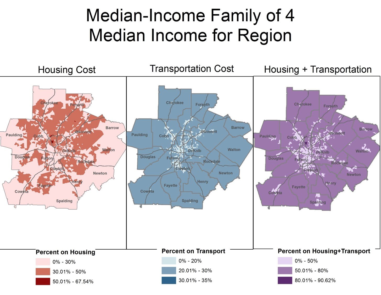
Transportation Tuesday: Affordability
These maps show areas in metro Atlanta that are most affordable (considering transportation and housing [...]

Monday Mapday: Early Voting Turnout
Election Day is tomorrow and 46% of registered active voters in the 20-county metro Atlanta [...]
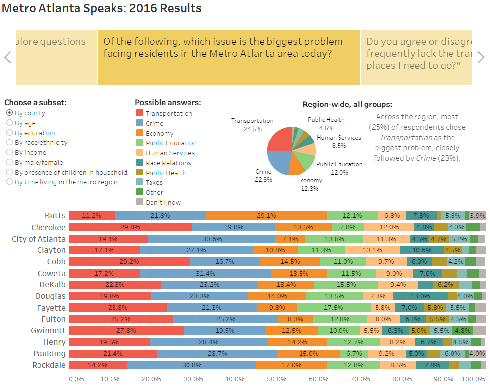
2016 Metro Atlanta Speaks Survey Results- Regional Snapshot
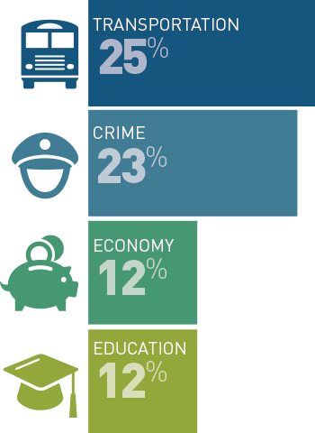
Transportation Remains Region’s Top Concern, According to 2016 Metro Atlanta Speaks Survey Atlanta Regional Commission's 2016 [...]
Transportation Tuesday: Transportation remains metro Atlanta’s top concern
According to the 2016 Metro Atlanta Speaks survey, 25 percent of respondents said transportation was the [...]

Monday Mapday: Income by Senate Districts
With Election Day quickly approaching, let's take a look at our Georgia Senate Districts. This [...]
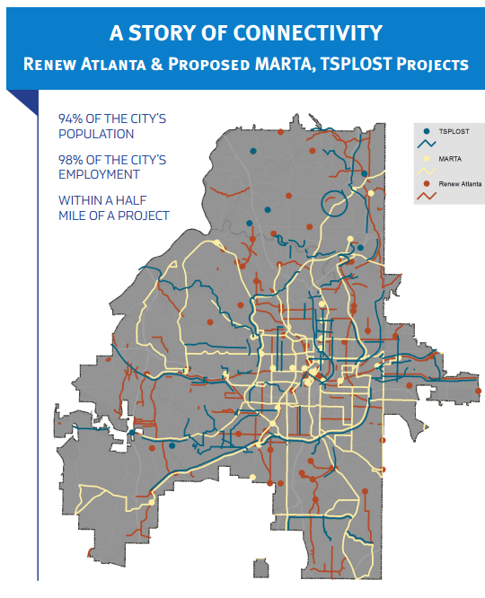
Transportation Tuesday: T-SPLOST
On November 8, 2016, Atlanta voters will vote on two ballot referenda authorizing investment in [...]

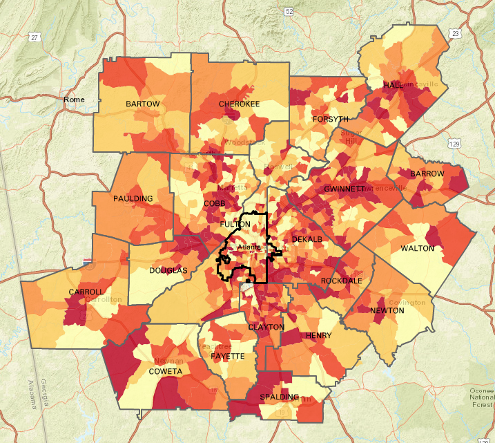
Monday Mapday: Change in Family Income
These maps show change in family income from 1970 to today. The blue map shows [...]