
Special Features
Reports, maps, and infographics about special topics.

Region’s Diversity Changes Profound in Local School Districts
School System Composition: Enrollment By Race/Ethnicity, 2014 (How to read this chart: The bars are color coded to a specific race or ethnicity. The longer the bar, the greater the SHARE of that race or ethnicity’s enrollment. [...]
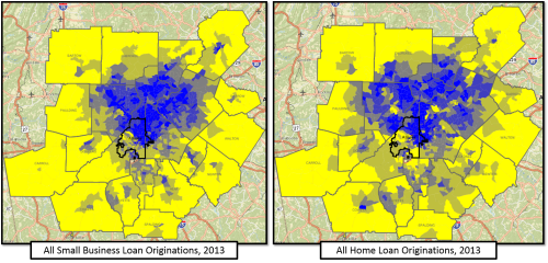
Where Banks Are Investing
Neighborhood Nexus (which ARC is a core partner in) recently put up some interesting new data - the distribution of small business loans. The map, as you can see, shows the uneven distribution of commercial lending [...]
Grass Always Greener…in the Backyard?
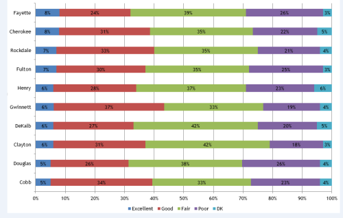
This is the first in a series of posts about the responses to questions in the 2014 Metro Atlanta Speaks (MAS) survey. 2014 was the second year for this new, first of its kind regional [...]
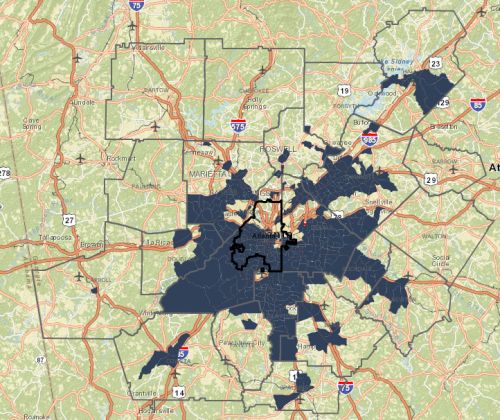
Atlanta’s Diversity Makes National Headlines!
The Pew Research Center, one of our favorite data analysis sites, recently released new data that shows that 78 counties nationwide switched to “majority-minority” between 2000 and 2013. Four of those counties are located in the [...]
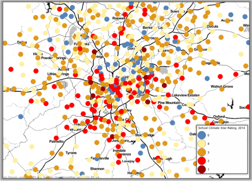
2014 School Climate Star Ratings
In an effort to holistically assess schools’ environments in Georgia, the Georgia Department of Education (DOE) has released the 2014 School Climate Star Ratings. This inaugural system is based on surveys distributed to all schools [...]