
Monday Mapday: Georgia-Born

By |2016-12-08T15:24:53-05:00June 27th, 2016|Monday Mapday|

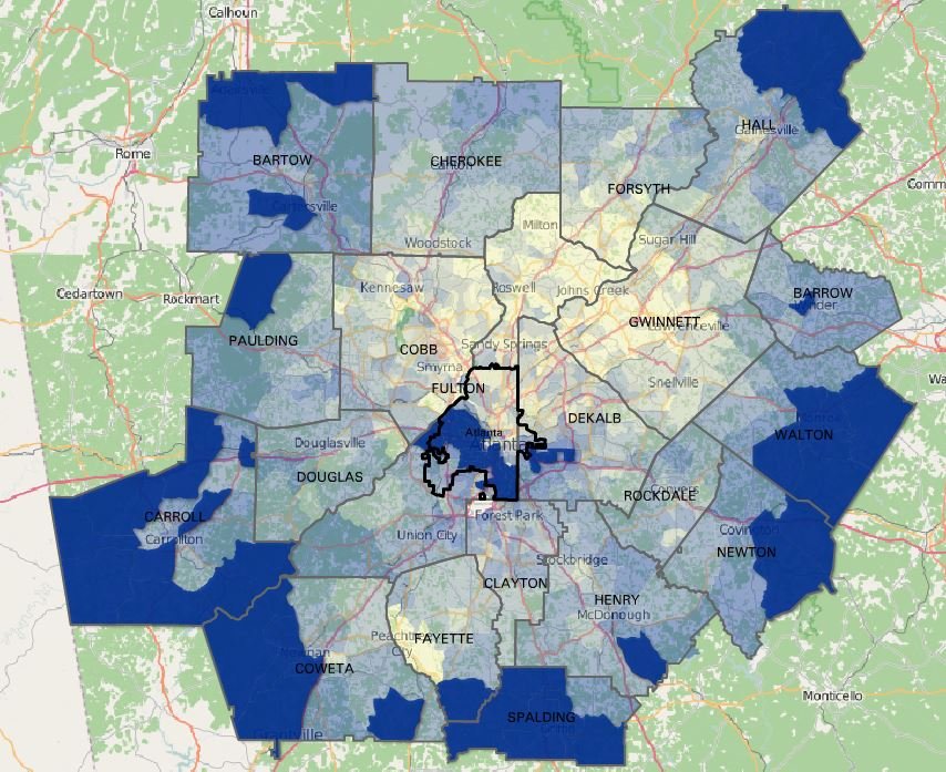
The places in metro Atlanta with the highest percentages of people who were born in Georgia are primarily in the suburbs, with an additional pocket in central Fulton County. In the blue areas highlighted on this map, 60%-100% of residents were born in Georgia. Most of Carroll, Spalding, and Walton counties have relatively high concentrations of [...]

Comments Off on Monday Mapday: Georgia-Born

Minimum wage vs. minimum income needed for a family to be self-sufficient

By |2016-12-08T15:24:53-05:00June 23rd, 2016|Economy, Special Features|

People often say that cost of living is low in Atlanta. And they are right, relative to many other metros, as our snapshot this month showed (How Expensive Is It to Live in Metro Atlanta?). But, when considering minimum wage and the needs of various family types, can working adults earn the minimum income [...]

Comments Off on Minimum wage vs. minimum income needed for a family to be self-sufficient

Transportation Tuesday: Employee Travel Patterns to Emory

By |2016-12-08T15:24:53-05:00June 21st, 2016|Transportation Tuesday|

As a regional employment center, Emory has a big impact on transportation due to the travel patterns of their employees. Here, we estimate the number of employees working in the Emory area and analyze where the workers are coming from (their home locations) using the U.S. Census Bureau's OnTheMap Application. The tool uses 2014  Longitudinal-Employer Household [...]

Comments Off on Transportation Tuesday: Employee Travel Patterns to Emory

Monday Mapday: 2009 High School Graduates with Bachelor’s Degrees

By |2016-12-08T15:24:53-05:00June 20th, 2016|Education, Monday Mapday|

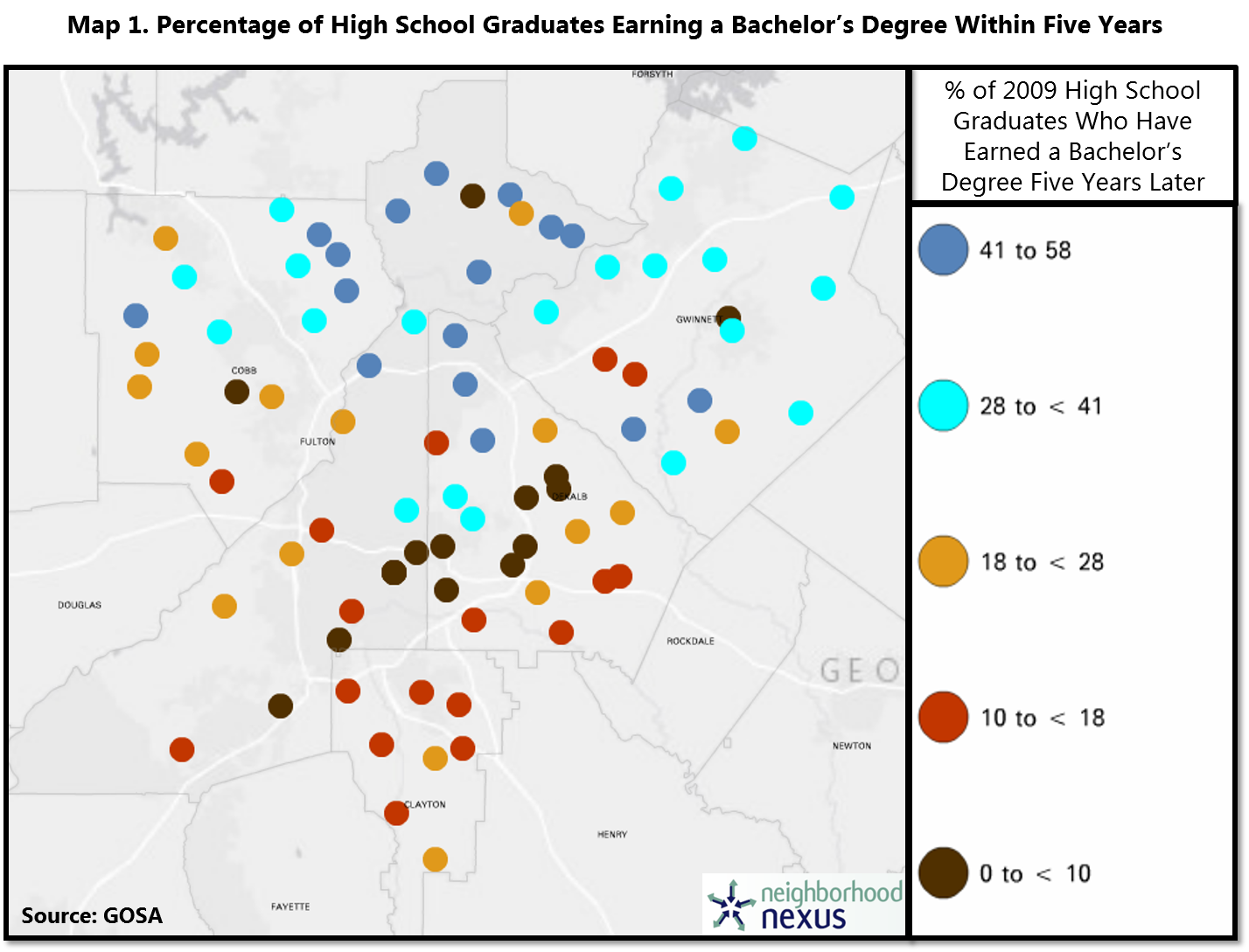
This map, from our special feature So What Exactly Happens After High School?, uses data from the Governor’s Office of Student Achievement (GOSA) (mapped using Neighborhood Nexus) shows, by school, the percentage of 2009 high school graduates (for most high schools in the five core counties) who had earned a bachelor’s degree within five years. We can see a familiar [...]

Comments Off on Monday Mapday: 2009 High School Graduates with Bachelor’s Degrees

Transportation Tuesday: Regional Bike/Ped Focus Areas

By |2016-12-08T15:24:53-05:00June 14th, 2016|Public Health, Transportation Tuesday|

We recently featured the new ARC-approved Walk. Bike. Thrive! regional bicycle-pedestrian plan.  To develop a regional, data-driven framework, the plan includes strategies for prioritizing projects and guiding investments for walking and biking. To evaluate projects in a way that reflects ARC's policy goals, the prioritization tool identifies "regional focus areas" based on desired safety, mobility, economic development, and [...]

Comments Off on Transportation Tuesday: Regional Bike/Ped Focus Areas

Monday Mapday: School Climate Ratings

By |2016-12-08T15:25:12-05:00June 13th, 2016|Education, Monday Mapday|

To start off this week, we wanted to take a look at the newly released School Climate Ratings- a rating system derived from surveys distributed to all schools in Georgia. The ratings aim to assess the perceived “culture”, character, and quality of school life. Data from the surveys are used to score each school  from [...]

Comments Off on Monday Mapday: School Climate Ratings

Metro Atlanta Speaks Spotlight: What Does Henry County Think?

By |2016-12-08T15:25:13-05:00June 8th, 2016|Metro Atlanta Speaks|

Henry County residents have local pride and strong community engagement, but have regional transportation challenges. Highlights of the responses from the 400 Henry County residents surveyed in the 2015 edition of Metro Atlanta Speaks are shown below. Featured questions: How would you rate metro Atlanta as a place to live? How would you rate support services for elderly citizens? Of the [...]

Comments Off on Metro Atlanta Speaks Spotlight: What Does Henry County Think?

Transportation Tuesday: May’s Worst Traffic Jams

By |2016-06-07T19:25:55-04:00June 7th, 2016|Transportation, Transportation Tuesday|

Now we can relive the worst traffic jams of May 2016! The top 10 bottlenecks for the month are shown here, with details about duration, length, and number of occurrences. For the second month in a row, the #1 bottleneck was I-75 N @ Chastain Rd/exit 271. The average maximum length of this bottleneck was 11.82 miles [...]

Comments Off on Transportation Tuesday: May’s Worst Traffic Jams

Monday Mapday: Cost-of-Living Index

By |2016-12-08T15:25:13-05:00June 6th, 2016|Monday Mapday, Special Features|

Taken from this month's Regional Snapshot, this map explores cost-of-living across the largest metropolitan areas in the United States. Red and green dots mark the cities with a lower cost- of-living index while blues indicate the highest. As you might have guessed, New York has the highest Cost of Living Index of 227.4- more than double than the [...]

Comments Off on Monday Mapday: Cost-of-Living Index

How Expensive Is It To Live in Metro Atlanta?

By |2016-12-08T15:25:13-05:00June 6th, 2016|Regional Snapshot, Special Features|

Ever wonder how expensive Atlanta is compared to other cities? We have an answer for you! This month's Regional Snapshot looks at how expensive it is to live in different metropolitan areas by exploring data related to cost-of-living. Here are the key findings, but you can access the full report here: Metro Atlanta’s overall cost-of-living is [...]

Comments Off on How Expensive Is It To Live in Metro Atlanta?
Go to Top