
Monday Mapday
Maps showing themes and trends, published on Mondays
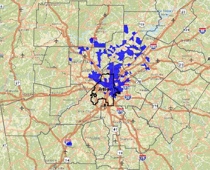
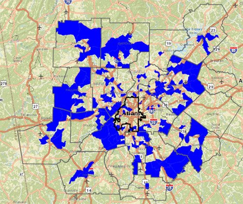
Monday Mapday: Mortgage Loans for Purchasing Homes Per Square Mile
The locations in blue had the greatest number of mortgage loans originated for buying homes per square mile in 2014. Most loans were concentrated in the northeastern areas of urban core, extending into northern metro [...]
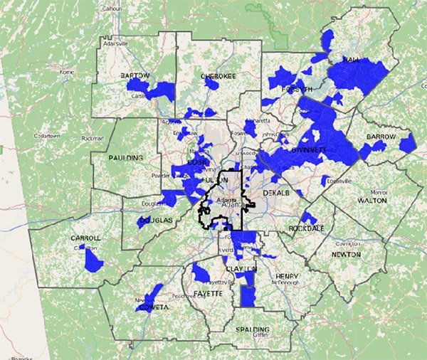
Monday Mapday: Change in the Percent of Hispanic Population
In honor of National Hispanic Heritage Month, this map shows the census tracts with the greatest increases in Hispanic population between 2000 and 2010. It highlights the largest changes in Gwinnett, Hall, Cobb and Clayton [...]
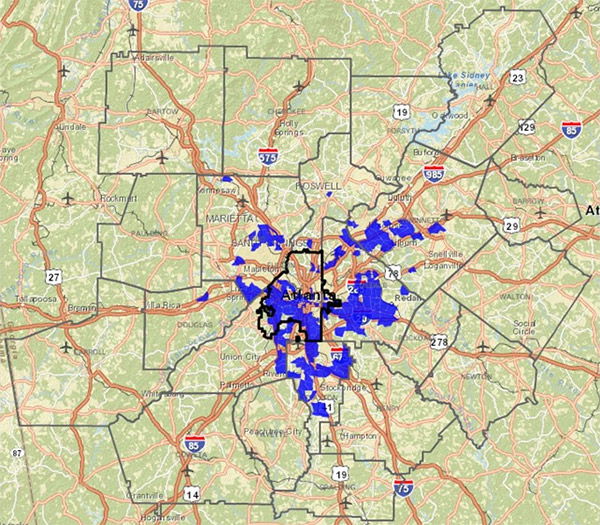
Monday Mapday: Public Assistance through Food Stamps
The areas shown in blue had the greatest increase in individuals receiving food stamps per square mile from 2010-2014 in metro Atlanta. While poverty is still concentrated in the urban core, suburban areas unaccustomed to [...]
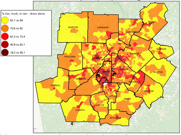
Monday Mapday: Riding Solo
The heaviest concentrations of commuters driving alone come from outside the urban core. It appears that the highest rates of commuting solo come from the larger more rural counties along the exurban fringe, such as [...]

Monday Mapday: Change in Family Composition: 1970-2010
This map comes from September's Regional Snapshot and highlights the areas most affected by the changing family structures. The areas highlighted in blue are those that flipped from very light concentrations of single-parent families in [...]
Monday Mapday: As the Stork Flies
These maps isolate those census tracts where the Stork has been the busiest. The first map shows the total number of births between 2009 and 2013. These are concentrated mostly in exurban areas where the tracts [...]