
Monday Mapday
Maps showing themes and trends, published on Mondays

Monday Mapday: Change in Family Income
These maps show change in family income from 1970 to today. The blue map shows neighborhoods with the largest declines in family income (concentrated in south Fulton, south DeKalb, and Clayton counties), and the red [...]

Monday Mapday: Educational Attainment
Which cities have the highest educational attainment levels? This map shows the percentage of residents age 25+ that have a Bachelor's degree or higher. The dark green colors, which are prominent in the metro Atlanta [...]

Monday Mapday: Patents Filed
Trends in patents are a leading indicator for higher-wage job growth. When there are high amounts of patents filed, it suggests that people are innovating, creating, and starting businesses. This map shows the number of patents [...]

Monday Mapday: Fastest Growing Metros
This map shows the top twenty metros that had the greatest increase in population from 2010-2015. The metros in darker circles had the greatest increase in population. Austin had the greatest increase with a population [...]
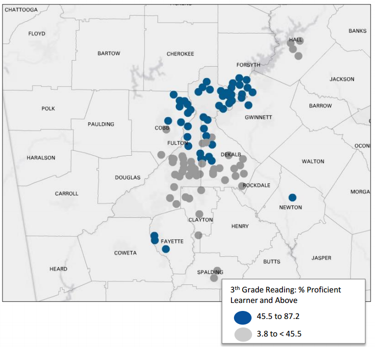
Monday Mapday: Reading Proficiency in Elementary Schools
This map, from our latest Regional Snapshot: Reading Matters and Math Counts, shows the 50 schools with the highest reading proficiency (in blue) and the 50 schools with the lowest reading proficiency (in gray) in metro Atlanta. With [...]
Monday Mapday: Population Age 65+ in Poverty
The blue areas in this map highlight neighborhoods in metro Atlanta that have a high percentage of residents age 65 and older living in poverty. While the urban core appears to have high concentrations of seniors [...]