
Monday Mapday
Maps showing themes and trends, published on Mondays

Monday Mapday: Atlanta Rents on the Rise
In keeping with the housing affordability theme, today's Monday Mapday explores metro Atlanta's rental market. Though rents are on the rise throughout the metro area, rental increases are greatest in the suburbs (as shown [...]

Monday Mapday: Population with No Health Insurance Coverage – 100 U.S. Metros
This map compares the most recent healthcare coverage data from the U.S. Census Bureau for the 100 largest U.S. metro areas, showing the percentage of population with no health insurance coverage. The areas in [...]

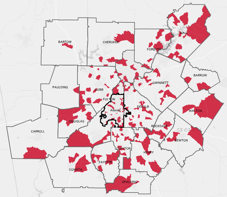
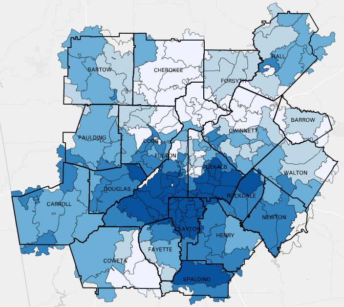
Monday Mapday: Location of Low-Income Workers vs. Low-Income Jobs
The maps below show a spatial mismatch between the location of low-income workers and low-income jobs. The first map shows the location of the region’s low-income workers by place of residence, with blue shades [...]
Monday Mapday: Transportation Costs Complicate Affordability
How do transportation costs factor into affordable housing? When considering both housing and transportation costs, the window of affordability becomes even more narrow. These maps show where a family of four (two working commuters [...]
Monday Mapday: Change in Low Birthweight Births
This map shows the areas (by Census Tract) that have had the greatest increase in rates of low birthweight births (where the infant weights less than 2,500 grams or 5.5 pounds), a key indicator of [...]
Monday Mapday: Negative Equity
Using Zillow data for Q3 of 2016, this map shows the percentage of homes that have negative equity (owe more on the house than what it is worth) for zip codes in metro Atlanta. [...]