The increase in inflation began to show up on our national radar early in 2021, and economists and policymakers haven’t taken their eyes off it since. Atlanta’s inflation hit 10.8% year-over-year growth in February 2022 – one of the fastest rates in the nation. But the impact of these higher prices isn’t distributed equally. For example, while paying an extra 20 cents for a pound of oranges might just be an inconvenience to almost all consumers, an extra $2,000 of yearly rent might well mean eviction for the most vulnerable lower-income households. We take a deep dive into “what inflation means for you”, inspired by work done at the Minneapolis Federal Reserve.
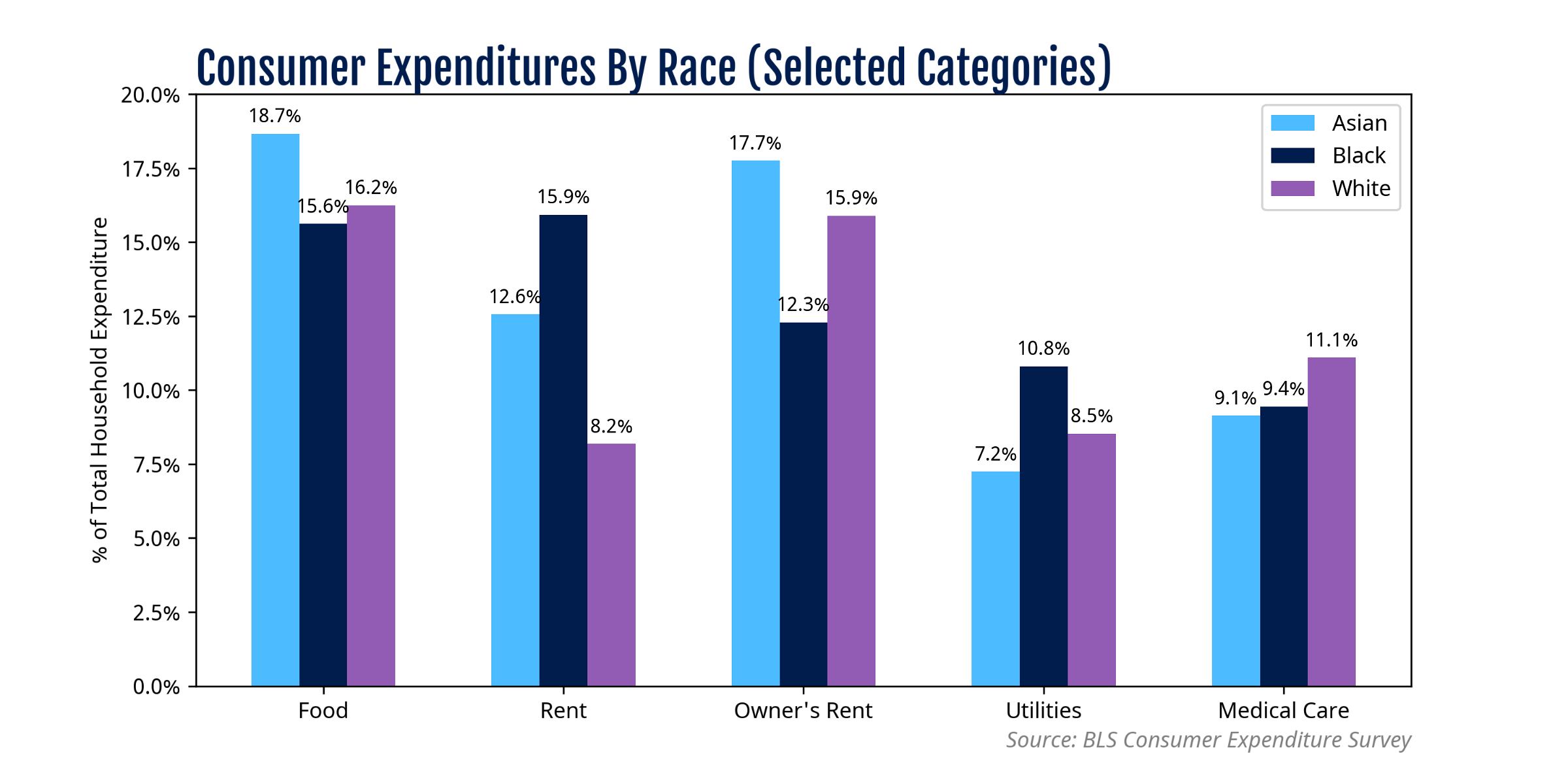
Chart 1 – Consumer Expenditures by Race

The consumer price index (CPI) is built upon consumer expenditure data. Let’s peel back the curtain to see the details on just how households spend money.
The chart on the right shows that Black families spend relatively more on rent and utilities. Asian and white families spend more, comparatively, on medical services and on homeowner expenses.
The average Black annual income in the Consumer Expenditure Survey was $56,000, compared to $76,000 for white families and $95,000 for Asian families. Higher incomes leave more “room” for households to invest in financial vehicles, for which returns can keep pace with inflation. It is very likely as such that long-term sustained inflation will increase the racial wealth gap unless wage growth “keeps up”. Unfortunately, our previous research shows wages are lagging behind inflation.
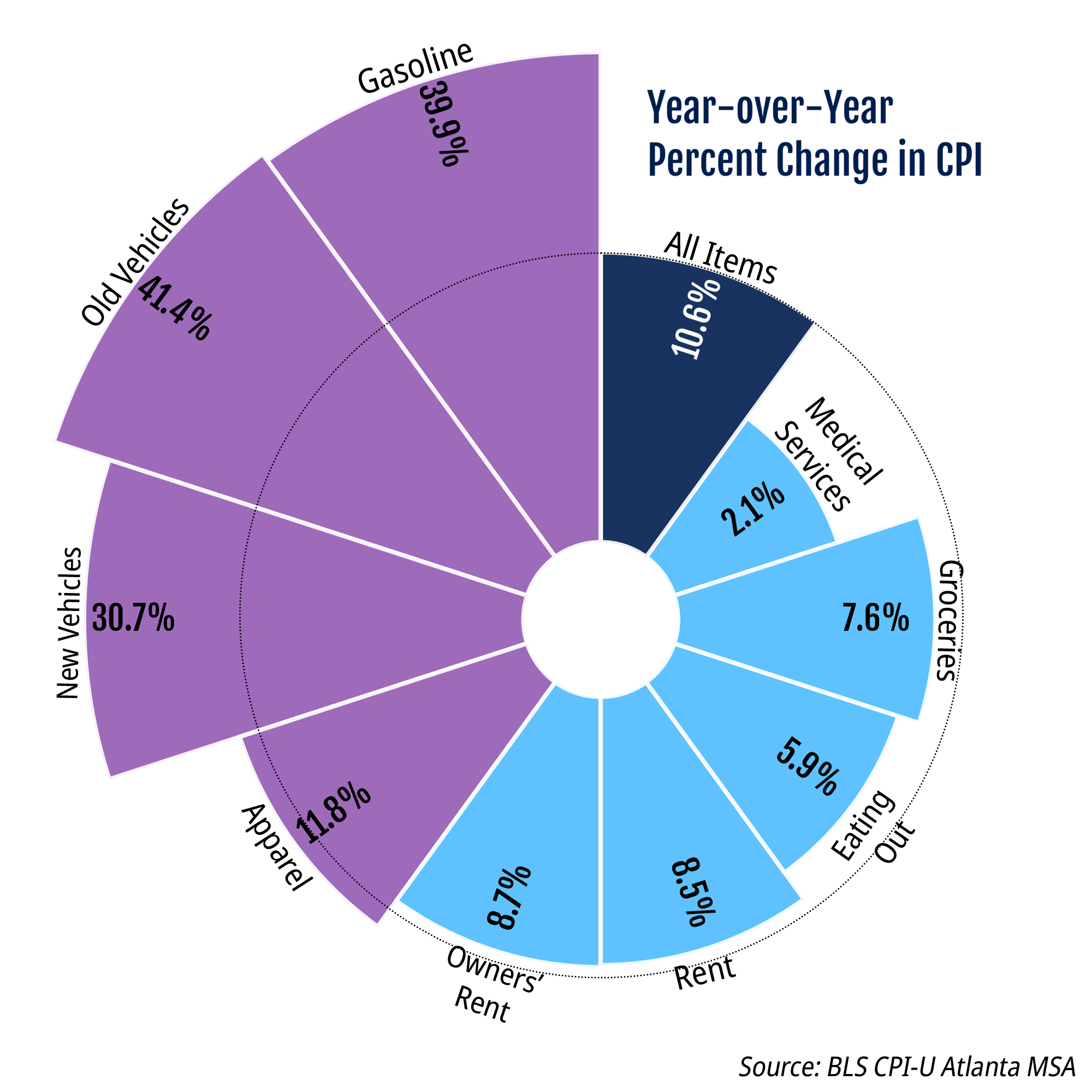
Chart 2 – Year-over-Year CPI Inflation of Selected Goods
Chart 2 at right shows the cost increases by “market basket group” as of February 2022. Transportation costs began to increase at the very beginning of 2021 but have skyrocketed in the last 12 months.
Rent costs and mortgage expenses have both increased at a similar rate, but closer analysis of the raw numbers shows that renting remains more costly than is owning a home.
In contrast, medical services have had some of the smallest cost increases of any expenditure category within the last year–and yet health costs remain (of course) elevated.
Combining the above expenditures with the cost of goods in Atlanta, we can estimate CPIs by race.

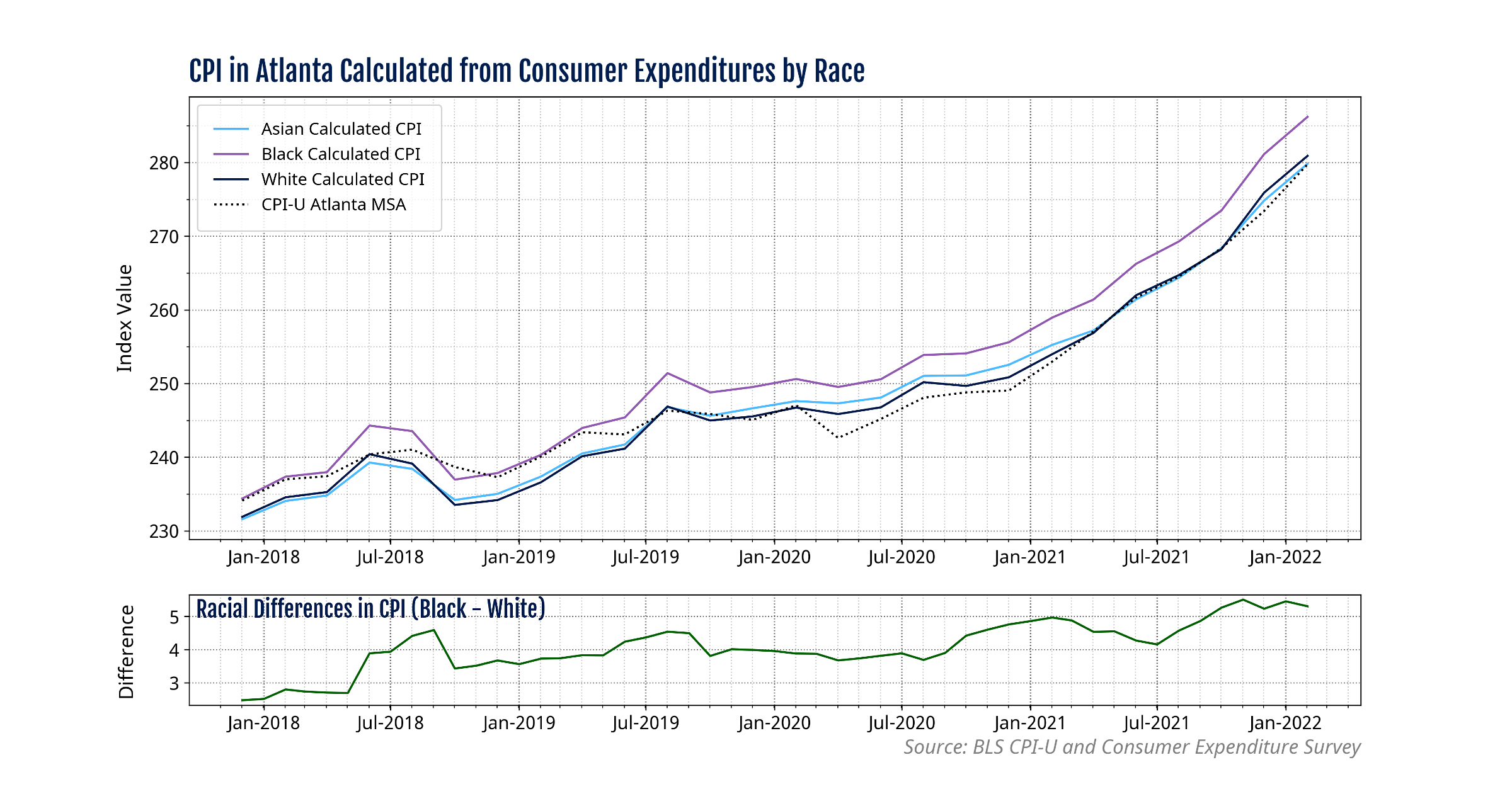
Chart 3 – CPI Estimates by Racial Group

Chart 3 above shows that white and Asian estimates for CPI are nearly aligned with the aggregate CPI-U from the BLS. The CPI for Black consumers shows similar growth trends to those of other races, but the expenditure levels lie above other group estimates. A closer look at this discrepancy is shown on the lower element of the chart, by the line in green. The difference is accounted for both by the larger proportion of Black households that rent, and by the fact that renting costs more than homeownership.
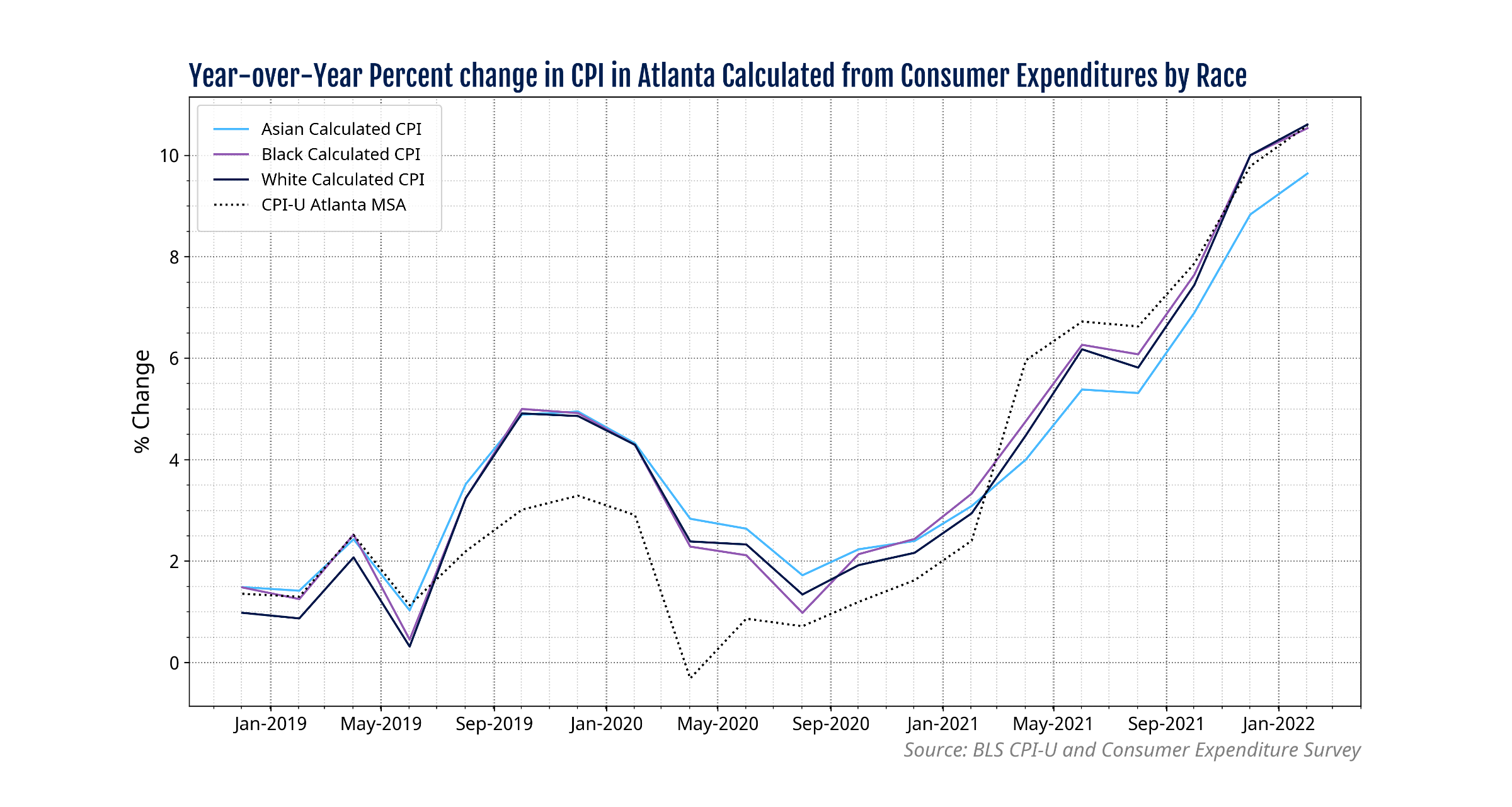
Chart 4 – Year-over-Year CPI Inflation Estimates by Racial Group

Taking a look at year-over-year growth in CPI we see that nearly all of the racial categories have very similar increases as of February 2022 – over 10% increase in CPI. Asian households faced a marginally smaller increase of 9.8% most likely due to relatively higher expenditures in food categories– which faced less inflation than transportation and housing categories (shown in Chart 2).

