


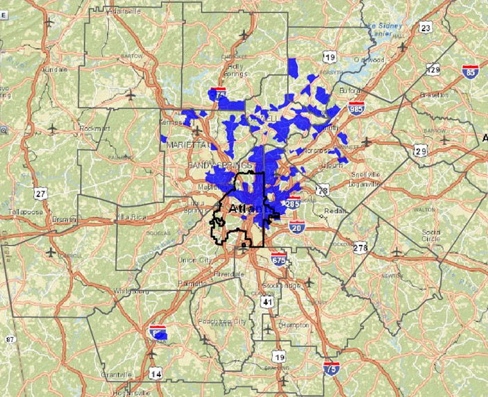
Monday Mapday: Small Business Loans
This map highlights an uneven distribution of small business loans, concentrated in the northern region of metro Atlanta. The locations in blue received the greatest number of small business loans in 2014. Investment is distributed in the same areas where major employment centers are located. To make your own maps of small business lending in [...]
Regional Snapshot: Hispanic Heritage Month
For October’s Regional Snapshot and in celebration of Hispanic Heritage Month (September 15th-October 15th), we have put together a profile on the Hispanic community in metro Atlanta! The highlights are: Although metro Atlanta has a smaller share of Hispanics than the other largest U.S. metros, it has the 2nd highest rate of employed Hispanics over [...]

Transportation Tuesday: Bottleneck Congestion
Where is congestion occurring? Real-time traffic data is used to identify congestion bottlenecks in Atlanta. https://atlresearch.tumblr.com/post/131170989078
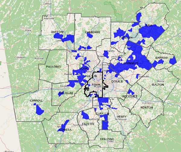
Monday Mapday: Mortgage Loans for Purchasing Homes Per Square Mile
The locations in blue had the greatest number of mortgage loans originated for buying homes per square mile in 2014. Most loans were concentrated in the northeastern areas of urban core, extending into northern metro Atlanta through DeKalb, Fulton and Cobb Counties.

Transportation Tuesday: Atlanta’s Mobility Scorecard
Published by The Texas A&M Transportation Institute and INRIX, the 2015 scorecard analyzes traffic conditions in Atlanta.
Monday Mapday: Change in the Percent of Hispanic Population
In honor of National Hispanic Heritage Month, this map shows the census tracts with the greatest increases in Hispanic population between 2000 and 2010. It highlights the largest changes in Gwinnett, Hall, Cobb and Clayton counties.

Transportation Tuesday: Congestion is Back!
Last month, the U.S. Department of Transportation released its most recent traffic volume trends report, analyzing trends throughout the country. https://atlresearch.tumblr.com/post/130156959523
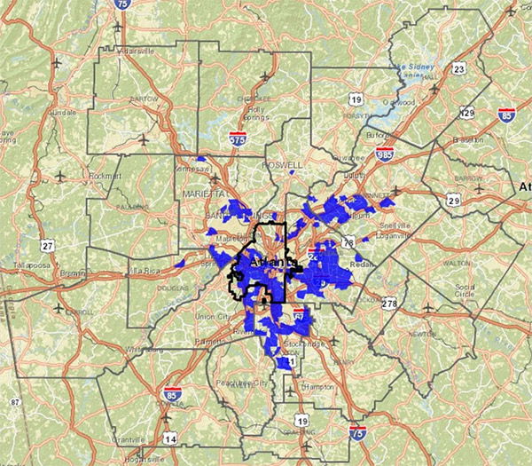
Monday Mapday: Public Assistance through Food Stamps
The areas shown in blue had the greatest increase in individuals receiving food stamps per square mile from 2010-2014 in metro Atlanta. While poverty is still concentrated in the urban core, suburban areas unaccustomed to poverty have seen some of the highest spikes in food stamp usage, particularly in the Marietta and Norcross areas. [...]

Traffic in Metro Atlanta: Just Passing Through?
Personal Trips: Where Are People Going? Vehicle trips that just pass through a county without stopping are among the least desirable trip types for places. These trips create traffic jams, wear-and-tear on our roadways, exacerbate air pollution, and, critically, they don’t contribute to the local economy or local road maintenance. The chart above [...]