The nation faces a record-breaking housing shortage, and Atlanta is no exception, with surging interest in homeownership coupling with short supply to create rapid run-ups in prices. Below, we use data from MarketNsight to take the temperature of the market and assess how it’s changed. And what we found won’t likely surprise: Housing prices have continued a steep climb across the region, with the supply of those in more affordable price ranges drying up.
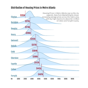
Chart 1 – Distribution of Housing Prices in 11-County Metro Atlanta Region
The chart to the right shows only Clayton and Douglas Counties with average new construction housing prices below $300,000. As we move down the chart, we see average housing prices rise, and right tails of the distributions get longer and longer. These long tails indicate many high-price neighborhoods in Fulton, Forsyth, and Fayette. Some have maximum housing prices of over $2.5M. These long tails come into greater focus when we add an assessment of housing supply to the story.

Source: MarketNsight 2021 single-family housing unit data; new construction only.
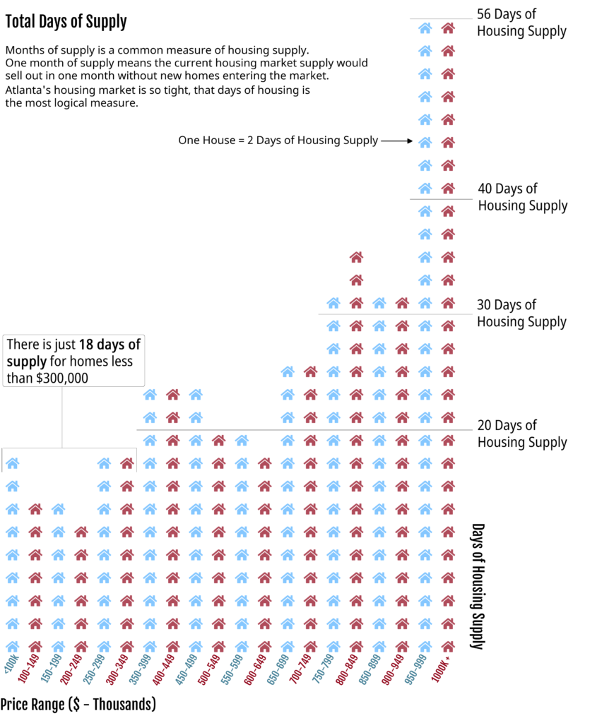
Chart 2 – Days of Housing Supply in Metro Atlanta
Typically, housing supply is measured in months, but as we will see, the Metro Atlanta supply is so low that it makes more sense to measure it in days. As we can see to the right, across the entire 11-county area, we only have 20 days worth of supply for homes priced at less than $300,000.
The implication? Without any new inventory coming “on line”, Atlanta would run out of affordable housing within 20 days. Meanwhile the supply of the most expensive homes nearly triples the supply of the more affordable homes. Compared to a national average of 180 days of supply, housing in all price categories remains scarce in Atlanta. The metro market has remained this tight for the majority of 2021, and current trends do not indicate any loosening. New homes are a key to solving the supply issue, and the map below shows where these new developments are happening.

Source: MarketNsight 2021 single-family housing unit data
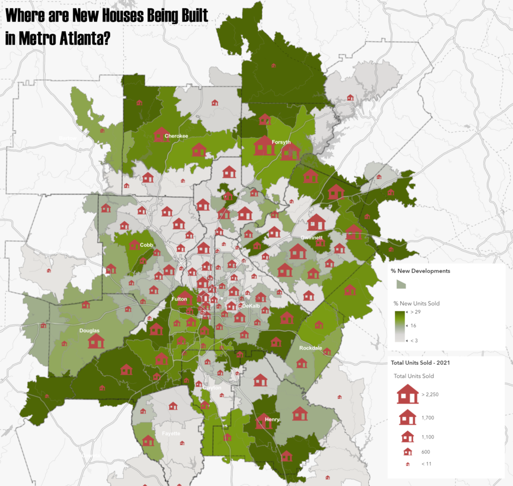
Chart 3 – New Developments by Zip Code Tabulation Area
This map shows that the largest number of new developments are happening on the outskirts of the Metro Area. Further, these outlying zip codes also capture the higher shares of total market activity in new housing (as opposed to higher shares in resale of existing units). Much of this pattern can be attributed to a saturated core area market with little and high-priced vacant land, combined with less expensive land in the suburbs. The spatial pattern of new development seems to be uncorrelated to the price of housing as can be seen on the map below.

Source: MarketNsight 2021 single-family housing unit data
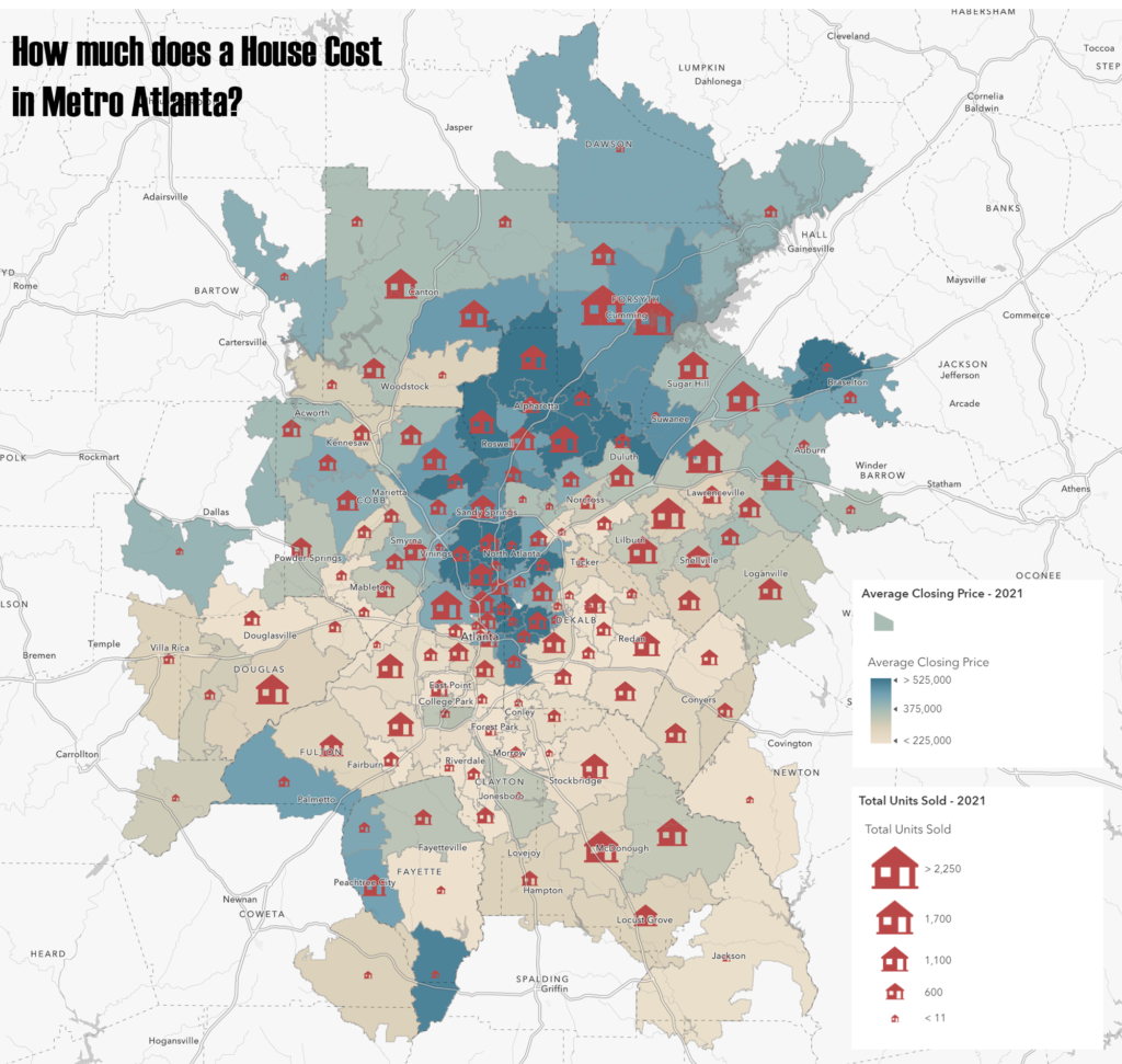
Chart 4 – Average Home Price by Zip Code Tabulation Area
The northern reaches of the metro area, including North Fulton, Cherokee, and Forsyth County, are seeing both the most closings and the highest closing prices. The south end has more affordable housing but fewer closings. This map offers another story angle with the same conclusion — affordable housing is declining in favor of more profitable expensive developments.

Source: MarketNsight 2021 single-family housing unit data

