
In a recent snapshot post, we explored quarterly findings from the Council for Community and Economic Research’s (C2ER’s) Cost of Living Index (COLI). The COLI is a useful barometer for classifying local prices for everyday items as either “high” or “low” compared to national averages.
As a follow-up here, we explore a national dataset from Numbeo on “purchasing power” for mid-year 2022. The concept of purchasing power is closely related to the COLI study we posted about earlier. This index starts from a base of 100 and considers the relative ability of a typical urban resident to afford common goods & services (more information about the index can be found here). For instance, if the cost of living in New York City is really high (and believe us, it is), do we find salaries commensurately high enough there to ensure a similar living standard of NYC residents as residents of, say, Atlanta? Does the average Atlantan in fact enjoy a greater ability to purchase local goods and services than their NYC counterparts because of the lower cost of similar goods and services in Atlanta (even though the typical Atlantan makes a lower salary)?
A quick clarifying note before we share a few findings: Numbeo’s index, unlike the COLI data, is indexed to New York City, with the Big Apple assigned a base of 100. Every city’s index that falls below that base of 100 has relatively lower purchasing power than NYC. Cities with index values above 100 have relatively greater levels of purchasing power. An index of 120, for instance, could be explained by : goods and services in that city being cheaper than in NYC, OR the average salary of that city being higher than in NYC, OR a combination of those two.
The Findings – Purchasing Power
The purchasing power index for cities in the southeastern US ranged from 74.0 (Birmingham) and 157.9 (Houston), with Atlanta’s index being 123.5. See the following chart of major southeastern US cities sorted from smallest to greatest purchasing power index:
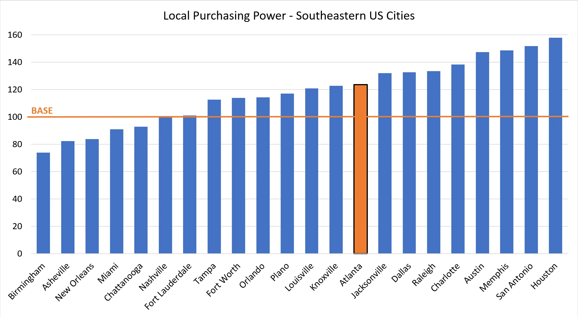
Surprisingly, most southern US cities feature higher purchasing power indices than New York City. But perhaps we should not be so surprised, given the number of New Yorkers moving to Atlanta!
While most southern cities are shown to have purchasing power indices above 100, no geographic region comes close to matching the purchasing power of California’s Bay Area. The cities of San Francisco, Oakland, Santa Clara, San Jose, and Fremont feature indices from 128.6 (Oakland) to an astounding 181.6 (Fremont). This last value constitutes the highest purchasing power index in the entire United States.
The Findings – Cost Indices
In addition to the purchasing power index, the study takes a look at several other related cost indices corresponding to housing rentals, groceries, and restaurants. You can explore the various cost indices yourself with the interactive map below, but we’ll highlight a few findings here. Among southern cities listed, Atlanta’s rental costs are generally on par with that of Charlotte, Tampa, and Orlando. The south Florida cities of Miami and Fort Lauderdale (along with Nashville, TN) are among the highest in the region.
Grocery costs, while highest in New York City and in the Northeast in general, fall off relatively quickly moving further to the south or to the east. Looking at the South, it is notable that Asheville, Birmingham, and Nashville all show higher grocery costs (i.e., are less green) than Atlanta, as shown in the “Grocery Index” layer of the interactive map below.
To evaluate the geographic relationships between the data in this study, we compiled and mapped–by metro– purchasing power and cost indices in an interactive map below. Hover over over an area to see the respective indices, and zoom / pan to see the values for other metros across the country. Each index’s value is represented by the same red-yellow-green scale, corresponding to least desirable in red (i.e., area has low purchasing power and/or high rent, grocery, and restaurant costs) to most desirable in green (i.e., area has high purchasing power and/or low rent, grocery, and restaurant costs).
Note that the layers can be accessed via the radio buttons in the upper-right corner of the map. As you’re exploring the metro data across the country, don’t forget to check out the two data points outside the lower 48: Anchorage and Honolulu!