
Ever wondered where all the folks who are moving to metro Atlanta moved from? Well, us too… just keep reading to find out!
First, a note about the data. We use metro-to-metro migration data from the 2015-2019 American Community Survey (ACS), a Census Bureau product, which obviously doesn’t cover the pandemic period. And, yes, we know that you are more likely interested in any new fundamental settlement patterns brought about by the pandemic, be it shifting priorities in picking a home or shifting work arrangements. Sorry, this post won’t address those questions, although we would like to know all that as well. There is, however, some interesting research out there, but since it was done at varying stages during the pandemic, the findings are incomplete. Here are a couple of links if you are curious. (Cleveland FED and NY Times, the latter may require a subscription).
The question in the ACS asks if you live in the same house as you did last year, and if different, it goes on to ask where that house was. Then, the Census Bureau post-processes responses to develop a metro-to-metro matrix that can answer how many people came from and moved to. various metros. Since this is a roll-up of five years of data, the charts below represent any move made during 2015 to 2019. So let’s dig in!
In-Migration
The first chart below shows the top 30 origin metros (or, in this case, global regions) for people moving into metro Atlanta. As you can see, the top two origin places actually aren’t metro areas. “Outside Metro Area within U.S. or Puerto Rico” and “Asia” contributed the most in-migrants to Atlanta during the 2015-2019 period. As for metro areas, New York, Miami, Chicago are the top origin places.
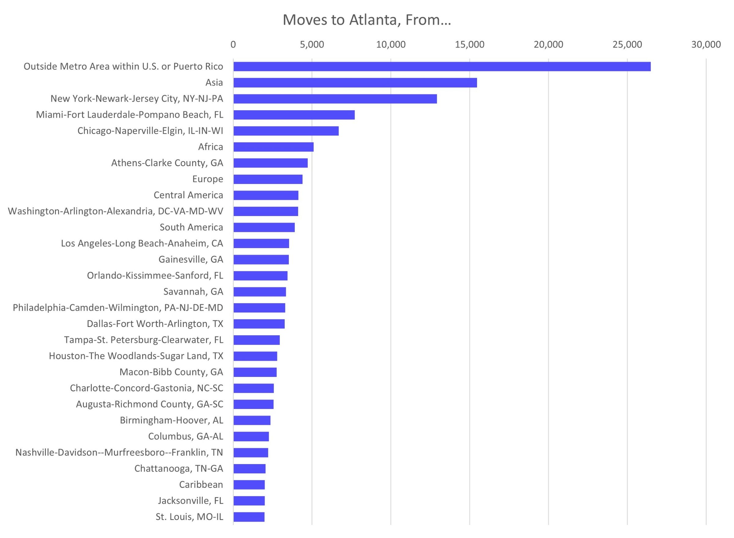
Source: 2015-2019 ACS
Out-Migration
Of course in-migration is only one part of the equation, so we also look at out-migration. The chart below shows that “Outside Metro Area within U.S. or Puerto Rico”, again, is the most popular destination for people moving away from metro Atlanta. What isn’t captured here are moves to other global regions because once you move away from the United States, you no longer get the ACS questionnaire. Athens, Gainesville, and New York are the metro areas receiving the most folks moving away from metro Atlanta.
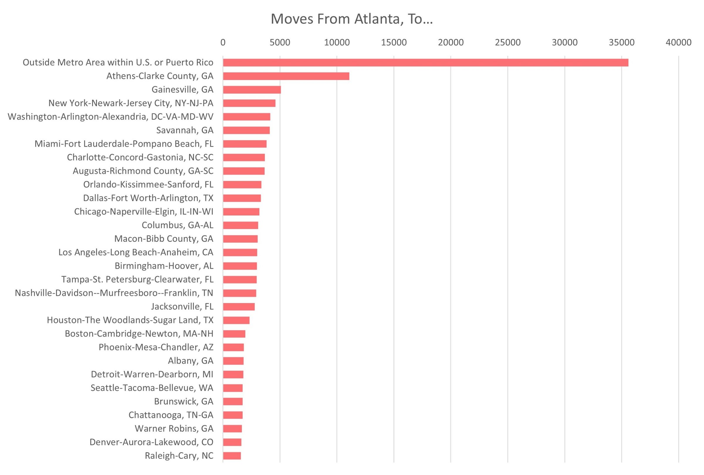
Source: 2015-2019 ACS
Net Migration
Let’s put this all together by looking at net migration, subtracting out-migration from in-migration. Again, since we don’t have out-migration for other global regions, those aren’t included on this chart. Also, since we wanted to focus on metro-to-metro migration, we didn’t include “Outside Metro Area within U.S. or Puerto Rico” on this chart either. What this chart does show is that New York (average of 8,300 net in-migrants each year), Miami (+3,900) and Chicago (+3,500) are the biggest net contributors of net in-migration to Atlanta during this time period of 2015-2019.
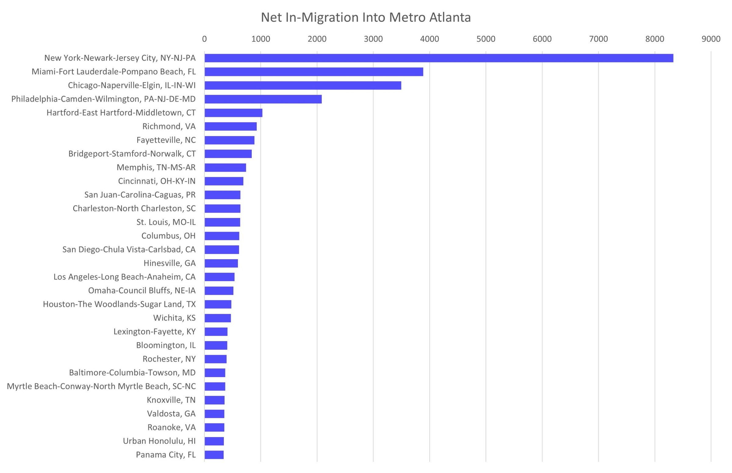
Source: 2015-2019 ACS
So, if you have found yourself wondering why so many people are wearing Yankees or Mets jerseys or hats around town, now you know.