The year 2019 saw some of the lowest unemployment rates in the past 75 years, as well as a strong stock market and gross domestic product growth. While significant inequity was present and wages were stagnant, many things were going pretty well. But then came COVID-19 in early 2020, and the landscape was altered dramatically. As opposed to many other issues occurring during the pandemic that we have addressed on this blog, the virus in this case did not make an existing problem worse; it rather birthed a recession where there was none before—a recession that was sharper and more brutal than the Great Recession of 2007-2010. This post investigates some data on the momentous 2020 decline and the current (and we hope lasting) rise of our area economy.
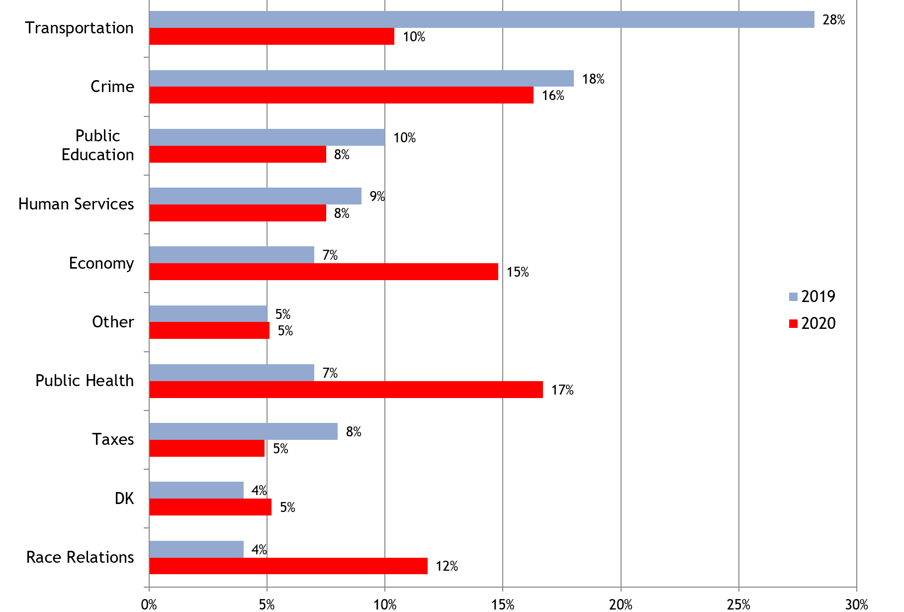
To start out, the economy is now far closer to top of mind than it was for the past six years of our Metro Atlanta Speaks (MAS) survey, the most recent of which was conducted in August 2020. In 2019, only 7 percent of residents rated the economy as their #1 concern, but as of August 2020 that share spiked to 15 percent. The economy was the 3rd rated “biggest problem” in last year’s survey, behind public health (read: the virus) and crime. The 15 percent level was the highest share for the economy as the biggest problem since 2013, when 24 percent of respondents cited it, and at that time our area was still coming out of the Great Recession. By the way, before we forget, check out our MAS dashboard tool to slice and dice this and other questions (like the one discussed below) most ways that you would want to do so.
Chart 1: MAS 2020 –The Perceived “Biggest Problem” for the Atlanta Region

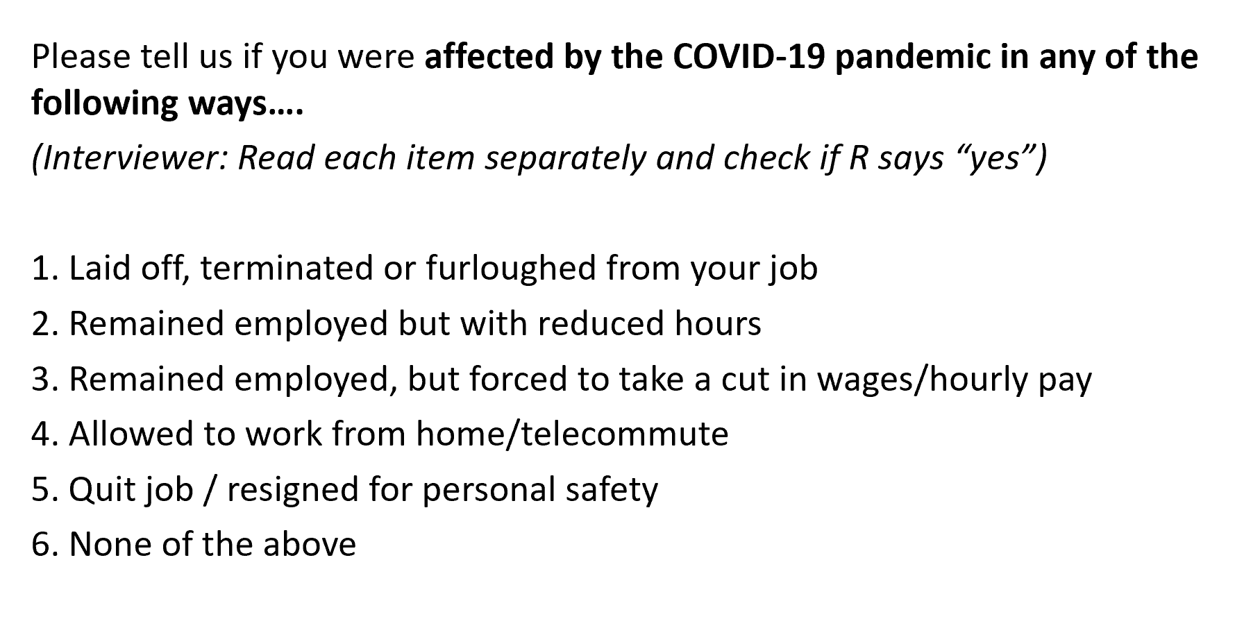
Let’s dig deeper into it. The 2020 survey asked one of its more important, new questions about what kinds of employment outcomes that respondents had experienced since the advent of the pandemic. That question is detailed below and followed by selected results. A key note is that respondents could select multiple answers to the question, unless they picked “none of the above.” As such, the question allows us to see any sub-regional spatial differences that exist in terms of employment outcomes. If you compare data from Charts 2 and 3 (below), you will notice that the results are close to reverse images. In Chart 2, we can see that core counties like Clayton, with lower income and higher poverty levels than suburban and exurban counties, had the highest levels of temporary or permanent job loss. Chart 3 then shows that teleworking is much more prevalent in the suburban, more “white collar” counties such as Cobb. It is least prevalent in Clayton, which as we saw above had the highest level of job loss.
Question from MAS 2020: Employment Outcomes from March to August 2020

Chart 2: MAS 2020 –Share of Responses Citing Termination, Furlough, or Layoffs

Chart 3: MAS 2020 –Share of Responses Stating that They Had Teleworked

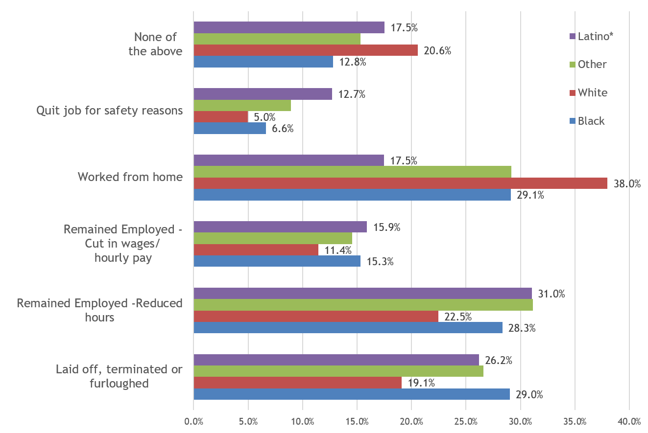
MAS crosstabs can then be reviewed to assess whether the discrepancies in employment outcomes are demographic as well as spatial. As you’d guess, and as shown on Chart 5, there are very different allocations of negative (and more positive) employment outcomes, dependent on the race of the respondent to the question. White populations are far more likely than Black populations to have not had any change to their work environment (as measured by the “none of the above” answer choice), as well as to have been able to telework. Black and Hispanic populations are over-proportionately likely to have experienced temporary or permanent job loss. Hispanic and Black populations, over-represented in frontline and essential work, are much more likely to have had to quit their jobs for safety reasons.
Chart 4: MAS 2020 –Employment Outcomes by Race of Respondent

Of course, there are other sources of information that have been tracking more recent trends in the economic recovery from the pandemic. A sample of those include:
-
- The Census Household Pulse Survey shows respondents in metro Atlanta are more optimistic today about future employment outlook than they were in November 2020. The latest survey (from March 29) shows 18.5% of respondents indicate an expected loss of employment in the next month, compared to 28.8% at the end of November.
- Initial claims for unemployment continue to decline from the pandemic peak, yet remain many times higher than pre-pandemic peak.
- Even though initial claims for unemployment is on the decline, and the unemployment rate has dropped to 6.6% from 12% in May of 2020, long-term unemployment continues to be elevated, suggesting the labor market still has a ways to go until full recovery.
- Of course, employment outcomes and the recovery are taking disparate paths based on race and ethnicity. Data from the Bureau of Labor Statistics indicate that, even though all unemployment rates are ticking down from pandemic highs, rates for Blacks (9.6%) and Latinx (7.9%) populations are still considerably higher than unemployment rates for Whites (5.4%).

