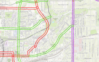
Transportation Tuesday: Peachtree Center Cycletrack

This interactive map shows the projects included in the Regional Transportation Plan, key components of The Atlanta Region's Plan that was adopted in February by the ARC Board. Red = Transit Projects Purple = Roadway Projects Green = Last Mile Connectivity Projects Orange = Other Projects Zoom into the map and click on individual projects to [...]
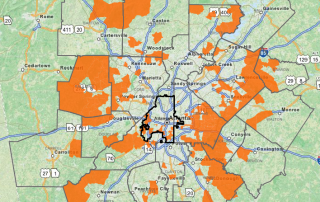
How long does it take you to get to work? This map uses 2010-2014 American Community Survey census tract data to highlight the areas that have the longest average commute, ranging from 34-45 minutes. Most of the concentrations occur outside of the urban core in counties such as Henry, Gwinnett, and Paulding (nearly all of Paulding [...]
Hartsfield-Jackson Atlanta International Airport has been the world’s busiest passenger airport since 2000 and still is today. Most passengers are domestic, by a large margin. However, a greater percentage of freight is international. This interactive dashboard from the Atlanta Regional Transportation Factbook provides information on aircraft operations, passengers, and freight and mail activity for 2011-2015. [...]
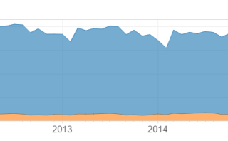
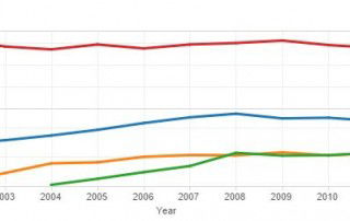
Transportation Tuesday this week looks at transit ridership data in metro Atlanta. This interactive dashboard, from the Atlanta Regional Transportation Factbook, shows transit ridership from 1999-2014 for four different agencies (MARTA, CCT, GRTA, and GCT). The dashboard also shows the number of boardings (people getting on the train) by MARTA rail stations. Transit ridership has [...]
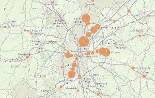
This week's Transportation Tuesday looks at park-and-ride lots in metro Atlanta. As a Transportation Demand Management (TDM) strategy, park-and-ride lots serve to increase access to transit options by allowing commuters to transfer from their vehicles to transit, vanpools, or carpools. The circles in this map represent park and ride lots and increase in size based on the number [...]
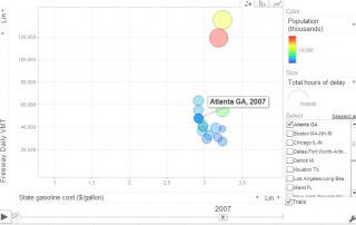
When gas prices go up, do people drive less? This motion chart uses data from the Texas Transportation Institute (TTI) to compare gas prices and vehicle miles traveled for the 15 metro areas TTI classifies as "Very Large." For the time period of 1982-2014, the chart uses the following variables: Daily vehicle-miles of travel (VMT) [...]