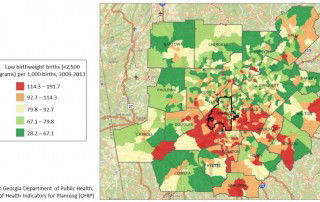
Regional Snapshot: Taking the Pulse of Public Health in the Atlanta Region: Exploring Disparities by Race and Age
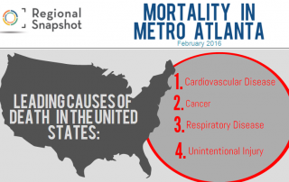
For February's Snapshot, we decided to take a look at how mortality rates from the leading causes of death have improved or worsened over time, and explore any disparities by race and age. We then took it a step further by delving into the question that has been circulating national headlines: Why is the mortality rate for [...]