About ARC Research

This author has not yet filled in any details.
So far ARC Research has created 361 blog entries.

Regional Snapshot: 2016 Population Estimates

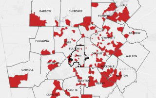
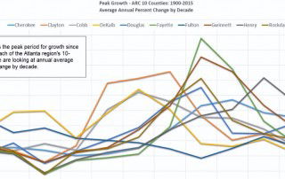
For 50 years, or so, ARC has been developing population estimates for the Atlanta region. While growth is still not as strong as the late 1990s or the early 2000s, the region did experience the largest single-year population increase since the Great Recession. Here are the highlights of ARC’s 2016 population estimates: The 10-county Atlanta [...]

By |2016-12-08T15:24:51-05:00August 8th, 2016|Other Demographics, Regional Snapshot|Comments Off on Regional Snapshot: 2016 Population Estimates

Transportation Tuesday: July’s Worst Traffic Jams (map)

Where were the worst traffic jams during July? This map shows the top 10 bottlenecks along metro Atlanta highways for the month of July. A bottleneck is a segment of roadway where the traffic speed has dropped below 60% of the historical referenced speed for at least 5 minutes. INRIX ranks bottlenecks based on their [...]

By |2016-12-08T15:24:52-05:00August 2nd, 2016|Transportation Tuesday|Comments Off on Transportation Tuesday: July’s Worst Traffic Jams (map)

Monday Mapday: Increase in Teen Births

In most parts of metro Atlanta, teen birth rates have been decreasing. This map looks at the change in birth rates from 2000-2004 (an average for the 5 year period) to 2010-2014 (another average). The red areas highlighted had an increase in teen birth rates. In these areas, the increase in birth rates for teen mothers [...]

By |2016-12-08T15:24:52-05:00August 1st, 2016|Monday Mapday|Comments Off on Monday Mapday: Increase in Teen Births

Atlanta’s Greatest Hits Through the Decades: Population Growth

Did the Atlanta region grow faster in the 40s or the 80s? This video shows the peak period for population growth for each of the Atlanta region's ten counties. The lines show the average percent increase/decrease by decade. As a whole, the region had the largest percentage gains in the 1950s, growing around 38 percent [...]

By |2016-12-08T15:24:52-05:00July 28th, 2016|Other Demographics, Special Features|Comments Off on Atlanta’s Greatest Hits Through the Decades: Population Growth

Transportation Tuesday: Housing + Transportation Affordability

This map was developed by the Atlanta Regional Commission using data from the U.S. Department of Housing and Urban Development's Location Affordability Index to show the affordability of housing and transportation costs, as a percentage of income. This map uses census tracts in metro Atlanta to show spatial trends in affordability. This map evaluates transportation and [...]

By |2016-12-08T15:24:52-05:00July 26th, 2016|Transportation Tuesday|Comments Off on Transportation Tuesday: Housing + Transportation Affordability

Monday Mapday: Housing Affordability

This map compares housing affordability in the 100 largest U.S. metros. One way to measure housing affordability is to consider the percentage of income that is spent on housing costs. Housing is generally considered unaffordable when housing costs exceed 30% of income. The colored circles on the map represent the metro areas and indicate what percentage of housing [...]

By |2016-12-08T15:24:52-05:00July 25th, 2016|Housing, Monday Mapday|Comments Off on Monday Mapday: Housing Affordability

Transportation Tuesday: AmericasMart

Today marks the last day of AmericasMart, one of downtown Atlanta's big events. How has the influx of visitors affected traffic downtown? While we can't correlate traffic conditions directly with AmericasMart opening times, we can look at general traffic conditions nearby to get an idea of roadway congestion. The charts below use INRIX data to take [...]

By |2016-12-08T15:24:52-05:00July 19th, 2016|Transportation Tuesday|Comments Off on Transportation Tuesday: AmericasMart

Monday Mapday: Showing our Age

Our recent special feature Showing Our Age used Esri 2016 Population Estimates data to analyze age trends in metro Atlanta. These maps use the same data for a 20-county region to show spatial patterns in concentrations of millennials/young professionals (age 20-34) and young children. The first map shows census tracts that have the highest densities of millennials. In these [...]

By |2016-12-08T15:24:52-05:00July 18th, 2016|Age and Generations, Monday Mapday|Comments Off on Monday Mapday: Showing our Age

Showing Our Age

This tool uses Esri's 2016 Population Estimates to show age trends in metro Atlanta. Click through the visuals below to find out what percentage of a county's residents are a certain age, how counties compare in their share of residents from different age ranges (check out who has the greatest percentage of millennials and young professionals [...]

By |2016-12-08T15:24:52-05:00July 14th, 2016|Age and Generations, Special Features|Comments Off on Showing Our Age

Regional Snapshot: Examining The Housing Market in Metro Atlanta

  In July 2014, we looked at home prices in metro Atlanta and found that while the area had made improvements, it has not completely recovered from the Great Recession. Two years later, we wanted to revisit the topic to see how our housing market is performing today. Our findings suggest that while some areas have made [...]

By |2016-12-08T15:24:52-05:00July 14th, 2016|Housing, Regional Snapshot|Comments Off on Regional Snapshot: Examining The Housing Market in Metro Atlanta
Go to Top