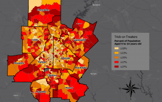
Monday Mapday: Hoards of Trick-or-Treaters in the Metro Region
Tomorrow is Halloween, and to get you in the spirit, we've created a map showing the highest concentrations of potential trick-or-treaters. With the exception of a few neighborhoods in the central cities of Atlanta and Decatur, the areas with the highest proportion of children aged 5 to 14 years old can be found in [...]