

Friday Factday: Tracking the Spread of COVID-19 (Global, US, and Georgia)
As the USA tries to slow the spread of COVID-19 with social distancing and other measures, it's instructive and sobering to review the extent and rapidity of the coronavirus's spread across the world, the country, and the state of GA. These interactive maps provide data visualizations to track the pandemic.

Monday Mapday: Older Adults–A Group Vulnerable to COVID-19
As we've all heard, our older adults have high vulnerability to coronavirus. This post provides some interactive maps that take a look at how our 65+ and 85+ populations are distributed across the state, in absolute and percentage terms.
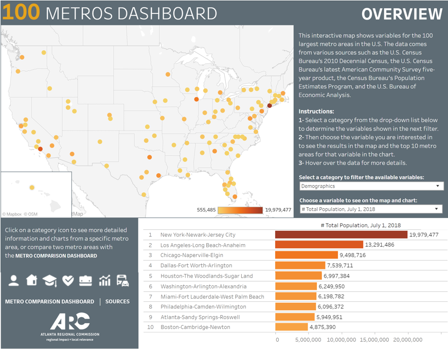
Regional Snapshot: 100 Metros Data Dashboard
This month's regional snapshot provides summary findings from an initial review of a just-released new and (vastly) improved version of a 100 Metros Data Dashboard. This tool enables easy access to interactive rankings of the top 10 major metros, across data in topic areas such as demographics, economics, health, and housing.

Friday Factday: The Pet Care and Service Sector in Atlanta
Just how much are we investing in our pets? This post takes a look at current household spending and pet service sector growth between 2007 and 2017.

Friday Factday: Trends in Low-Paying Jobs in Metro Atlanta
An examination of wage trends in low-wage jobs in Metro Atlanta, with comparisons to peer metros and cost of living.

Friday Factday: Heart and Vascular Disease
An overview of how ischemic heart and vascular disease — the state's No. 1 killer — affects Atlantans today and how its impact has changed over time.
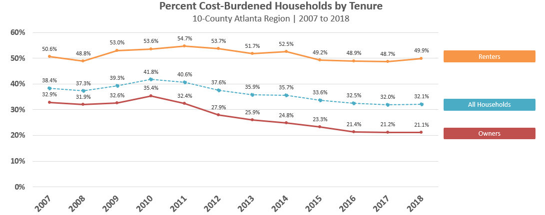
Regional Snapshot: 2020 Regional Housing Affordability
This month's regional snapshot provides an assessment of regional housing affordability in the Atlanta region. Starting with a review of historic trends in housing construction and costs, the snapshot then steps through the definition of regional "subareas" based on inventory, price, and affordability characteristics.
Monday Mapday: The Distribution of Georgia’s Black, Non-Hispanic Residents
Interactive maps taking a look at how our black, non-Hispanic population is distributed across the state today and how things have (or haven't) changed since 2000.

Monday Mapday: Disconnected Youth
This Monday Mapday considers disconnected youth ages 16 to 19 in the 21 County Metro Area.

Friday Factday: Labor Force Participation, 2000 vs. 2018
Take a look at how labor force participation rates among different age groups today compare to the year 2000 as well as how representation of different age groups in the workforce has changed over time.