
ARC’s Research & Analytics Group will be publishing a series of Special Features on equity over the next few months. Posts in the Equity Series will examine a variety of aspects of equity along with some of the key factors hindering the realization of this ideal in the Atlanta Metro region. Each post will focus on a single data visualization designed to clearly convey the aspect of equity being discussed.
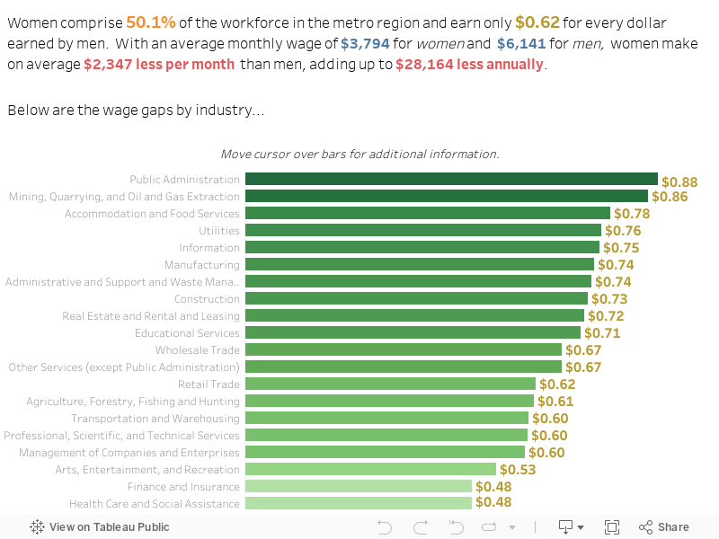
For this the second post in this equity series, we created the interactive chart below which displays the wage gap by industry between female and male workers in the Atlanta Metro region. As you can see, female workers in the region make less than their male coworkers in every industry. Moving the cursor over each bar on the chart, you can see an explanation of the displayed data, as well as see a breakdown of the average monthly wages by gender in each industry. At the top of the chart, the Public Administration Industry exhibits the greatest gender wage parity in the metro region. Nonetheless, women in this industry earn on average $0.88 for every dollar earned by men. At the other end of the spectrum, the Health Care and Social Assistance Industries, in which women make up 80.6% of the workforce, report a female-to-male wage gap of $0.48 to the dollar. Monthly, this translates into an average pay difference of $4,097. Annually, the difference is $49,164!
It should, of course, be noted that the differences reported here do not take into account the wage gaps between women and men working in the same occupation. However, what the data does suggest is that, occupational comparisons aside, men hold a disproportionate share of higher-wage occupations while women are more likely to hold lower-wage occupations within each industry.
For better viewing on a mobile device, click here.