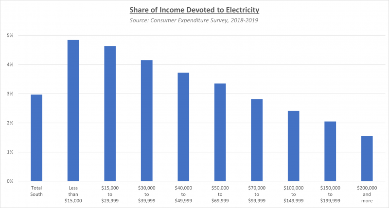
Any time we look at Metro Atlanta’s cost of living, a major finding is that our utility costs are low when compared to other metros around the country — even metros that overall have much lower costs of living. The caveat here is that just because our utilities are low relative to other metros, it does not mean they’re affordable for everyone. The chart below, for instance, shows the percent of income that people of different income groups in the U.S. Southeast devote to electricity.

What we’re seeing in the chart above is the electricity portion of residents’ energy burden, which is defined as the percentage of a household’s gross annual income that is spent on energy for heating, cooling, appliances, etc. While costs vary, in the Southeast, the majority of energy expenses goes to electricity. Nationwide, the average household may spend 3 percent of its annual income on energy, but low-income households often spend three times that — 9 percent or even higher.
Higher energy burden leaves less income for other necessities and can force households into making difficult decisions affecting the health and well-being of their occupants, and energy burden is an aspect of poverty that is frequently overlooked or poorly understood. A new data tool from the U.S. Department of Energy and National Renewable Energy Laboratory, however, helps provide more insight into the issue.
The Low-Income Energy Affordability Data (LEAD) tool is an interactive mapping tool using data from the U.S. Census (ACS and PUMS) and energy utility providers to look at energy burden across the United States, particularly in low-income communities. Stakeholders such as local governments, nonprofit and community organizations, utilities, weatherization providers and others can use the LEAD Tool to better understand the issue and make data-driven decisions and plans to address the energy needs of low-income households to help create a more equitable energy future. The LEAD Tool is part of the larger Clean Energy for Low Income Communities Accelerator (CELICA) program, which promoted equity and lower energy burden through increasing energy efficiency and improving access to renewable energy.
The LEAD tool allows the user to examine energy use and energy burden data at the national, state, county, city or Census tract level. You can look at actual energy expenditures or energy burden as a percent of household income. In addition, the following variables are available in the tool:
- Low-Income definition –Area Median Income, State Median Income or Federal Poverty Level
- Building Age – Pre-1940, 1940-1959, 1960-1979, 1980-1999, 2000-2009, 2010+
- Primary Heating Fuel Type – Electricity, Natural Gas, Fuel Oil, Wood, Solar, Other
- Type/Size of structure – # of Units, Type (single family detached, duplex, multi-family, boat/RV/van, mobile/trailer)
- Tenure – Owner-occupied vs Renter-occupied
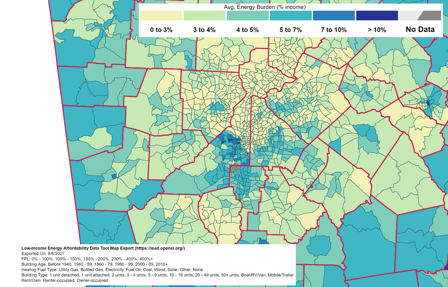
All of these geographies and variables can be mapped, charted, compared, and even grouped and sub-set into new custom variables. An example of the LEAD Tool’s output is below. The map reveals a familiar pattern, showing higher energy burden in the southernmost parts of the region with a larger number of low-income households. You can also see a higher energy burden in the surrounding more rural counties. Household income is the primary factor here, but other factors include age and type of structure, and relative costs of various energy sources being used.


