While the fight against cancer will not be won until we can say no one develops it, when it comes to breast cancer, the picture isn’t as grim as it once was: Nationally, death rates for the disease have been on a steady decline since the 1990s. For this post, we’ll be taking a look at declines in death rates for ARC’s 11-county metro, comparing 2020 figures to 2010, 2000 and 1994 — the earliest year available for this data.
Why look at death as opposed to incidence? This data is available at smaller geographies through Georgia Department of Public Health’s OASIS portal, and using the same source for all years of comparison ensures we are getting the most equivalent comparisons possible. Incidence data is available at the state level through the National Cancer Institute’s State Cancer Profiles.
And a quick note on the charts — we’ve used line graphs to help make changes over time more apparent. The data, however, is pulled at points in time as close to 10 years apart as possible; there is a lot of room in that time span for rates to go up and down. Our charts are providing a rough impression of how rates are changing over a decades-long period rather than showing annual change.
Reason for optimism: The average age at death is getting older
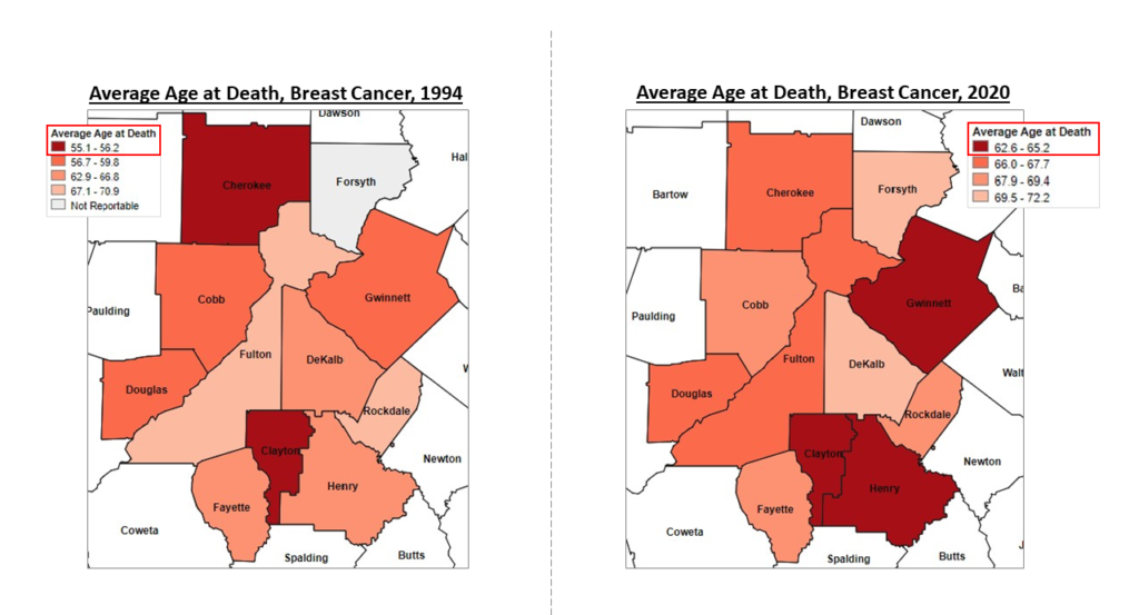
The set of maps below compare the average age at death from breast cancer in ARC’s 11-county metro in 1994 versus 2020, with the color ramp based on data quartiles. One read on the set of maps is the geographic shift for the younger age brackets for death, moving from Cherokee and Clayton in 1994 to Clayton, Gwinnett and Henry in 2020. Another read, however, lies in the legend, which shows that in 1994, the youngest age at death was 55 (in Cherokee County). This number moved to 63 in 2020 (in Clayton County). While we would love to see the average ages tick up to ever-older age brackets, there is reason for optimism when looking at the data.
Reason for optimism: Age-adjusted deaths per 100,000 and hospital discharge rates are decreasing
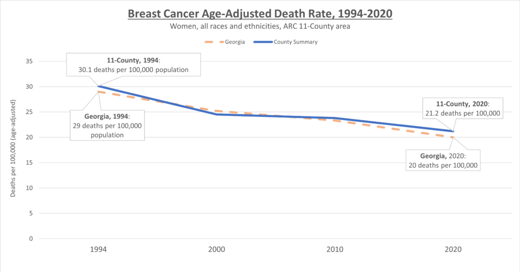
The chart below shows that our age-adjusted death rate from breast cancer — that’s deaths per 100,000 individuals — have decreased since 1994. This is for all women of all races and ethnicities, and we can also see that the local numbers are slightly greater than the rest of the state’s. The pattern is very similar for premature death rates attributed to breast cancer.
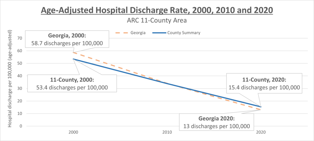
Next, we can see that age-adjusted hospital discharge rates have decreased a great deal since the year 2000 — the earliest year for which this data is available.
Needs improvement: Disparity among races and ethnicities
Below, we can see that, when the individual years we’re comparing are aggregated, Black women by far are more likely to die of breast cancer than any other racial or ethnic group.
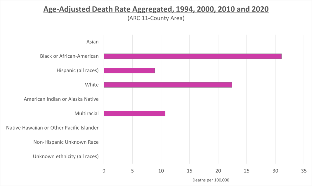
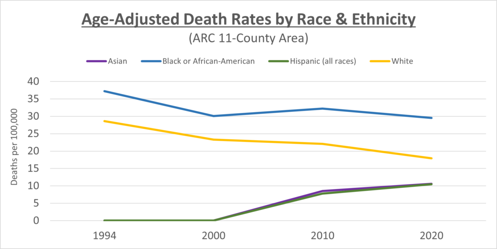
The following charts dive deeper into race and ethnicity disparities in breast cancer death. While the initial chart may make it look like deaths outside of the Black and White communities were negligible, as the region’s Asian and Hispanic communities have grown, so too have deaths from the disease. Deaths in other race and ethnicity groupings, however, continue to be negligible due most likely to lower population numbers.
*Data note: While the lines for Hispanic and Asian women on the graph are set to zero in 1994 and 2000, it does not mean that there were zero deaths at that time. Rather, the numbers were either so low as to be incalculable from a rate perspective or a quirk of data collection rendered it impossible to provide an accurate figure.
We can also see that while deaths among White women steadily decrease, deaths among Black women are essentially the same today as they were in 2000. The decreased death rates we are seeing, therefore, can most likely be attributed to decreases in deaths among White women.
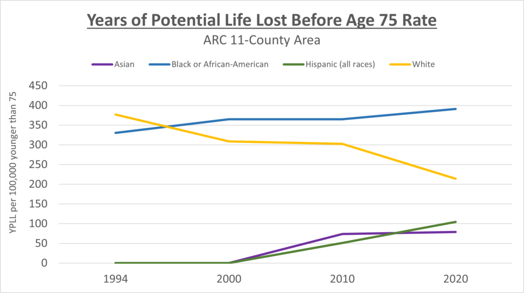
On the YPLL 75 Rate chart to the right, we see that White women are seeing significant declines in premature death from breast cancer. Disturbingly, Black women have actually seen an uptick in premature death rates in 2020 relative to 2010. Rates among Hispanic women have seen steady increase while the YPLL 75 rate is stable in 2020 relative to 2010.
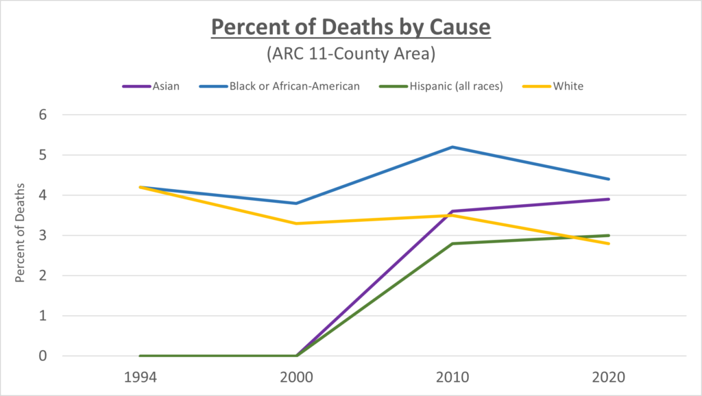
The percent of deaths that can be attributed to breast cancer (right) brings home the concern While white women are seeing decreases in overall death in this area, every other race and ethnicity is seeing an increase.
These disparities generally align with nationwide data showing that Black and White women overall have higher incidence of breast cancer relative to other groups, but breast cancer mortality is persistently higher in Black women than white women.

