Key leaders from the Atlanta business community are in Austin, TX this week on the annual ARC Leadership, Involvement, Networking, and Knowledge (LINK) trip. These yearly journeys, since 1997 have always provided a large number of learnings for those who attend–for example, ideas about things we can do better as a region, as well as validation of a good many already ongoing efforts. Many LINK-inspired ideas for change have “come back” to our region and then implemented as policy or program initiatives –for example, Metro Atlanta Speaks (near and dear to 33N’s heart) and the Metro Atlanta Mayor’s Association.
In honor of 2022 LINK, we offer some data comparisons between Atlanta and Austin. The highlights are what many might expect:
- The Atlanta metro is a lot bigger than Austin, but Austin is growing quite a bit faster.
- Both areas’ housing markets are underbuilt and overheated
- Atlanta’s economy has more large companies, while Austin with its high-tech image has had strong entrepreneurial growth lately.
But there is, as always, a lot more nuance with a deeper dive into the data.
A new and cool way to take that plunge is our recently updated 100 Metros Dashboard, which offers not just rankings for metros across a host of variables, but also a metro comparisons feature (see Figure 1) that allows a user to assess data for two metropolitan areas side by side.
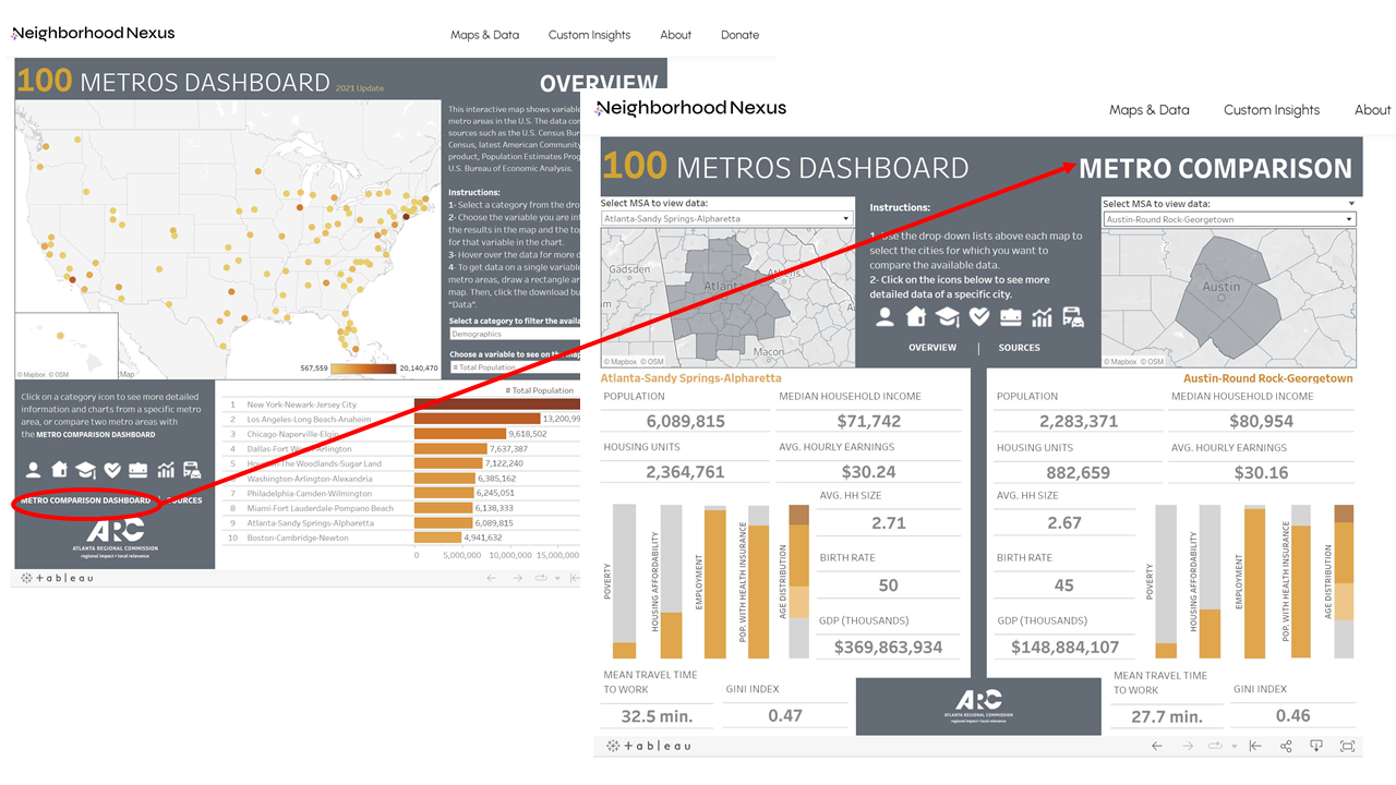
But don’t just stop with that comparative profile…by selecting any data grouping (check out the icons to the lower left on the dashboard home page), you can get MUCH more detailed information on any topic area for a given metro.
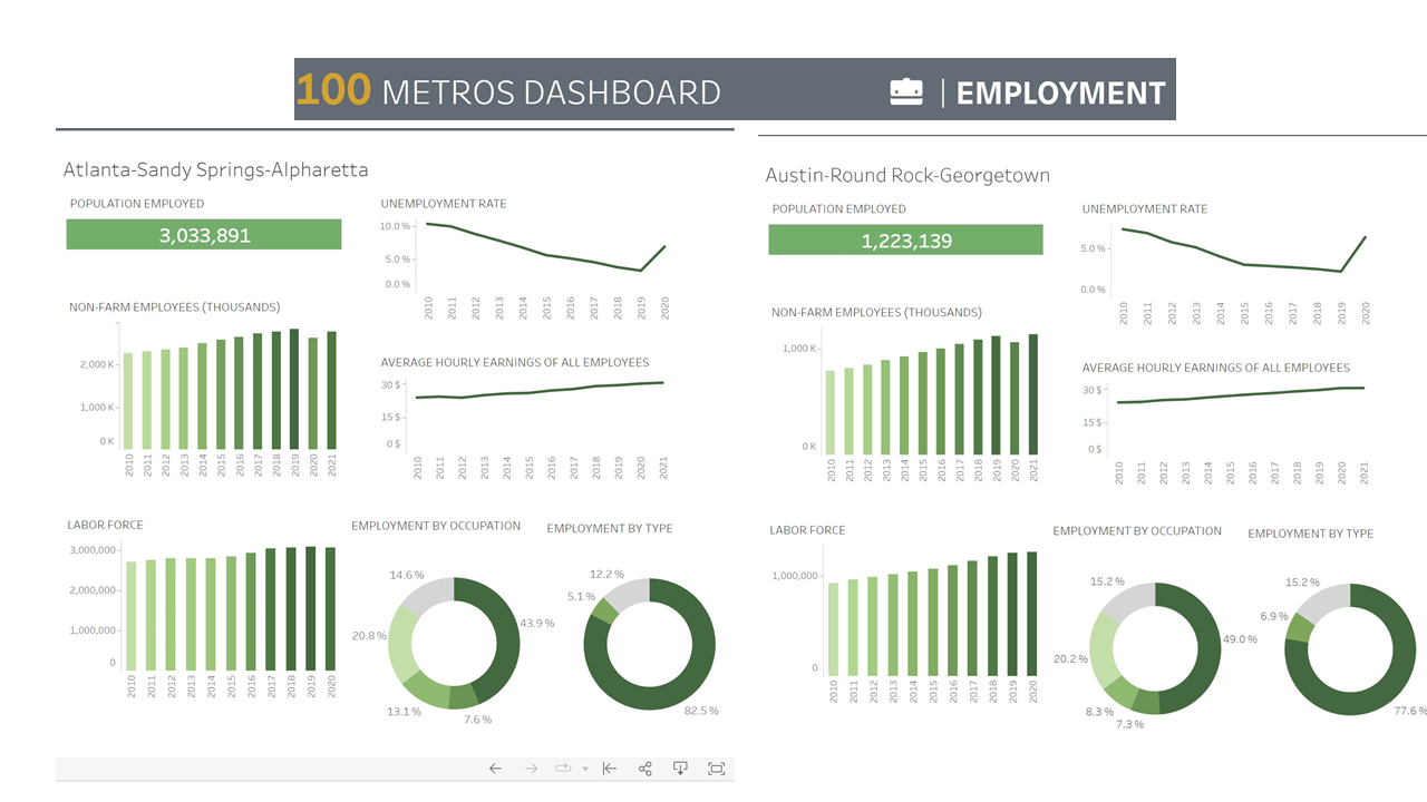
Below in Figures 2 and 3, you see side-by-side more detailed comparisons of housing and employment/ economic variables, respectively.
Figure 2: Comparing Atlanta and Austin Housing Data: 100 Metros Dashboard (Source: Neighborhood Nexus)
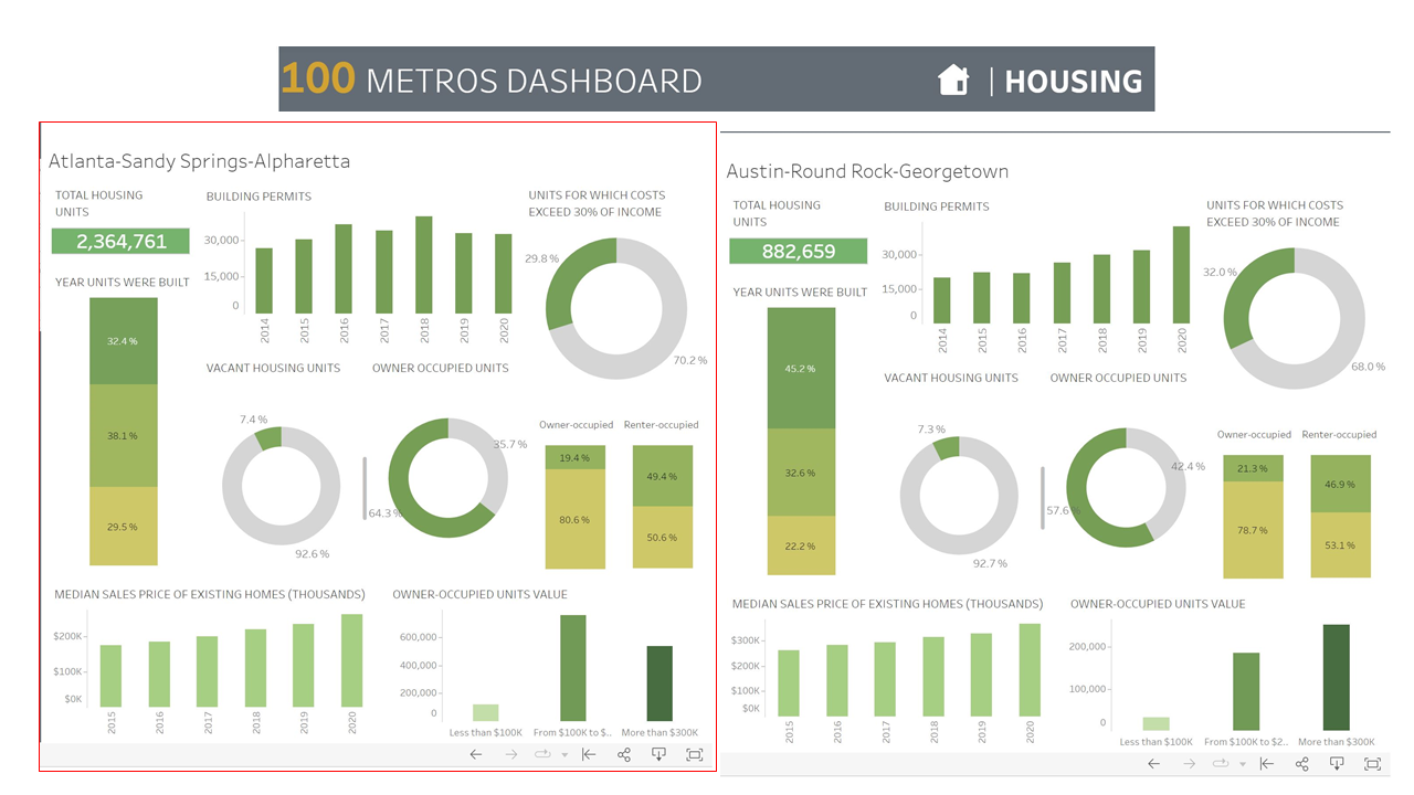
Figure 3: Comparing Atlanta and Austin Employment: 100 Metros Dashboard (Source: Neighborhood Nexus)
And finally, as terrific (and free) as the 100 Metros Dashboard is, we want to let you know that ARC jurisdictions can get ahold of even more information, with different and also way cool data visualizations, from the third-party “Developer” tool that ARC recently got access to through a license with EMSI Burning Glass
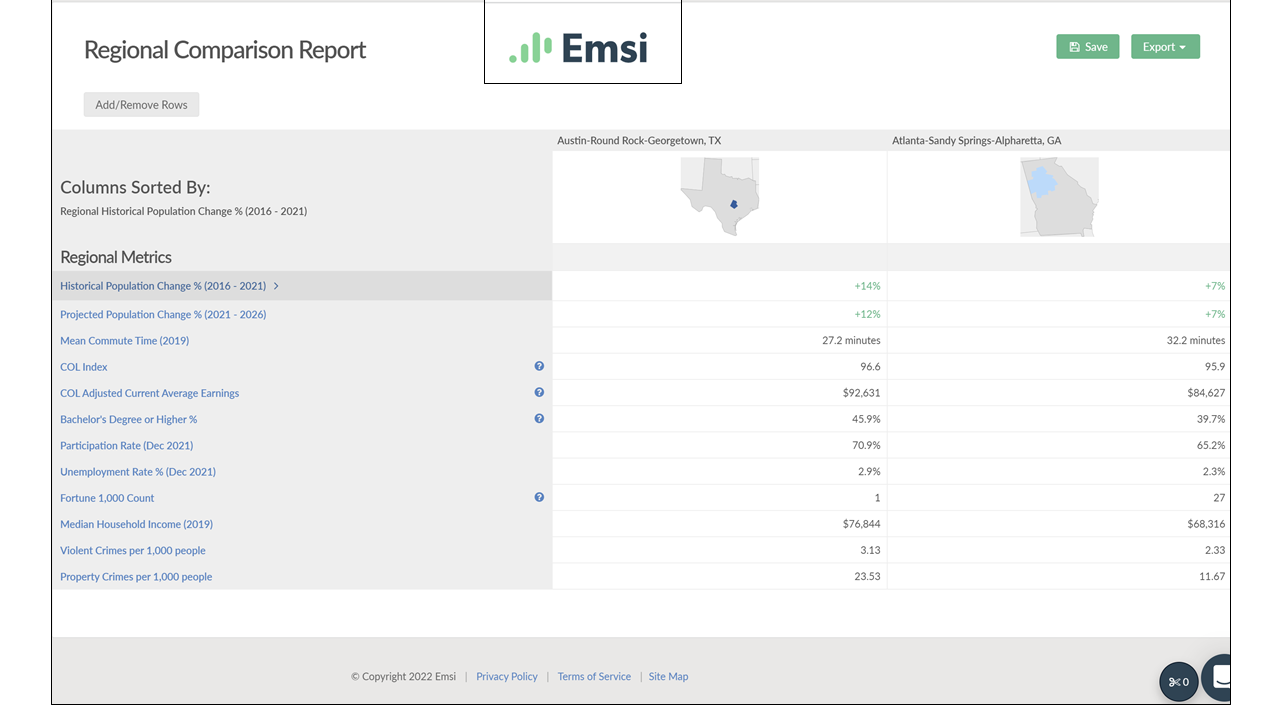
Below in Figure 4 is a “taste” of the EMSI Burning Glass Developer tool—with a screen cap of the “Regional Comparison Profile” of population growth, commuting, crime, and economic indicators.
Figure 4: EMSI Developer Regional Comparison: Austin and Atlanta (Source: EMSI Burning Glass)