
This week’s Friday Factday is the last post in our three-part series visualizing Occupational Employment Survey (OES) data for 2017 from the Bureau of Labor Statistics (BLS). In our first post post using the OES data, we provided an interactive tool for comparing occupations by total employment, median annual wages, and the prevalence of regional employment in each occupation to such employment in the nation as a whole. Last week, we followed-up with another post providing a tool enabling the exploration of changes in employment by high-, middle-, and low-wage occupations** between 2014 and 2017. For this week, we have created a similar tool to the one from last week but with a focus on changes in average wages instead.
By selecting a major occupation category from the tool’s drop down menu, you can see the average change in wages for high-, middle-, and low-wage occupations in that major category. On the detailed view toward the bottom of the tool, you can see employment and wage changes for specific occupation(s) — color-coded and sorted by average wage — in the major category you selected. For example, looking at the tool below, you can see that the largest wage increase among Health Support occupation (the default selection below) has been for those occupations in the high-wage category — with a $7,562 ( or 12.9%) average wage increase of between 2014 and 2017. Scrolling through the detailed view at the bottom of the tool, you will see that the only high-wage occupation in this major category is Occupational Therapists, which indeed exhibited a 12.9% average wage increase over that period.
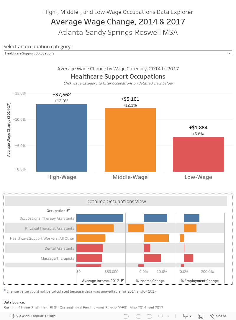
** Wage categories are defined, here, relative to an average wage in the Atlanta Metro region in 2017 of $51,390. Low-wage occupations are those earning less than 80% of the average wage, middle-wage occupations are those earning between 80% and 120% of the average wage, and high-wage occupations are those earning more than 120% of the average wage.