
Our most recent regional snapshot published findings on the local economy. Today’s post looks at one aspect of the local economy: home price appreciation. Along these lines, our own Hae Seung Sung recently published a post on Zillow’s Small-Area Home Sale Price Data around the 11-county Atlanta metro, a post you can find here.
The economy snapshot showed national indexed home price appreciation (taken from Redfin) along with indexed wage growth (from the BLS) since 2014. Shown together, we see the degree to which home sales prices nationally have outpaced growth in wages:
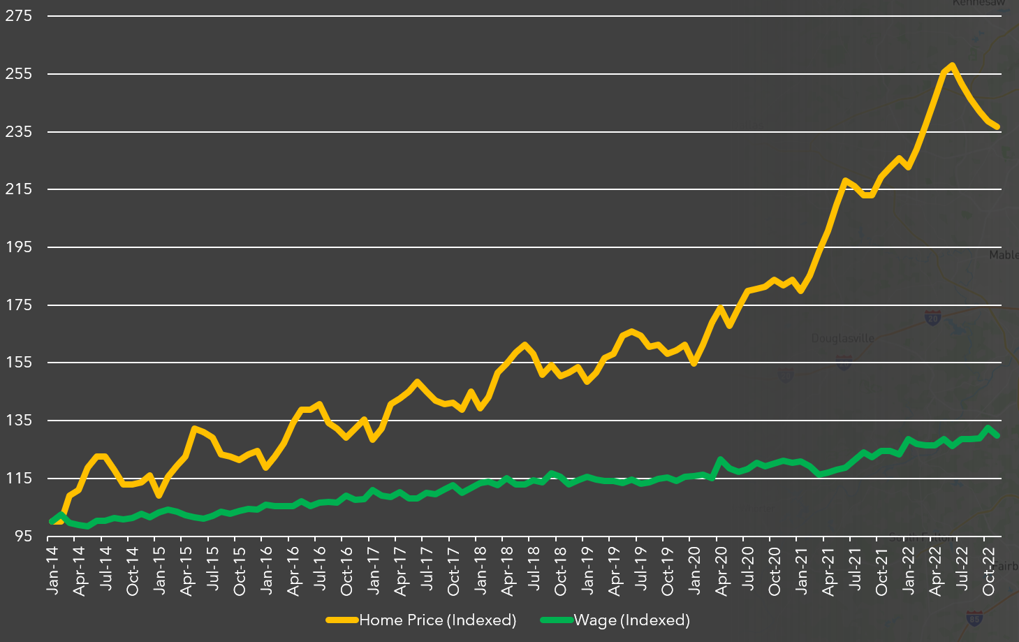
As shown above, Redfin’s national home price index fluctuations have been much more pronounced since 2014 than have wages; however, home prices have undoubtedly far outpaced the growth in national wages.
We have utilized Redfin’s housing data in the form of an interactive chart to zoom in on Covid-era home sales at at a national and metro level. Along with Atlanta, we have pre-selected peer metro areas to show trends through time.
We can observe the general rise in median sales prices nationally (bright red in the chart below) and in each metro area, with the Los Angeles metro area trending well above the rest (light orange in the chart below. The Atlanta metro area in royal blue shows to be near the bottom of the pack (user note: isolate a single metro area by clicking on the respective line in the chart area or legend).
Like most of the metro areas shown, Atlanta’s median sale appeared to peak near the middle of 2022. Our area’s median sale price hit $400,000 in May and June of 2022 and has declined since. As of January 2023, this value sits near $350,000. Overall, the median sales price in the Atlanta metro has hovered near (but just below) the national median home sales price for the timespan shown, indicating relative affordability in our area. The median sales price in January 2023 nationally, per Redfin, is $383,000. The national median peaked in May 2022 at a value of $433,000.
Explore the dataset below, keeping in mind you can expand the time period and add / subtract other metro areas from the Tableau chart.

And speaking of Redfin, we maintain an interactive dashboard using Redfin data to show key housing indicators for Atlanta and select peer metros. The dashboard also features a second page (accessed via arrow in the bottom-left corner of the dashboard) showing Zillow data around the metro region at a ZIP code level. Explore this dashboard below: