
Our most recent regional snapshot highlighted the updated version of our 100 Metros dashboard. The dashboard provides data about the Atlanta-Sandy Springs-Alpharetta MSA, how it compares to the country’s other most populous metros, and finally, presents data about those metros. Taken together, the tool helps to provide an impression of Atlanta’s place in the country.
The dashboard organizes metro data into seven buckets: Demographics, Housing, Education and Technology, Health, Employment, Economic Development, and Commuting. Today’s post explores the Housing bucket in particular. The following screenshot shows the housing analysis for the Atlanta-Sandy Springs-Alpharetta MSA:
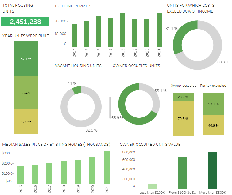
As shown in the top-left corner, Atlanta’s total housing units total just under 2.5 million. Building permits in 2021 have just exceeded 2018 levels, which was previously the high-water mark up to 2021. Clearly, the Covid-era housing boom has driven both home sales and home construction. We also see that roughly two-thirds of total housing units in the Atlanta MSA are owner occupied. However, given the increase in multi-family permits issued from 2020 to 2021, this percentage is likely to decrease in the future as more renter-occupied housing leases up.
While a significant amount of housing units are considered cost-burdened in our MSA (31.1% of housing units feature costs exceeding 30% of its occupant’s income), this figure is on par with other major southern metro areas. For the sake of comparison, Charlotte features a housing cost burden percentage of 28.0%; Nashville is 29.7%; Houston is 33.7%; Dallas is 34.4%; and Miami is a whopping 45.3%.
These metrics only scratch the surface of the vast amount of information available for each of the top 100 metros in the country. We’ll be taking another post or two to dive into other data categories for the Atlanta MSA in particular. But for now, happy data exploring!