As a final 33N note to this year’s Black History Month, we offer a historic time trend analysis of of Black, White, and overall poverty rates–for the 11-county ARC area, the state as a whole, and the USA. We close then with a quick look at the perceptions versus the reality of wealth, for Black and white households. To lead with the headlines: Black poverty rates are declining at a faster rate than White and overall poverty rates. But Black rates are far higher, still, in the latest data. And wealth disparities show how far we all still have to go…in terms of diminishing the generational differences across races that could continue to make the poverty gaps persistent into the future.
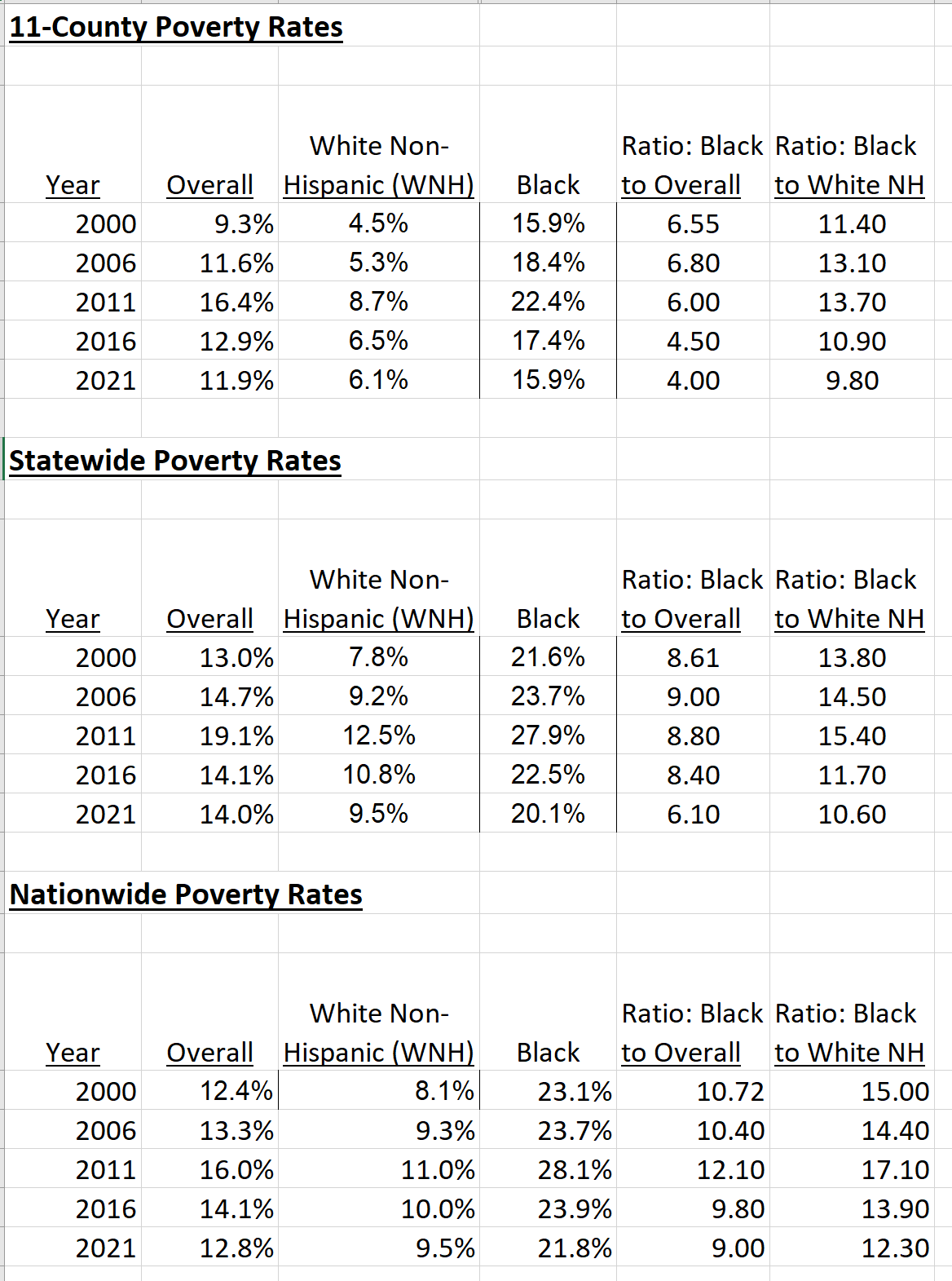
As Figure 1 shows, overall and the selected poverty rates did (all) increase with the Great Recession, but all fell 2011 through 2021. Black poverty rates fell faster than overall and White, Non-Hispanic rates. Though Black poverty did (by 2021) remain more frequent than overall or White, Non-Hispanic poverty, the gap had narrowed fairly consistently across the analysis period. Figure 2 provides similar details for the State and the whole USA –while trends for these other areas did resemble those in the 11-County area, it’s worth noting that (a) the poverty rates in the 11-county area are lower than in the other areas; (b) the gaps are wider between Black and other groupings; and (c) the gaps narrowed faster in the 11-County area.
Figure 1: Poverty Rates for ARC 11-County Area: 2000-2021 (Source: US Census; ARC RAD)
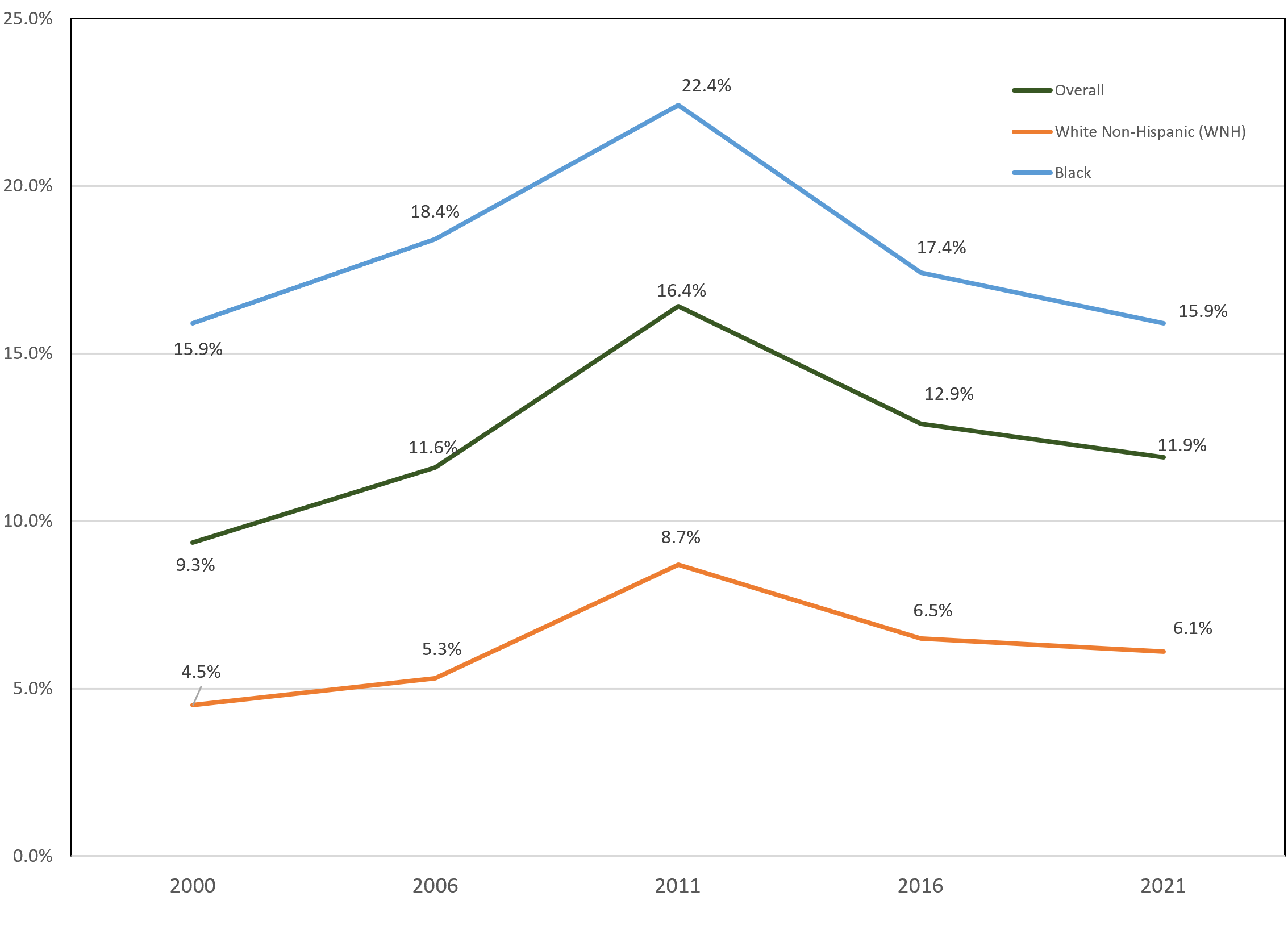
Figure 2: Comparing Historic Poverty Rates & Ratios by Area: 2000 to 2021 (Source: US Census and ACS 1-Year; ARC RAD)
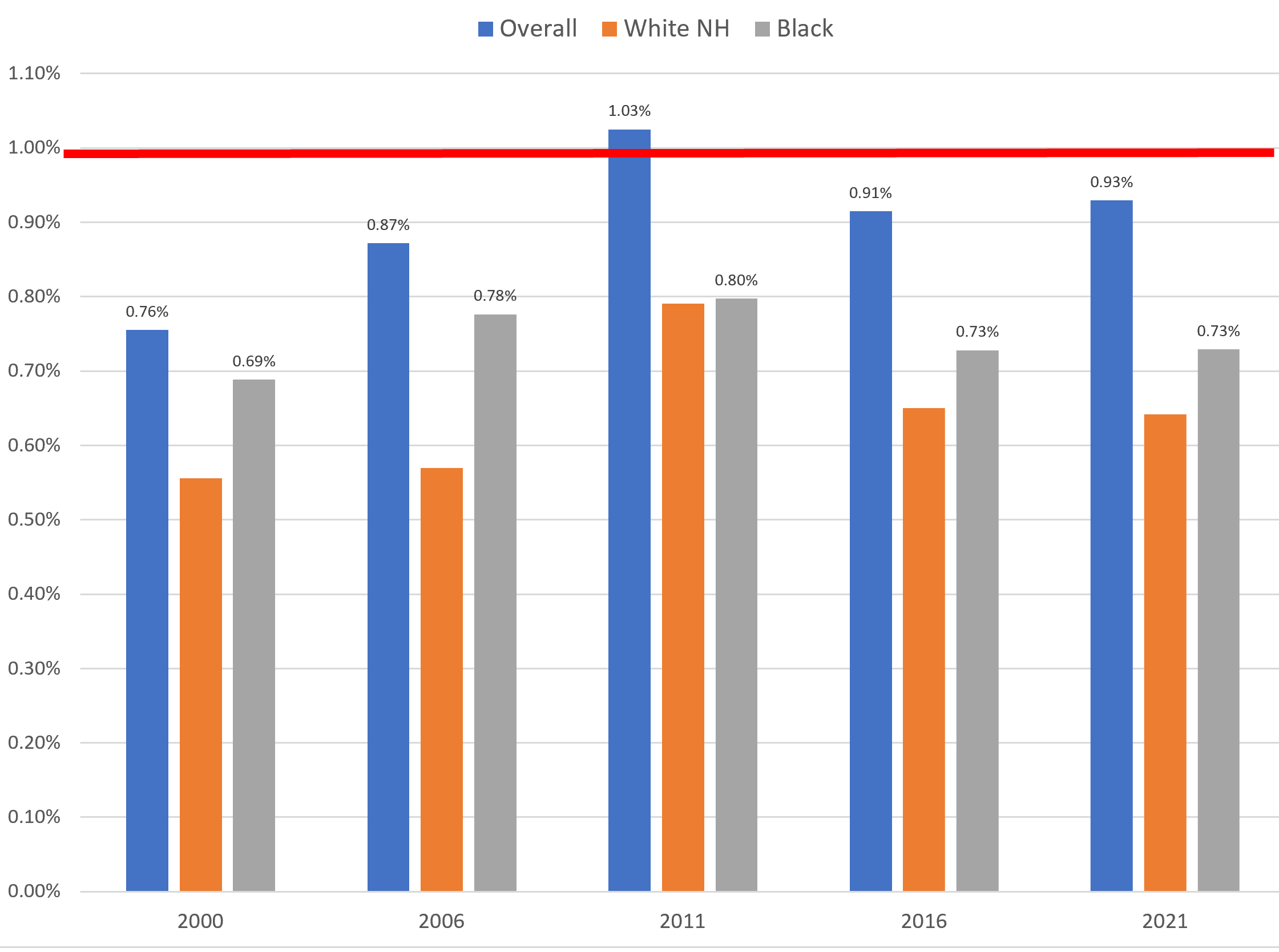
Figures 3 and 4 provide a chart comparison of overall and selected poverty rates by race between the 11-County area and (for Figure 3) the state of Georgia and (figure 4) the nation. When the values on any bar are less than 1.0, that means that the rate in the 11-county area is less than in the geographic area being compared (in any given time period). The key finding across both these charts is that, for both race groups and overall, the 11-county rates are almost never above comparable rates at the state or national level. Only in 2011, with the overall poverty rate, did the 11-County area exceed the comparable overall national poverty rate. While it’s not the focus of this post, the driving force for that turns out to be (substantially) higher Hispanic rates–in 2011–for the 11-County area than in the nation as a whole.
Figure 3: Overall and Poverty by Race Rates: Comparing 11-County to State of Georgia, 2000 to 2021 (Source: Census; ARC RAD)
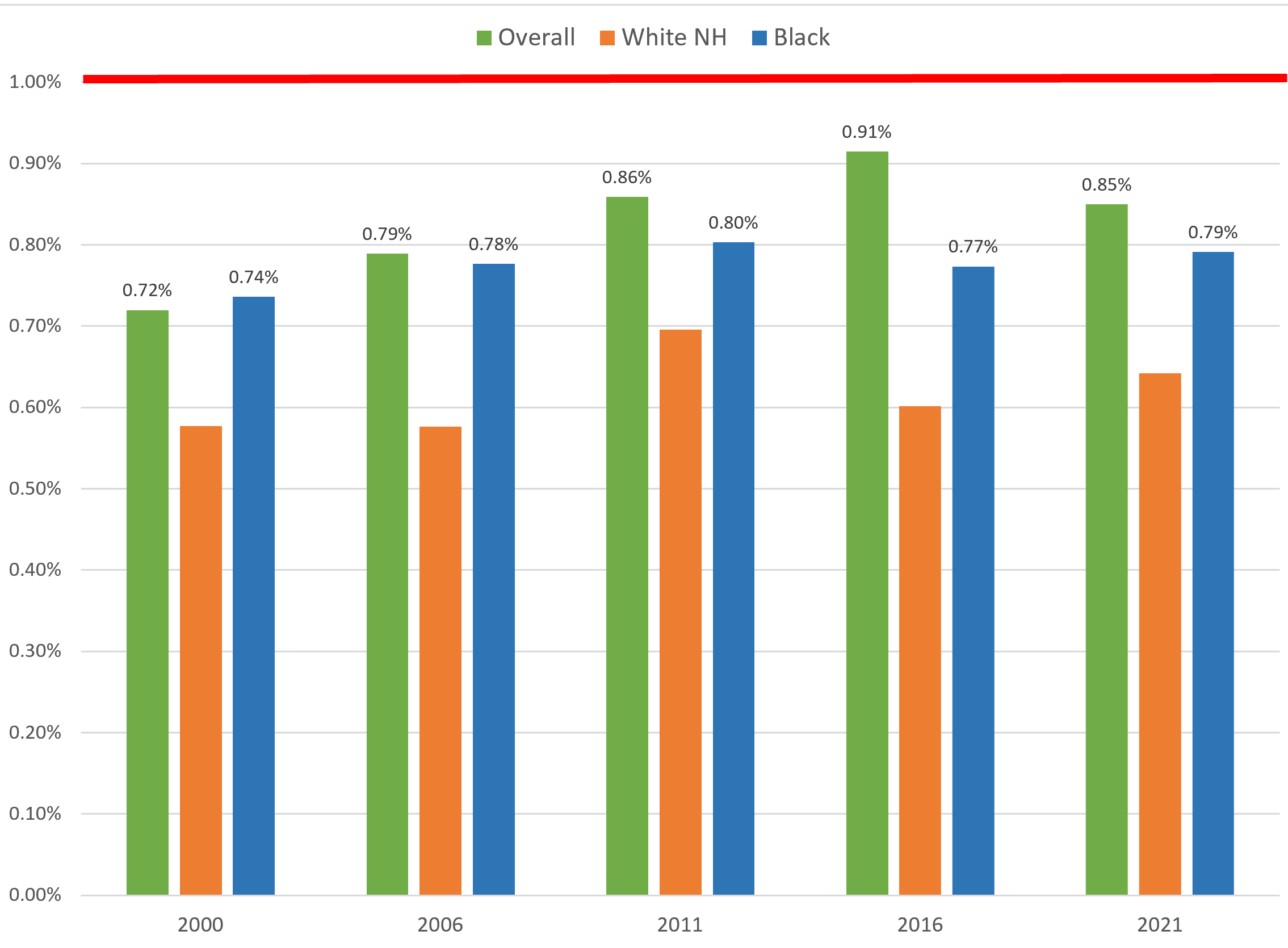
Figure 4: Overall and Poverty by Race Rates: Comparing 11-County to United States, 2000 to 2021 (Source: Census; ARC RAD)
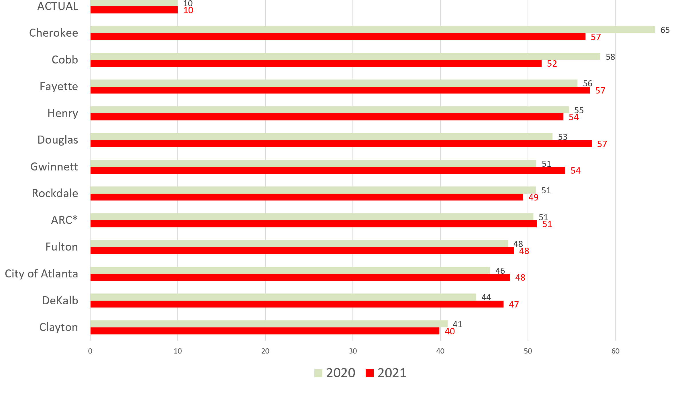
So, poverty rates have dropped recently, and the gaps between the still-higher Black poverty rates and overall plus White, Non-Hispanic rates have narrowed. But wealth gaps have not narrowed, and auger poorly for further narrowing of the poverty gaps in future decades. We wanted to include some data and links here to give a sense of how wide that wealth gap is and how poorly the extent of the gap is understood. Figure 5’s “headlines” are these: (a) the actual Black family has 10% the wealth of the average White family; (b) all resident demographic and economic subgroups believe that ratio is much higher than it is, i.e. that the gap is narrower than it is ( i.e. that our wealth inequalities are less than they are) . Figure 6 shows that this “lack of knowledge” is prevalent (and varies quite little, and did not “improve” from 2020 to 2021) across ARC jurisdictions. One small caveat: counties with more diversity and/or lower incomes do have a slightly better sense of the true extent of the gap.
Figure 5: 11-County Resident Perceptions (by Group) :Ratio of Black to White Average Family Wealth (Source: 2021 Metro Atlanta Speaks Survey)
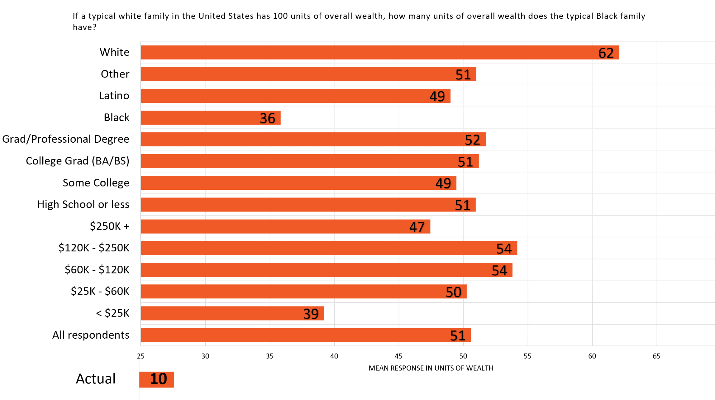
Figure 6: Resident Perceptions (by County) :Ratio of Black to White Average Family Wealth (Source: 2021 Metro Atlanta Speaks Survey)
To learn more on the wealth gap, here are some really useful sources for further inquiry:
- https://www.mckinsey.com/industries/public-and-social-sector/our-insights/the-economic-impact-of-closing-the-racial-wealth-gap
- https://www.minneapolisfed.org/article/2022/how-the-racial-wealth-gap-has-evolved-and-why-it-persists
- https://lightcast.io/resources/blog/good-jobs-gap-bhm-2023
- https://shelterforce.org/2022/02/08/doing-the-right-thing-wont-close-the-racial-wealth-gap
- https://blackwealthdata.org/explore/intro

