So public school has begun for 2023-2024! Let’s as such take a look back (only slightly!) at recently released Georgia Milestone Assessment results for 2022-2023 (“2023” from here on in the post). These scores provide an opportunity to examine the progress of education recovery since the pandemic’s end.
One approach is to use a school’s performance in 2019 as a baseline and compare to the 2023 results, such as the Atlanta Journal-Constitution offers in an online tool it recently published. While this comparison can be quite informative, we must exercise caution as the timespan grows, especially in parts of our region experiencing growth (and the school rezoning that follows) or rapid neighborhood change. Another approach is to compare a school’s performance with some set of expectations. In this case we’ll use the simplest possible model, in that it has only one explanatory variable: the economic status of the students attending the school (graphed as “economic need” and labeled as “% Directly Certified” on all our visuals in this post).
A bit about the data: The Georgia Milestone Assessment involves end of grade exams for grades 3-8 and end of course tests for certain high school subjects. We focus on the 3rd grade English and Language Arts (ELA) test because a successful transition between “learning to read” and “reading to learn” by the end of 3rd grade is considered crucial for future academic success. We will use the percentage of students “directly certified” for income-based programs as a measure of economic need.[1]
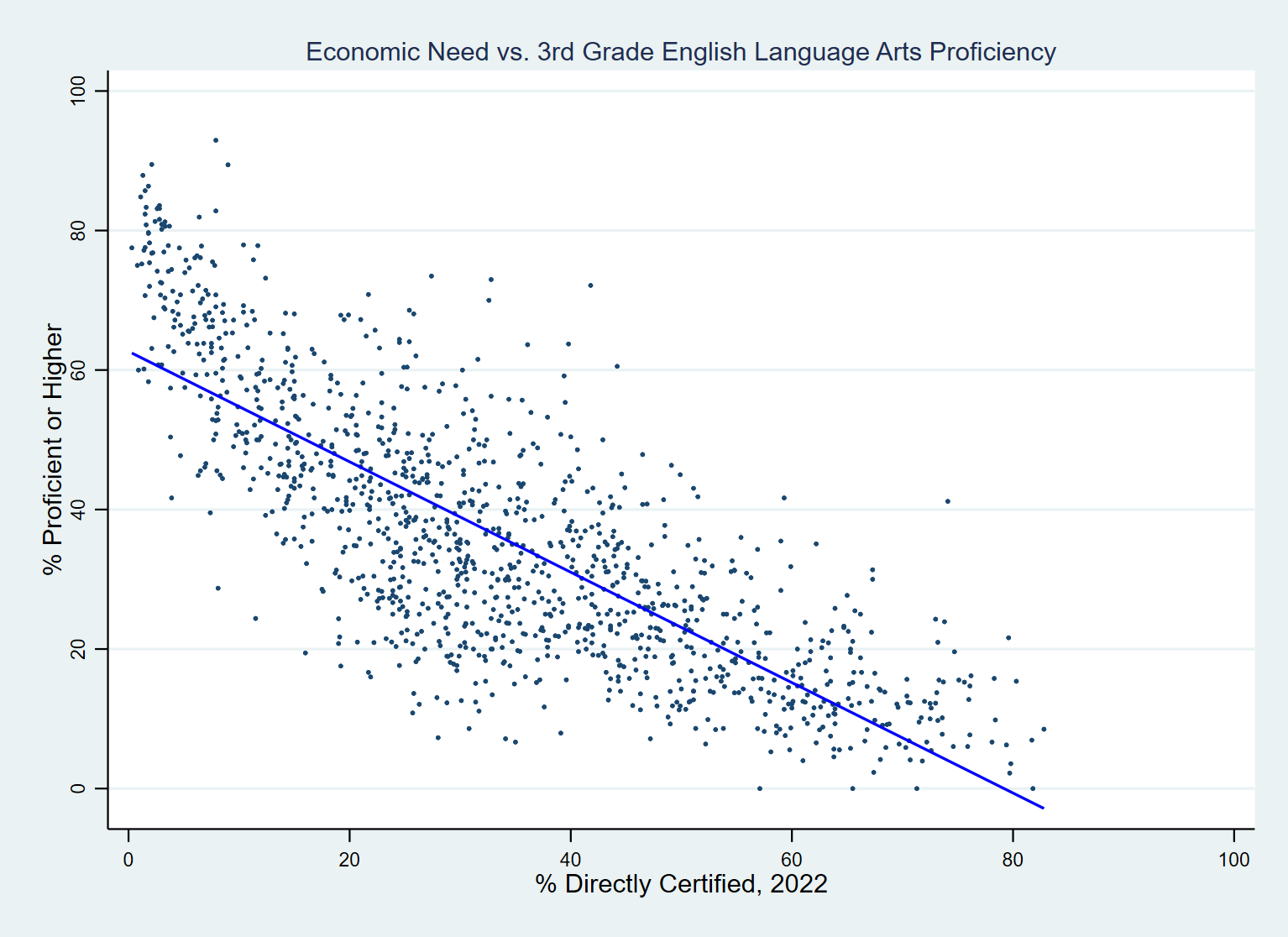
There are many other factors that impact school performance, such as teacher quality and class sizes. And straight lines rarely occur in nature. Yet, the model performs disturbingly well, with an R-squared of .63 (see Figure 1 below). Or, translated into English, it means that 63% of the variation in a school’s performance on the 3rd grade ELA Milestone exam in 2023 can be explained by the family incomes of the children attending that school.
Figure 1: 2023 Georgia Milestone ELA Test Scores vs. “Economic Need” (Source: GA DoE, ARC RAD)

What else can this model tell us (in Figure 1 above)? The blue line represents the predicted value for percent proficient or better on the ELA, given any particular level of economic need. If you don’t mind digging out your high school algebra, recall that the formula for a line contains a y-intercept and a slope. The y-intercept tells us the value of y (that’s the vertical axis above) when x (that’s the horizontal axis) equals zero, so we predict that 62.7% of students would score proficient or better if 0% of the students were in economic need. The slope tells us how much y changes given a change in x.[2] In this case, the slope of this line predicts a decline of .79 percentage points for every additional percent of the student body in economic need. That drop is pretty steep, indicating that we have a long way to go before students have equal opportunities “regardless of their ZIP Code.”
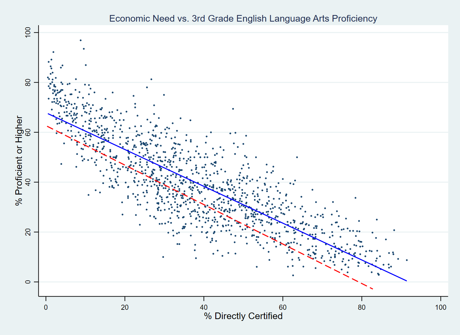
Figure 2 below shows the same data for 2019 (blue line); the red dashed line shows the prediction line from 2023 for comparison.
Figure 2: Georgia ELA and Economic Need: Comparing 2019 (blue line) to 2023 (red line) Source: GA DoE, ARC RAD

The percentage of variation explained by the 2019 model is a bit higher (69% as opposed to 63%).[3] In 2019, we would have predicted expected a school with 0% economic need among its students to have 67.8% score proficient or higher– 5.1 percentage points better than in 2023. Perhaps more important, however, is the slope of the prediction line: the slope of the line steepened from -.73 in 2019 to -.79 in 2023. That means a 20-point change in the poverty rate meant 14.6 percentage point swing in proficiency rates in 2019, but a 15.8-point swing in 2023.[4]
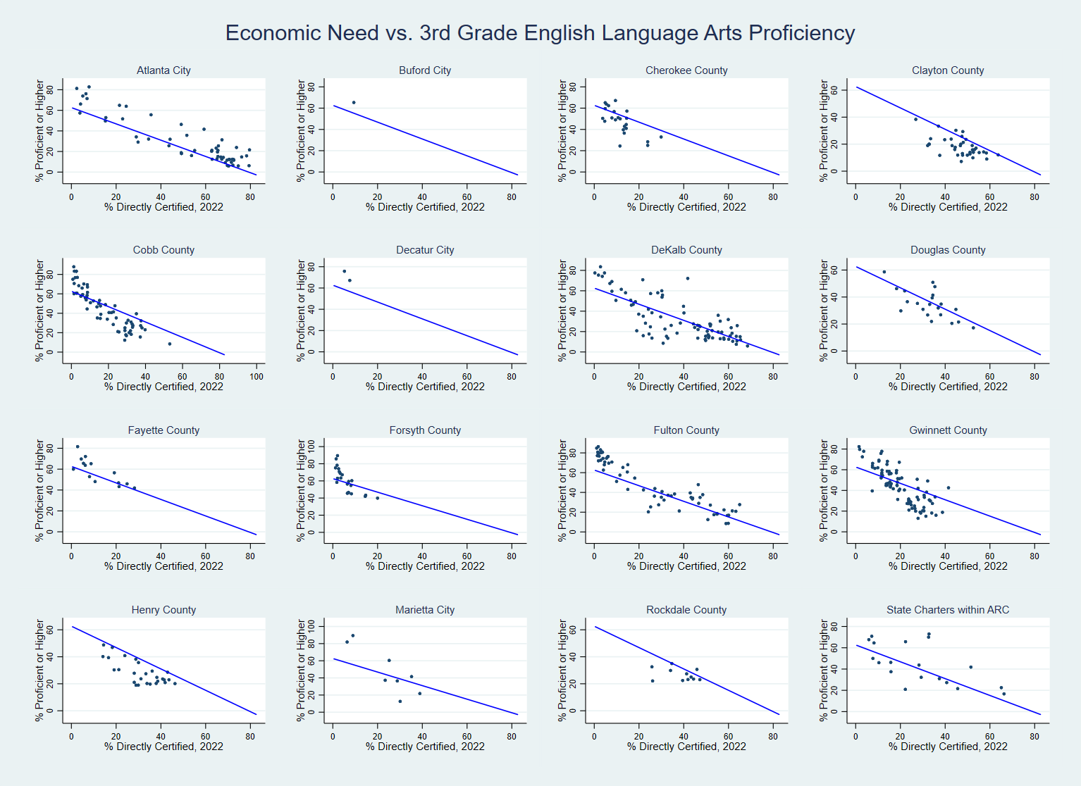
Graphing schools alongside the prediction line can benchmark how schools are performing against that prediction. Schools above the line are outperforming the expectations of the model, while schools below are underperforming what the model predicts. Looking for schools well above the line allows us to identify potential “bright spots” to be emulated, while schools well below the line may need extra resources or face additional challenges that should be accounted for.
Figure 3: Comparing ELA Milestone Scores and Economic Need –for Multiple School Districts (Source: GA DoE, ARC RAD)

In Figure 3 above, we see some interesting differences among school systems. For example, Atlanta Public School elementary schools are for the most part above the prediction line. Clayton County school results, on the other hand, may show a lingering impact of their decision to stay virtual longer, in the “Sophie’s Choice” every system made between health risk and risks of learning loss.
Even though the model explains about two-thirds of the variation in 3rd grade ELA performance with a single predictor, we should be mindful that this still leaves a lot of differences unaccounted for. And if a school is performing below what the model predicts, we still need to investigate why.
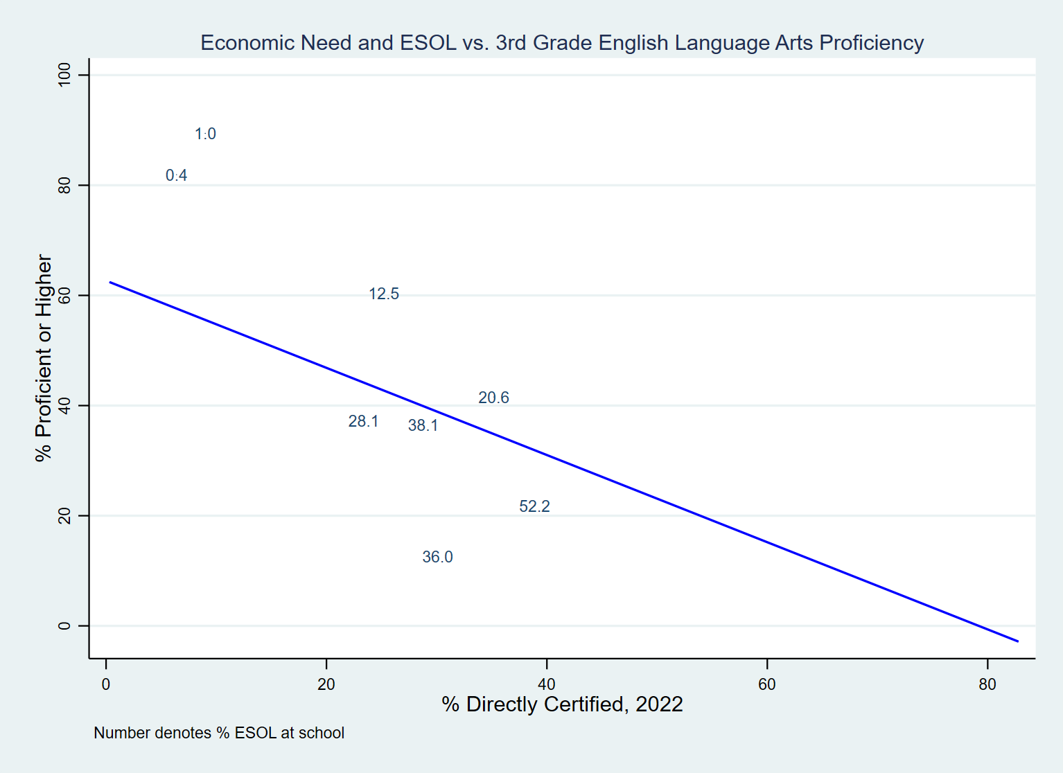
To illustrate this point, consider the case of Marietta City schools (below in Figure 4). A recent AJC article highlighted the positive impact of the system’s $7 million investment in hiring forty reading specialists. Yet we see multiple schools in the system that are below the prediction line.
In the case of Marietta (below) , the answer primarily lies in the population it serves. In particular, a number of its schools have very high percentages of non-native speakers. This graph replicates the Marietta schools’ portion of the small-multiples graph above, only with a twist: instead of a dot representing each school, we show the percentage of the student body receiving English as a Second Language services.[5]
Figure 4: Marietta ELA Milestones Compared to Socioeconomic Indicators (Source: GA DoE; ARC RAD)

Footnotes:
[1] See this discussion from the Governor’s Office of Student Achievement for an explanation of how direct certification is measured and why it is a preferable measure to the more traditional measure that focuses on students receiving free or reduced price school lunches:
[2] Or, as your teacher may have called it, the “rise over the run.”
[3] Unfortunately, there is a lag in the release of direct certification data: The Governor’s Office of Student Achievement typically provides these data for a particular school year in December of the following school year, about the same time that it releases Milestone data broken down by subgroups. We must therefore use data for SY2022 (aka the 2021-22 school year) to measure economic need.
[4] Twenty points reflects a one standard deviation change in percent directly certified.
[5] Again, due to how the release cycle for education data works, we must use data from SY2022.

