
A recent Atlanta Journal Constitution opinion piece argued that Atlanta’s 2025 drop in murders is part of a larger transformation underway and that we should pay more attention to the role that neighborhood revitalization may have played. To explore this idea, what did the homicide rate look like in the City of Atlanta in 2025? How does that compare historically? And what parts of the city have seen the greatest changes?
To answer these questions, we utilize data found in the Atlanta Police Department’s (APD) Open Data Portal, which provides information on all reported crimes including type, location, and date reported.[1] Data on the portal cover 2009 through the present, giving us 17 years’ worth of data to analyze.
Figure 1 shows the homicide rate over time for the City of Atlanta.
Figure 1: Homicide Rate in the City of Atlanta, 2009-2025
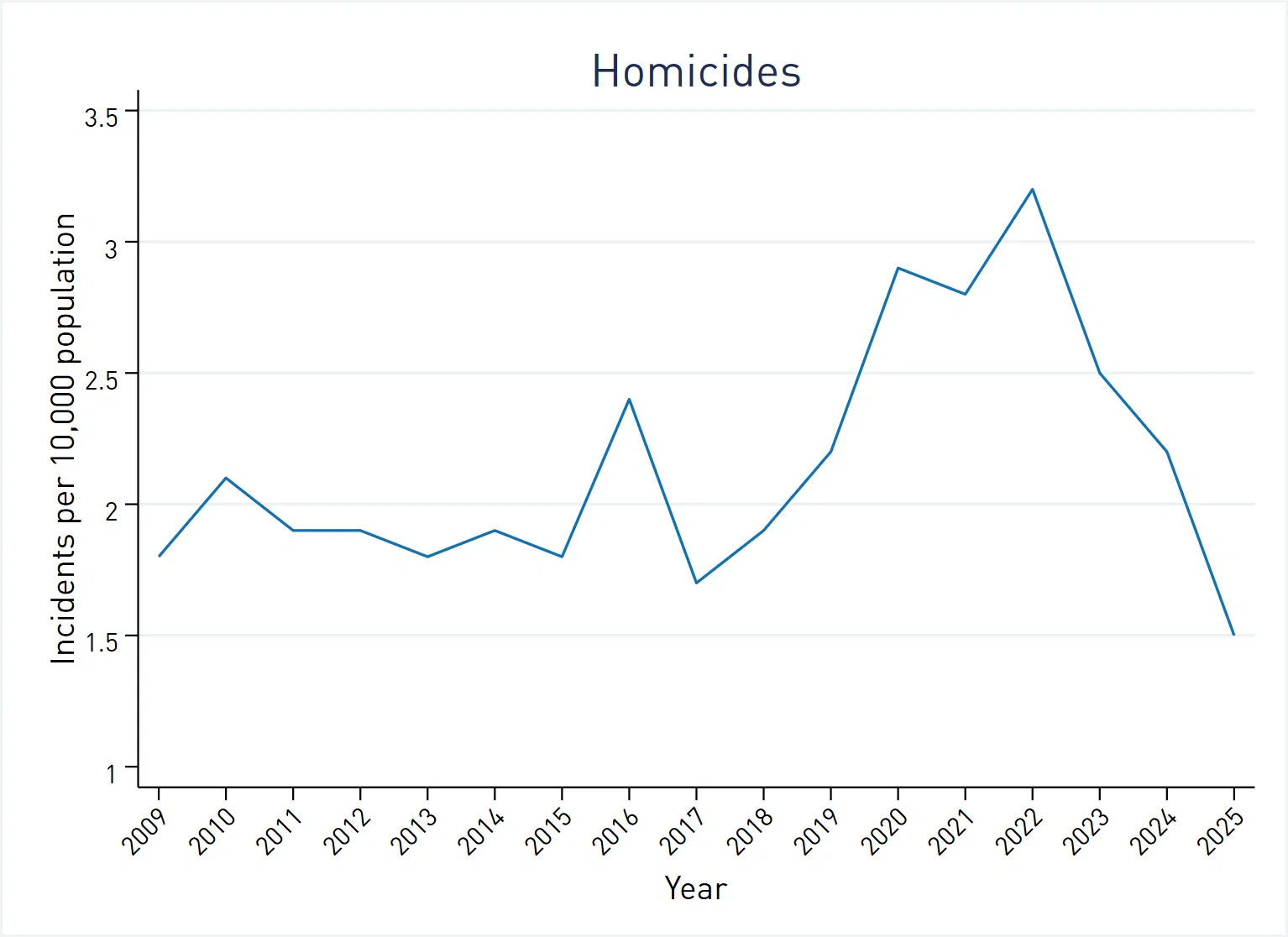
Data Source: Atlanta Police Department Open Data Portal
The homicide rate has been something of a roller coaster. After a period of slight decline from 2009 to 2015, the rate spiked in 2016, rose sharply from 2018 to 2022, and then declined dramatically over the last three years. While it’s risky to overemphasize a single year’s data, it is worth noting that the 2025 homicide rate is a historic low– certainly for the period for which we have data. The decline since 2022 has been impressive by any standard, even as many politicians and news sources claim that urban crime is rising.
How have the trends differed across the city? Figure 2 shows homicide rates over time, by Neighborhood Planning Unit (NPU).[2]
Figure 2: Homicide Rate by Neighborhood Planning Unit, 2009-2025
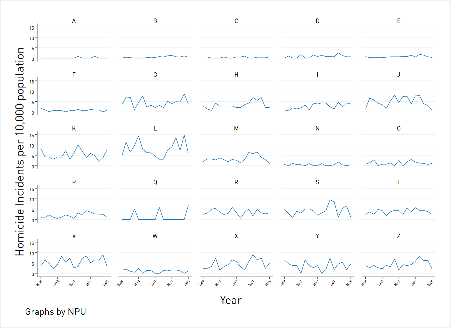
Data Source: Atlanta Police Department Open Data Portal
Many NPUs, particularly on the north side of the city, have maintained low homicide rates over the entire timespan. NPU A is especially noteworthy: it recorded only two homicides during the entire seventeen-year-long period covered by our data, the most recent one of which occurred in 2022. Some of the areas that experienced the worst spikes during and after the pandemic (e.g., H, J, L, and M) have seen the greatest improvement. At the same time, however, others such as NPU K have diverged from the citywide trend and experienced an increase in recent years.
Is there evidence that neighborhood revitalization has played a role in the decline in the crime rate? It’s a reasonable hypothesis, but one difficult to demonstrate with available data. First, one would need a good, measurable definition of revitalization. Second, NPUs that were already well-off would not be subject to revitalization, and might need to be excluded from the analysis.
One potential measure of revitalization might be the economic well-being of residents, i.e., the poverty rate. Figure 3 compares the change in poverty between 2010 and 2024 utilizing estimates derived from the American Community Survey and the change in the homicide rate between 2010 and 2025.
Figure 3: Neighborhood Revitalization and Change in Homicide Rate by Neighborhood Planning Unit
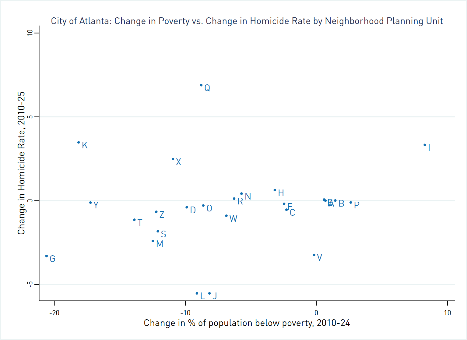
Data Sources: Atlanta Police Department Open Data Portal and U.S. Census Bureau American Community Survey 5 year Estimates, Table B17001
The first thing we observe is that most NPUs experienced a decline in poverty. Those that saw increases tended to see only small changes and most were relatively well-off to begin with (e.g., NPUs E, A, and B). The one exception is NPU I, which had a sizable increase in the percentage below poverty. Second, the graph does not show evidence of a relationship between these two types of change, at least as measured at the NPU level. Again, since this scatterplot includes NPUs not subject to revitalization, we should take this graph with a grain of salt. If revitalization, measured through poverty reduction, were a major driver, we would expect NPUs with the largest improvements (such as G, Y, and K) to show the strongest declines in homicide. We would also expect NPU I, which saw an increase in poverty, to see a corresponding increase in its homicide rate. But these NPUs do not stand out from their peers in the time-series graphs.
In conclusion, homicides are down in Atlanta, which is always welcome news. Why they are down and how to sustain that progress remain questions that require further investigation.
We’ll examine other types of violent crime in the next post.
Notes:
[1] As we have noted in the past, APD exhibits exemplary transparency with its crime data. One can visit their Open Data portal on any given day and access a map of all crimes reported the day before. The system provides data on not just the Part I crimes of homicide, robbery, aggravated assault (collectively known as violent crimes) and burglary, larceny, and auto theft (collectively known as property crimes), but many types of Part II crimes as well, such as vandalism, drug violations, simple assault, and confidence games.
[2] As a reminder, the City of Atlanta is broken down into 25 neighborhood planning units, labeled A-Z (there is no NPU U), proceeding from A in the northwest corner to Z in the southwest corner of the city. See this map from the City of Atlanta’s planning department for a reference.