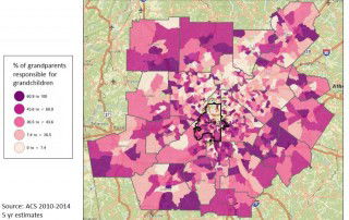
Do metro Atlanta residents feel like they are involved in their communities?
One of the questions asked in the 2015 Metro Atlanta Speaks survey was "How Involved are you in your community?" Residents were asked to respond with "Very Involved," "Somewhat Involved," "Not Involved at All," or "Don't Know." A total of 5,029 residents in 13 counties responded. A subsequent question encouraged residents to reflect on their experiences in [...]