
Do you rent an apartment in metro Atlanta? If so, you’re likely to notice that rental rates have been on the rise lately – along with pretty much everything. This is the third and final post in a 3-part series that has taken a look at Atlanta’s rental rates in the housing market using a variety of data sources and visualizations.
In part 1 of this series, we saw how the Zillow Observed Rent Index (ZORI) showed metro Atlanta’s residential rental rates to be increasing since the start of 2020. In part 2 of this series, we considered Esri’s proprietary national rental index, which is set to a base 100 (representing the national average).
Today’s post continues pulling at the thread from part 2, as we take a deeper dive into several datasets from Esri, mapping them and looking for any emerging geospatial patterns.
The Findings
The highest rental indices found anywhere in metropolitan Atlanta are just northeast of downtown Atlanta, and specifically in the Atlanta neighborhoods of North Druid Hills, Druid Hills, Virginia Highland, Little Five Points, and Cabbagetown, among others. Moving away from the core of the central business district, higher rent indices hug the major transportation corridors. Specifically, these higher rents tend to remain near I-75 in Cobb County, GA-400 through northern Fulton County and into Forsyth County, and along I-85 to the northeast and into Gwinnett County. Census tracts with higher rents (designated below in orange, red, or deep red) are virtually nonexistent in Douglas, Fayette, Clayton, Henry, and Rockdale Counties to the south of the Atlanta central business district.
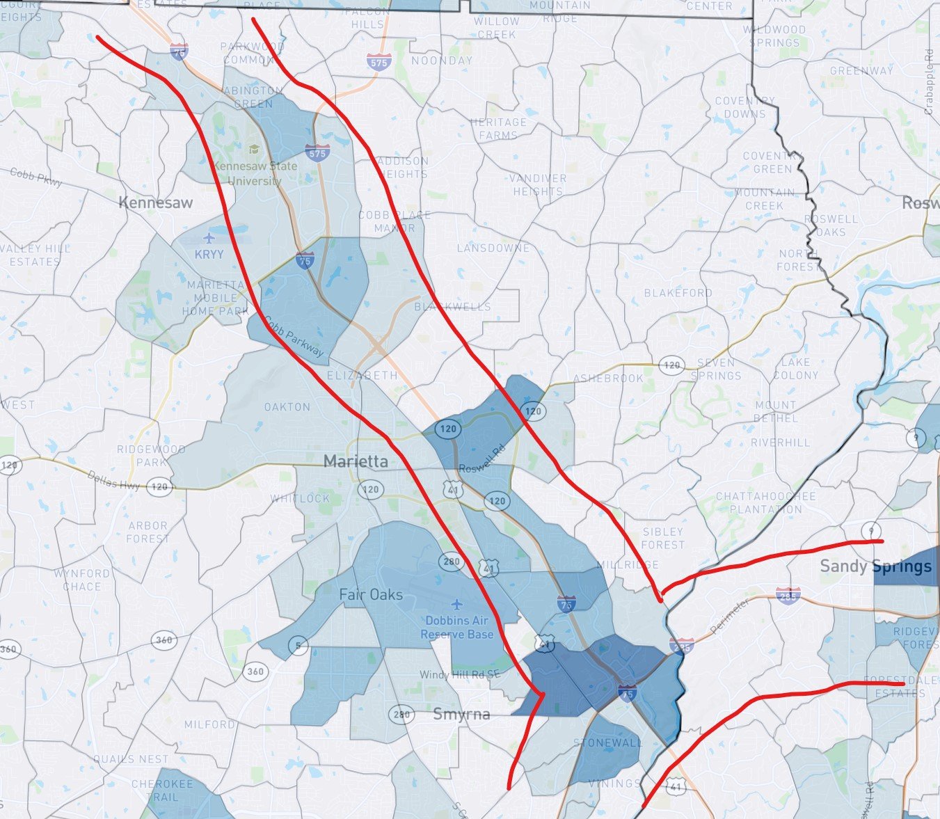
The map layer visualizing renter occupied housing units (which appear on a blue gradient) show a somewhat similar pattern. Census tracts which feature a greater number of these units tend to cluster near major transportation routes, as demonstrated by the red annotations in the screenshot of Cobb County below. The darker shaded census tracts follow the I-75 corridor quite closely, with a greater concentration near the I-285 Perimeter and Truist Park. We note that the geographic distribution of renter occupied housing units overall appears to be somewhat evenly distributed around the metro area.
When looking at generational concentrations, we see that larger shares of Millennials tend to cluster near the major transportation hubs, loosely correlating to the areas with higher rent indices. Baby Boomers, meanwhile, appear to shy away from these major highways (look for the lighter shaded census tracts in the screenshot below, zoomed in on I-85 in Gwinnett County). We might conclude that, in general, Baby Boomers are the more likely homeowning generation as compared to their younger counterparts; these data would seem to agree!

Finally, higher income levels (shown on a green color gradient below) do not appear to track geographically with higher rental indices, except near the downtown areas. This finding makes some intuitive sense: many wealthier residents further from the city core are more likely to own their own land and home, while their more urban counterparts, faced with much more expensive real estate, are more likely to own in and around the central business district.
Methodology note on the median household income: You’ll notice that several of the darkest green census tracts in and around northern Fulton County show a median household income of exactly $200,001 (see screenshot below). According to Esri, the median for this variable is calculated from the income intervals of the distribution using Pareto interpolation, unless the median falls in the lowest ($200,000) interval. For the lowest interval, linear interpolation is used. When the median falls in the upper interval, it is reported as $200,001 because households in the upper interval are topcoded to $200,000. As such, when using Esri’s data, some census tracts show a median household income of $200,001, when in fact they may be higher.

The Map
The interactive choropleth map below shows the Esri Rental Index for all 11 metro counties at a census tract level. A quick reminder about Esri’s rent data: the variable is indexed to 100, corresponding to the national average. Values above this threshold visualize rents above the national average, while those less than 100 visualize rental prices below a national average.
Additional data layers are accessible from the dropdown menu and include total renter occupied housing units, median household income, and the generational concentration of Millennials and Baby Boomers.