Incomes are unequal—wage levels and wealth distributions play roles in this– and that there are overall e discrepancies surprises exactly no one. But drilling down to consider income indicator inequality at the regional and sub-regional level and by race is instructive, as conditions vary a lot by jurisdiction. It is easily seen that areas are more or less unequal than are others. not only in terms of real growth in household or per capita incomes but also as to whether there is narrowing (or not) of income gaps over time.
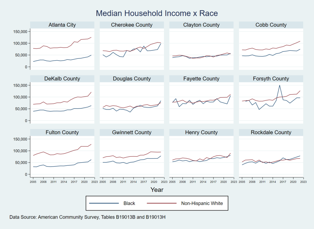
Median household income (Median HHI) by race is perhaps the income variable most cited in the media when these topics arise. Figure 1 below reveals the Atlanta area landscape. In the core areas of the City of Atlanta, Fulton County, and DeKalb County, the gaps between White and Black median HHI have been and remain wide. For Cobb and Gwinnett Counties the gaps are distinct, but narrower. In Clayton, Henry, Douglas, and Rockdale, which are also areas with high shares of Black population, there is minimal difference between white and Black median HHI AND those differences do appear to be lessening over time. In the counties of Cherokee, Fayette, and Forsyth (counties with lower shares of Black population), we see a lot of variation in Black median incomes (given the smaller numbers of households involved) but in general, income gaps there are less than those found in other counties.
Figure 1: Trends (since 2005) in Median Household Income by Race: Atlanta Regional Commission Major Jurisdictions
The dispersion of median per capita incomes by selected race (Figure 2 below) have similar spatial patterns to median HHI, but the gaps are more pronounced. This is the case owing to larger average household sizes for non-White populations (and as a result) relatively lower per capita income for Black populations. Per capita incomes for both White and Black populations are increasing over time, with slowing population growth across the board.
Figure 2: Trends (since 2005) in Per Capita Income by Race: Atlanta Regional Commission Major Jurisdictions
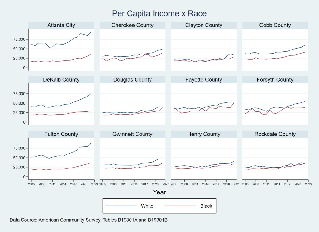
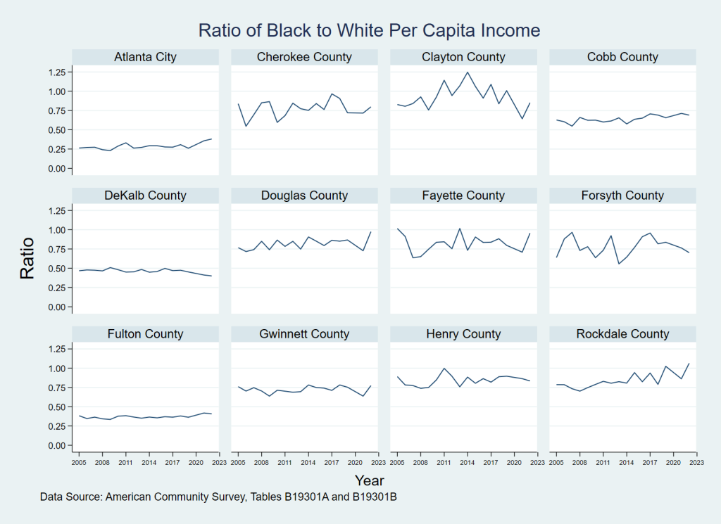
Figure 3 shows that the ratios of Black to White per capita income range from a fairly consistent low of 25% in the City of Atlanta–to 75% in counties like Cobb, Gwinnett, Douglas, Fayette, and Forsyth–and then on up to over 1.0 in Clayton County early in the 2010s, as well as close to 1.0 in Rockdale for 2022.
Figure 3: Ratio (since 2005) in Black to White Per Capita Income: Atlanta Regional Commission Major Jurisdictions
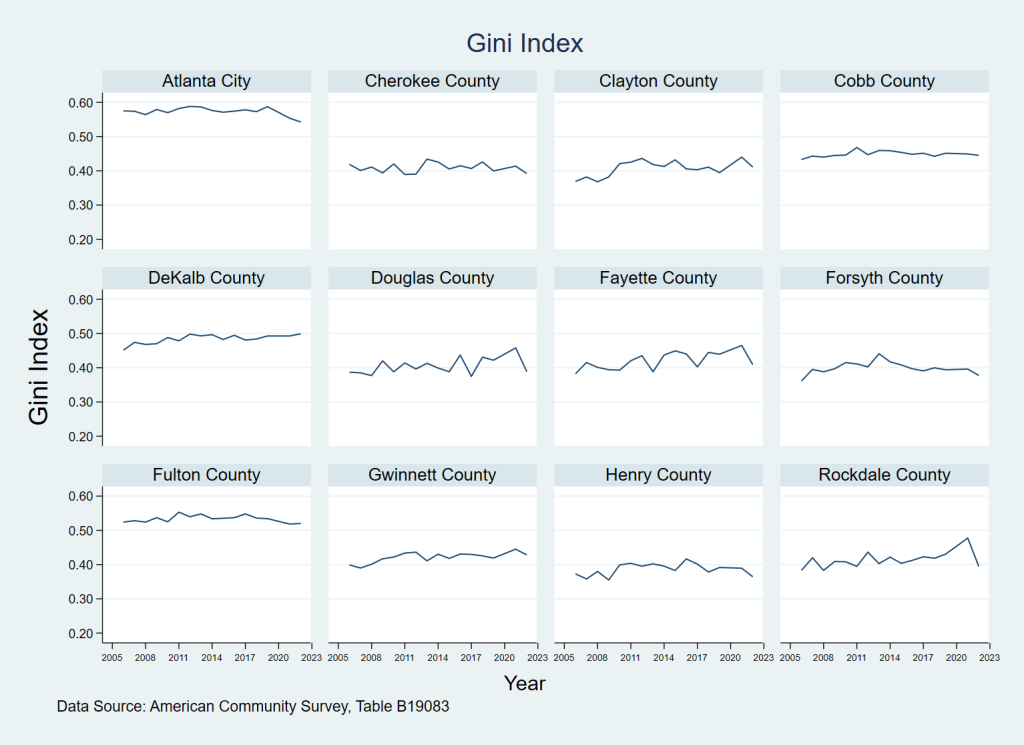
The GINI coefficient compresses incomes for all races and ethnicities into a single inequality measure. Looking at the vertical axis of Figure 4 below, the closer the values are to 1.0, the more unequal incomes are in a given area. So, not surprisingly, given the greater gaps that we saw (between White and Black incomes) in Atlanta City, Fulton County, and DeKalb County, GINI values are consistently high there– though ticking down very slightly over time. This is perhaps due in part to gentrification occurring in more urban areas within those areas. The charts don’t suggest that income inequality is lessening (or increasing) significantly in any ARC jurisdiction, though as expected it is incrementally less unequal in suburban counties with less racial diversity.
Figure 4: GINI Coefficients (since 2005): Atlanta Regional Commission Major Jurisdictions
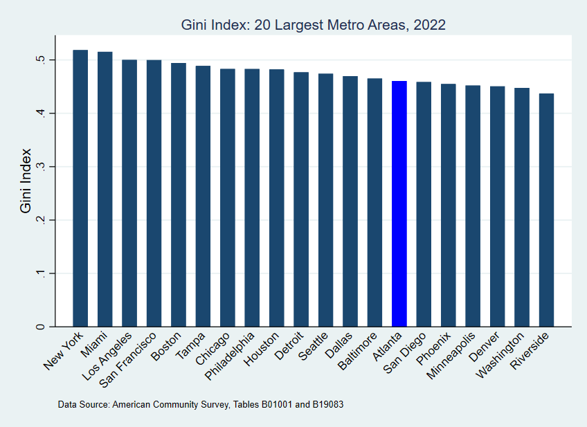
A final chart (Figure 5 below) shows, however, that Atlanta is hardly alone in facing the challenges of these income gaps. And relatively speaking, many areas are worse off as per the GINI coefficient. The Atlanta MSA has the 7th lowest GINI coefficient among the twenty largest metro areas (v.v. population), showing incrementally less income inequality than many large Northeastern and Midwestern metros. In comparing these larger metros, Atlanta has greater income inequality (and only slightly) only when compared to select Western metros and Washington DC.
Figure 5: GINI Coefficients 2022: Twenty Largest Metro Areas (by Population)
