
The metric we keep our eyes on is the positivity rate. If it is increasing, that means community spread is increasing, and the positivity rate in nearly all our counties is on the rise. If testing alone could account for the increase in new cases, we’d see the rate per 1,000 change together in the top chart. What we are seeing, however, is that the rate of testing per thousand in many counties is decreasing while the new cases per thousand is increasing.
This brings up an important and nuanced caveat to interpreting testing data: A decrease in testing is capable of increasing the positivity rate. Why? Because as you narrow the group getting tested, it is possible that this group includes more sick people. In these situations, increasing testing could lower the positivity rate even if there is an uptick in the number of new cases.
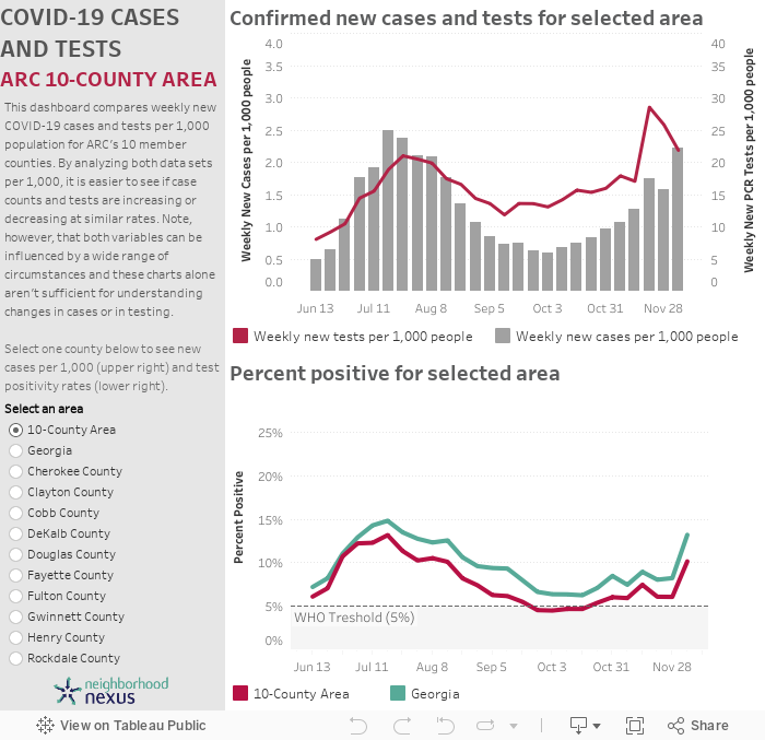
Additional insights from the December 10th update of the dashboard include:
- Since mid-October, weekly new cases have been back on the rise, and as of December 5th, all counties in the 10-county area have a positivity rate higher than 5 percent, the World Health Organization’s threshold before implementing a reopening strategy or loosening restrictions. In previous weeks, several counties were near or below the threshold, but they have all returned to a higher positivity rate.
- With the rise in new cases, Cherokee recorded its highest positivity rate on the week of December 5th, while the rest are on their way to reach a new peak in the coming weeks. Previously, all counties in the 10-county experienced a peak of transmission from mid-July to mid-August.
- Douglas and Henry County have the highest positivity rate in the 10-county area as of December 5th, with 16 and 14.9 percent of PCR tests returning positive results, respectively.
For more about the tool, continue scrolling, or dive straight into the data using the dashboard to explore the data and identify trends in each of the ten counties:
About the tool
COVID-19 testing data is fundamental to determine if COVID-19 cases are actually decreasing as opposed to appearing to decrease because we are administering fewer tests. Plus, when a community administers more tests, it can better identify the transmission level of the virus and make fact-based decisions about loosening restrictions and reactivating the economy.
This dashboard uses data published by the Georgia Department of Public Health’s COVID-19 Status Report on weekly new confirmed cases and weekly new tests. To help understand how both indicators are moving through the population, the dashboard shows confirmed new cases and tests per 1,000 population at the county level (top right chart). The percent positivity rate, which is the most common measure for analyzing the state of the pandemic, is in the chart at the lower right at the county, 10-county region, and state level. The World Health Organization (WHO) recommends a community have a 5 percent positivity rate before implementing a reopening strategy or loosening restrictions.
When it comes to testing, an important caveat is that publicly available data currently only include the molecular (PCR) test, and only those reported to DPH. Rapid antigen testing (that 15-minute test growing in popularity) data is not yet available, so test counts, like case counts, likely are underreported. For more on this, check out Amber Schmidtke‘s excellent reports, especially her weekly digest.