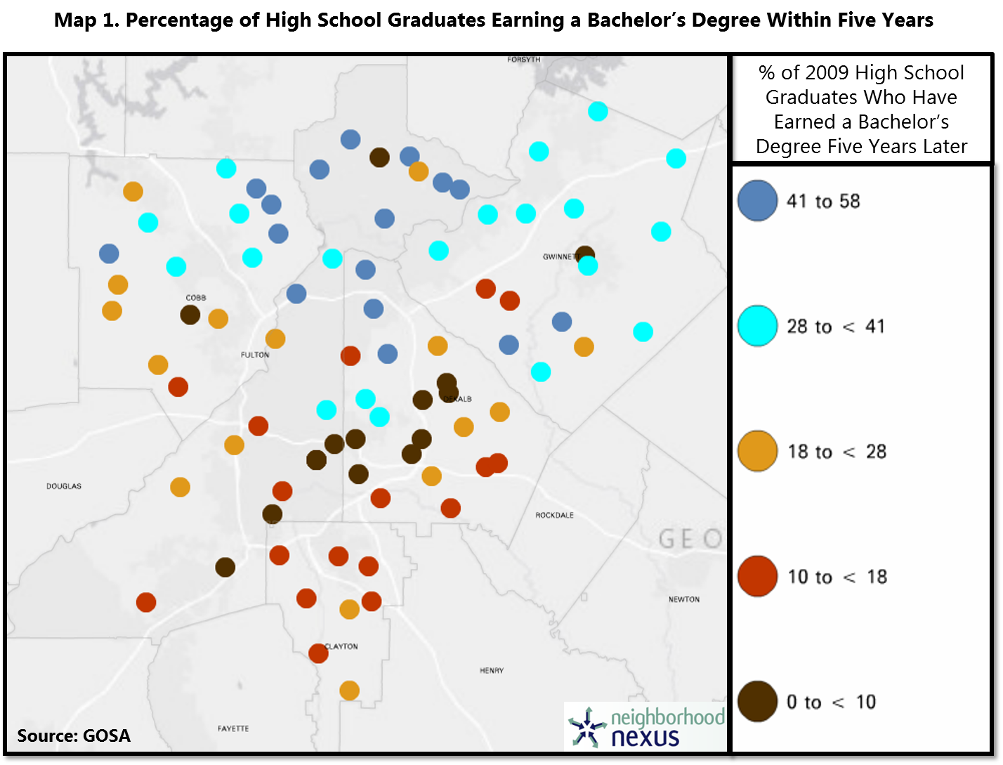
This map, from our special feature So What Exactly Happens After High School?, uses data from the Governor’s Office of Student Achievement (GOSA) (mapped using Neighborhood Nexus) shows, by school, the percentage of 2009 high school graduates (for most high schools in the five core counties) who had earned a bachelor’s degree within five years. We can see a familiar pattern emerging, with the best performing schools on this measure clustered in the north. This spatial pattern is similar to many variables that we map, driven mostly by income.